When the team at Sees Design first began working with these Dallas homeowners, they weren't designing for house at all. The project actually started on an entirely different lot, but midway through, the clients changed course and bought a nearly-completed new build instead. There was just one catch: it was already well into construction and almost ready to sell. So, rather than starting from the ground up, Sees Design had to work with a house that already had its bones, finishes, and a fairly well-established plan in place – and then work out how to make it feel like it belonged to their clients.
In less than two years, the Dallas-based studio reworked the interiors from the inside out, swapping materials, hardware, and flooring, removing cabinetry and even moving walls. 'We were challenged with creating a cohesive design in a house where construction was nearly complete,' associate principal Sara See explains. 'We had to undo some of the layout and design and reimagine other areas to customize to our clients' expectations.'
And undo they did. The finished home feels worlds away from its spec-build beginnings, layered with classic details, antiques, and richly textured fabrics alongside sculptural contemporary pieces and cleaner lines. The result is neither strictly traditional nor modern, but something much more interesting.
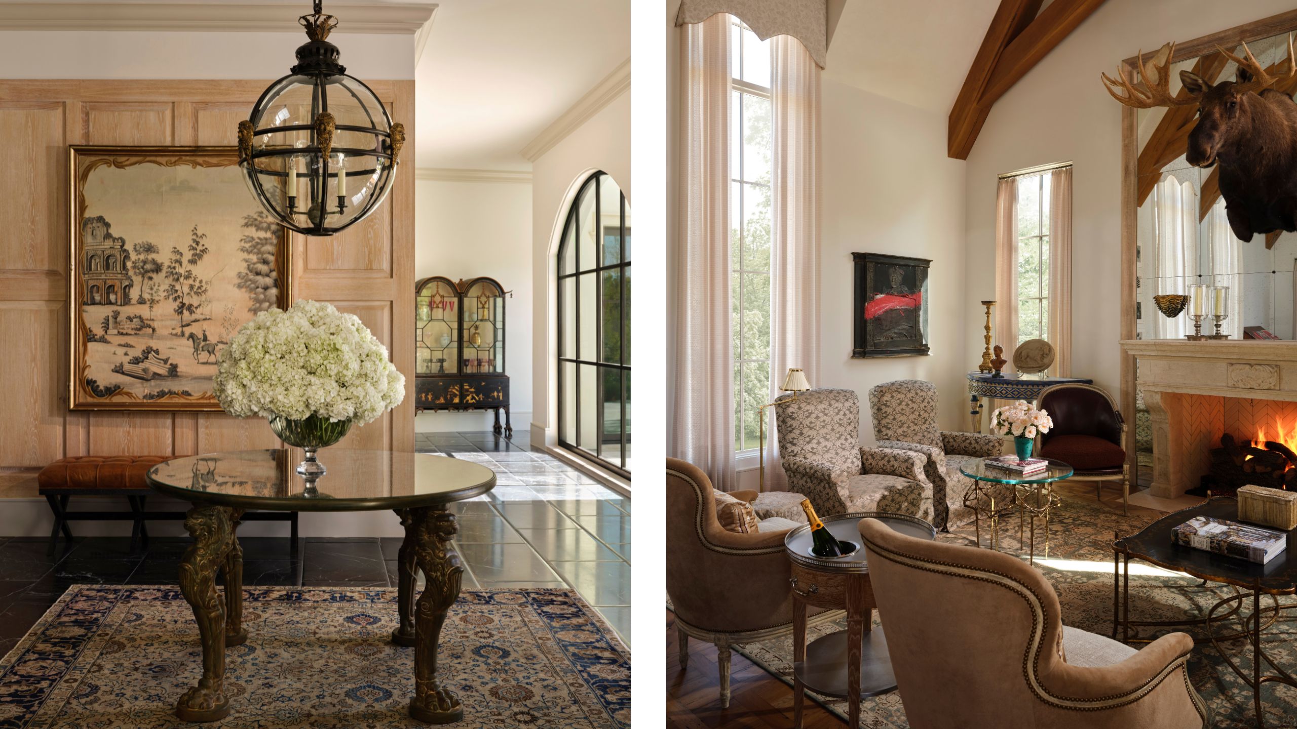
The secret was less about making the house look old and more about giving it the layers that make a home feel as though it has a past. Sees Design's answer wasn't about mimicking a particular interior designer style either; instead, the brief was to make it feel collected – as though the contents had arrived over time, gathered from travels, hand-me-downs and discoveries.
'We would describe the home as richly layered, collected and deeply personal,' the designers explain. 'It is rooted in traditional architecture, but it is not governed by any single period or style.' That meant they could pair European antiques alongside tailored textiles, English country-house references and cleaner contemporary pieces, with the occasional unexpected moment thrown in for good measure.
The architecture provided the framework, reimagined alongside architect Jerry Coleman to tweak it to their new vision, but the character came from the conversation between all those layers. 'That tension keeps the house feeling alive,' they add. Now, a custom tracery ceiling and hand-painted wallpapers sit alongside natural wood, stone, metal and a deliberately varied palette that keeps appearing throughout. 'The continuity comes less from repeating exact finishes and more from maintaining a consistent sense of warmth, patina, and contrast,' they explain. The effect is beautifully inviting: nothing looks as though it is forced together or arrived in one delivery, and that is the entire point.
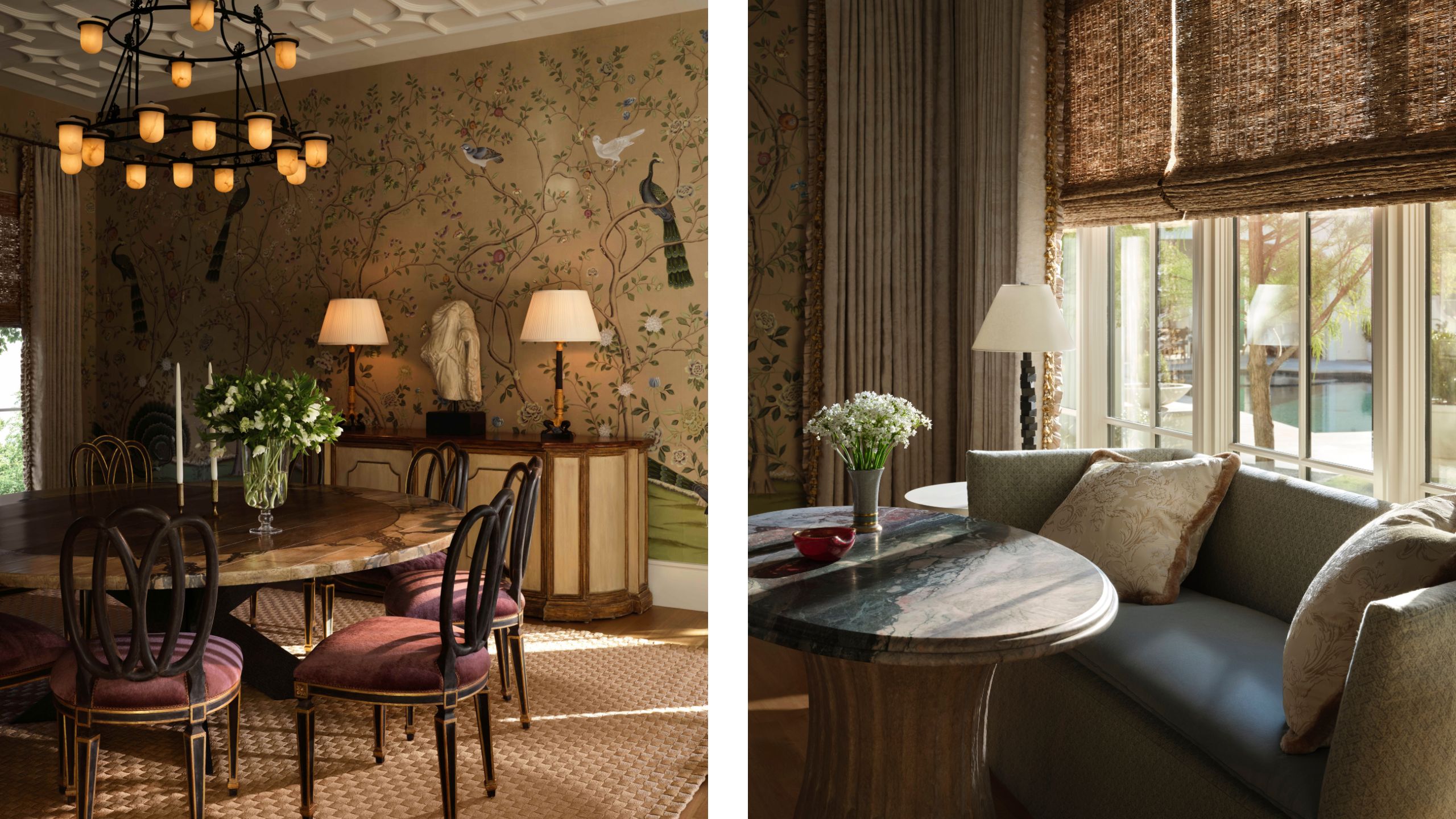
The homeowners provided yet another hurdle: they could hardly have had more different design sensibilities – his lean modern and eclectic, while hers are more romantic and traditional. Designing for both could easily have resulted in a house divided into competing camps, but the design team already had a useful head start. The studio had furnished the couple's previous home, so they knew their personalities and had a feel for 'how to coordinate their likes and dislikes.' This time, the goal was not to make his rooms modern and hers traditional, but to bring those opposing instincts together into what the designers describe as 'a portrait of the entire family.'
The dining room is perhaps the clearest example of their blended personalities. Custom de Gournay panels on natural tea paper bring a softness to the walls, while a striking ceiling adds what the designers describe as 'a layer of quiet drama.' A secondary table, topped with an architectural Dennis & Leen Louis XVI fluted base, is both beautiful and practical, accommodating overflow during entertaining while defining the circulation between the dining room and kitchen.
'The challenge was striking a balance – creating a space that felt feminine and traditional, yet remained cohesive with the broader transitional language of the home,' they add. The same push and pull appears in the parlor, where vaulted ceilings and a striking moosehead lend grandeur. Divided into two zones, there's a formal sitting room for her, and a more masculine 'listening room' area for him that comes complete with state-of-the-art audio equipment and an enviable record collection.
For all the decorative flourishes, this is not a house that was simply designed to look good. Despite its vast size, the homeowners wanted to make use of every inch of the substantial property, so Sees took a close look at the 'layout and traffic patterns' to adjust everything to their lifestyle. That, in practice, meant thinking about how the family would actually move through the house, where they might gather, and which spaces needed to work harder than others. Sure, it remains generous and sprawling, but each room has been given a clear purpose, with transitions between them that feel carefully considered and at ease with one another.
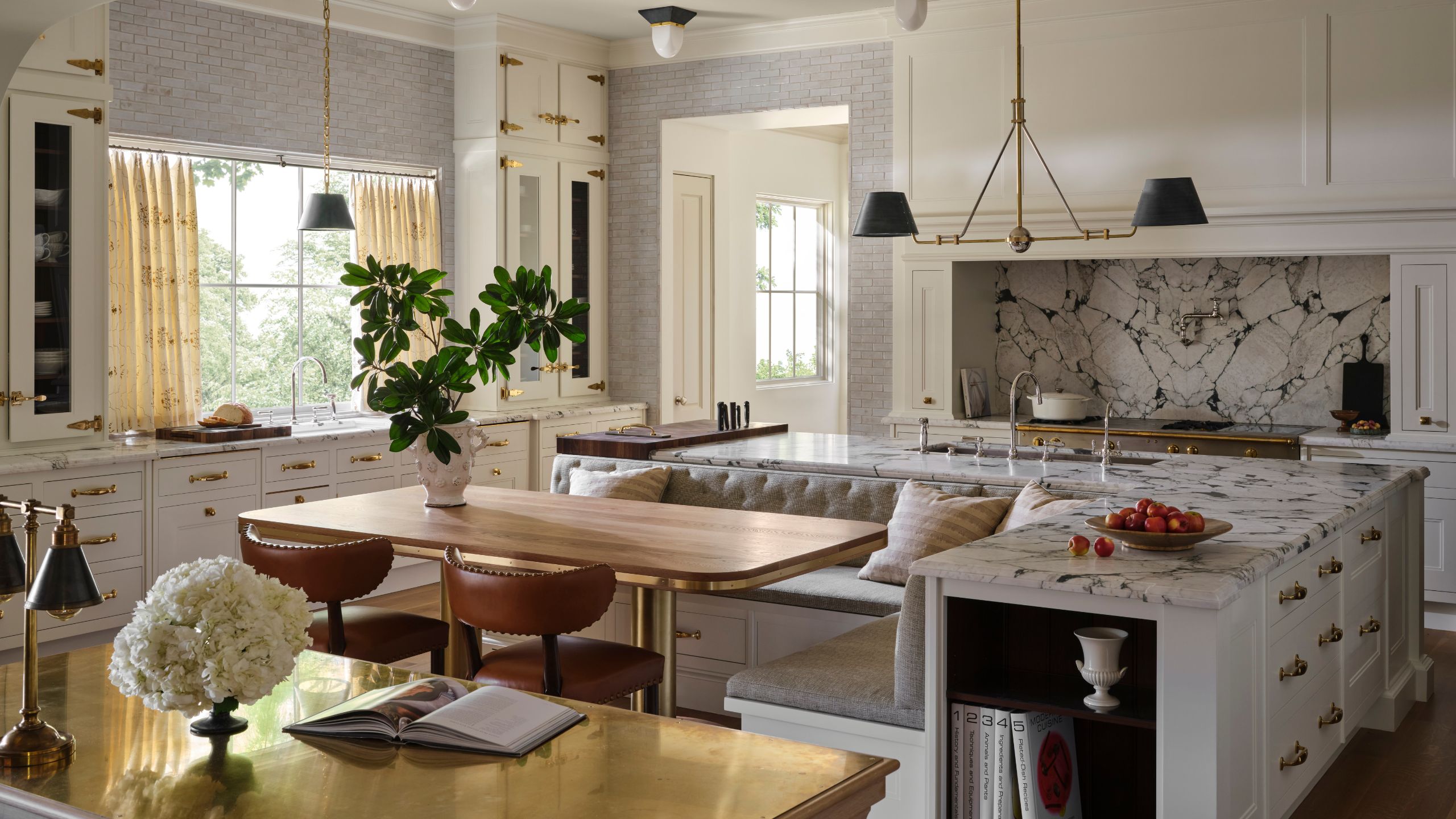
The kitchen is the most obvious social hub. Made by Christopher Peacock, a built-in banquette upholstered in performance Rose Tarlow fabric sits tucked into a spacious island and has become the family's favorite meeting place, rivalled only by the custom sectional in the family room and the expansive outdoor dining area. The entertaining spaces continue outside, where a covered loggia, poolside cabana and pizza oven give the family plenty of room to host extended family without everything having to happen indoors.
Even the practical details have been considered with entertaining in mind, and the tweaked layout now allows the house to accommodate a crowd without losing its sense of intimacy. It's a big home, but it sure doesn't feel like one.
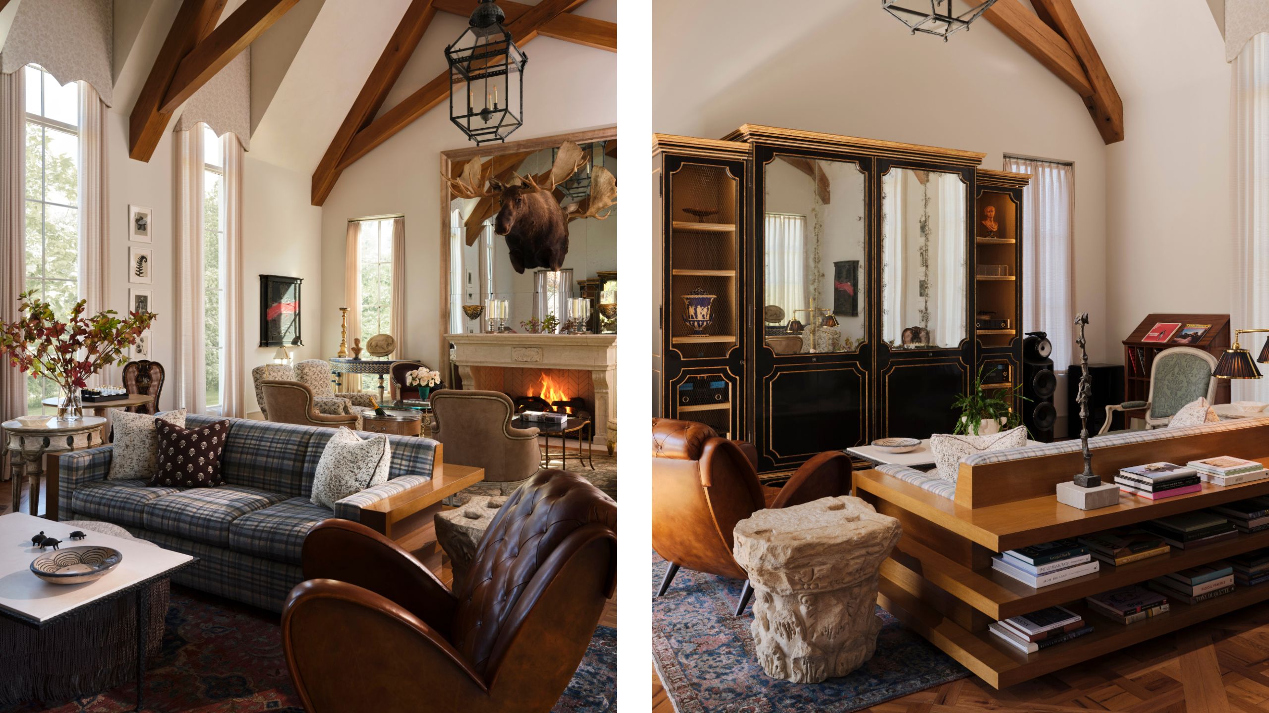
The parlor is where the home's personality is really revealed. Sees Design calls it 'the emotional center of the home,' and it's easy to see why: soaring ceilings and exposed timber beams give the room plenty of grandeur, but the furniture arrangement brings everything back down to a more human scale. A plaid sofa, worn leather chairs, and patterned rugs meet a mix of antique and contemporary pieces that make the space feel best suited for cozy nights in, while the monumental fireplace anchors the room. And of course, there's the moose.
'The moose above the fireplace is unapologetically personal, and it brings character, humor, and a connection to the outdoors. Rather than trying to quiet that piece, we allowed it to become part of the room’s identity,' they explain. That sense of confident mix and match is the win here. Nothing is overly coordinated, yet everything feels connected.
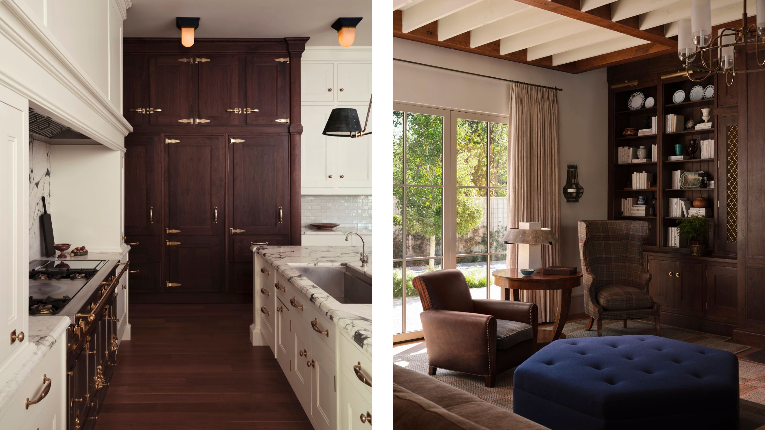
The kitchen takes a lighter, more tailored approach to the home's aesthetic. White cabinetry and dramatically veined stone create a crisp foundation, but Sees Design kept the room from feeling too polished with warm brass hardware, dark wood, pleated shades, and sweet floral cafe curtains. The effect is classic without being fussy, with the variation of the marble and wood bringing some of the patina that runs through the rest of the house.
The details are absolutely what give it personality. 'The kitchen is lighter and more tailored,' they explain. 'The built-in banquette and table turn the island into a place for gathering rather than simply food preparation. It is a highly functional room, but still very much connected to the decorative language of the house.'
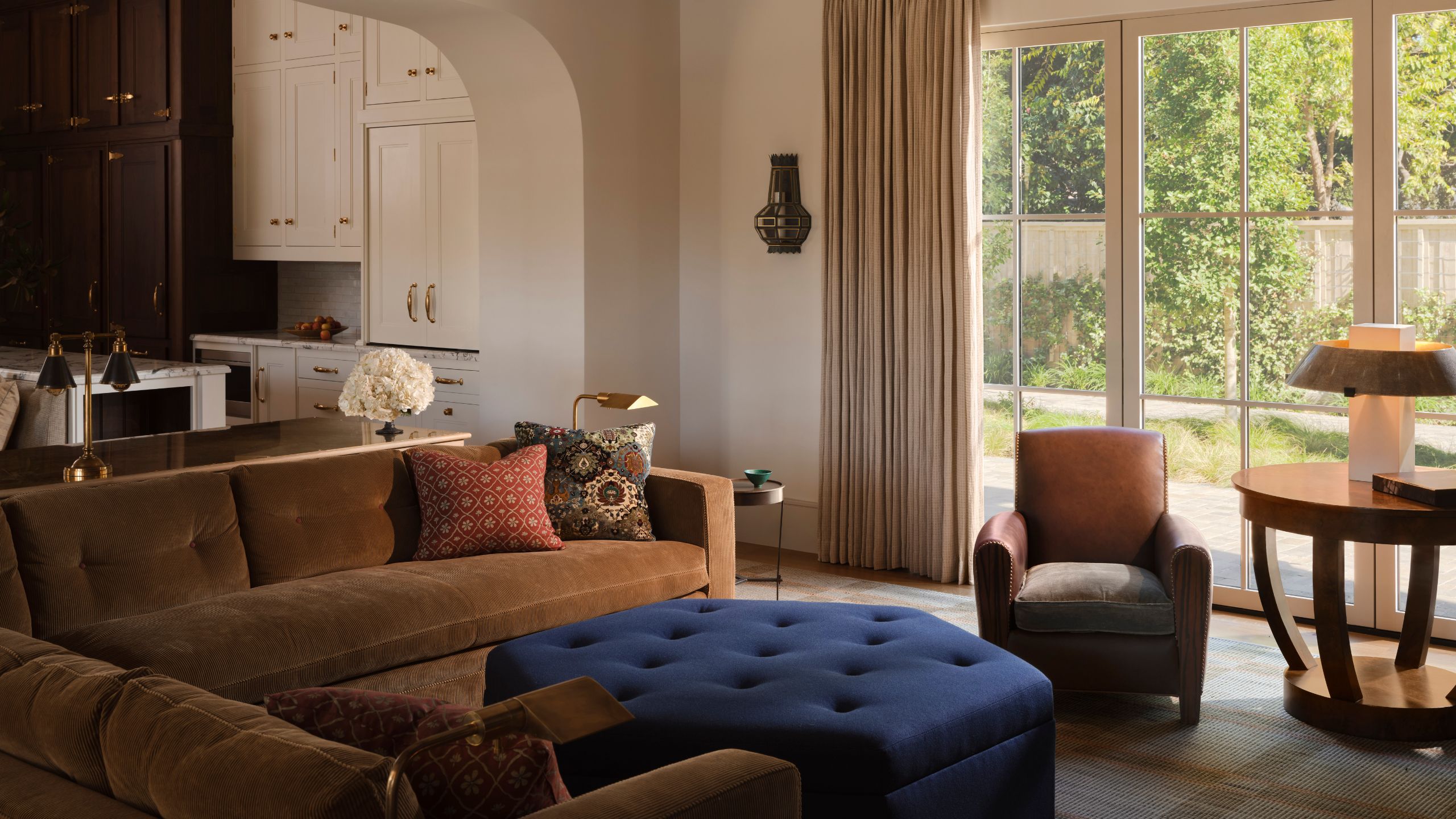
Adjoining the kitchen, the family room shows the client's more relaxed side. A generous corduroy sofa and deep blue buttoned ottoman make a comfortable centerpiece, while patterned cushions add a layer of personality, picking up the richer tones seen elsewhere in the house. This room also brings together the home's color story in a nutshell.
The palette moves between soft neutrals and deeper, earthier tones – ivory, camel, tobacco, chocolate and charcoal – with touches of muted plum, blue and green adding depth. Pattern is generous but never jarring, appearing in 'softened or historic forms like florals, plaids, botanical motifs,' they explain. 'Repeating these colors and textures in different combinations allows every room to have its own atmosphere while still belonging to the same home,' they add.
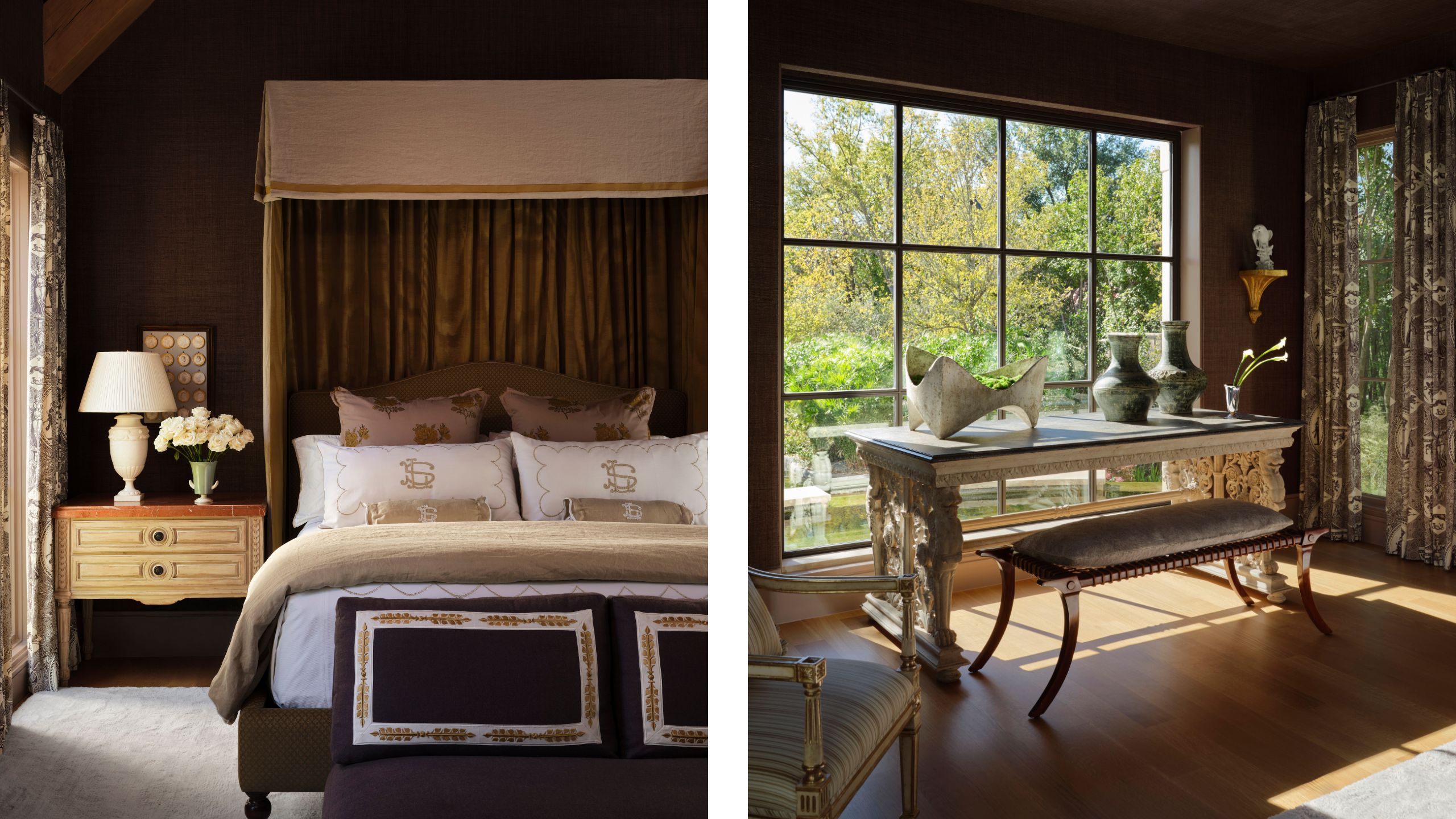
The primary bedroom is 'the most enveloping space' in the house, they explain, wrapped in dark, textured walls and ceiling that make the room feel instantly cocooning. Against that moody backdrop, the custom canopy bed (which they describe as feeling like a time capsule) in Dedar silk takes center stage, its pale frame and tailored bedding bringing softness and lightness to the scheme. 'The room is quiet, but not minimal,' they add. 'Patterned curtains, embroidered textiles, antique furniture and carefully chosen objects give it intimacy and history. The dramatic windows and garden view prevent the darker palette from becoming heavy.'
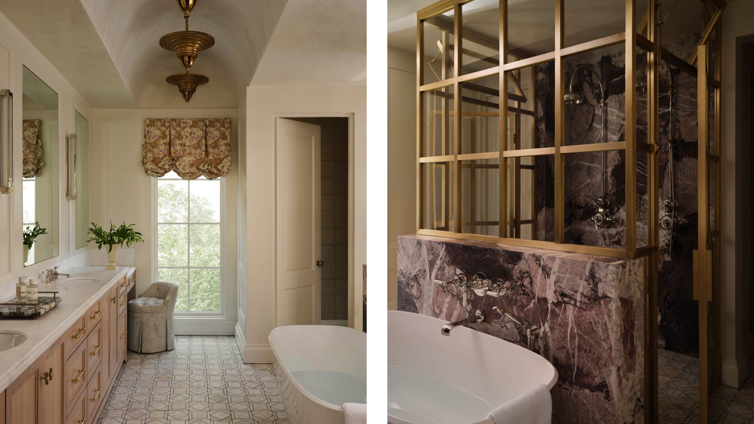
The primary bathroom balances light and dark, romantic and modern. The main area is bright and airy, with pale cabinetry, stone floor, and a pretty floral shade that softens the drama. Overhead, a sculptural freestanding tub sits beneath a curved ceiling lined with aged brass lighting and hardware to match. Behind, a brass-framed glass and marble-wrapped shower dials up the theatrics. The designers were careful to create a really cohesive material palette throughout the home, working with natural wood, stone, and metal in various manners to create a recurring thread. 'Each application is different, but all share a sense of permanence and natural variation,' they explain. 'Together, these finishes create a vocabulary that feels developed over time rather than rigidly coordinated.'
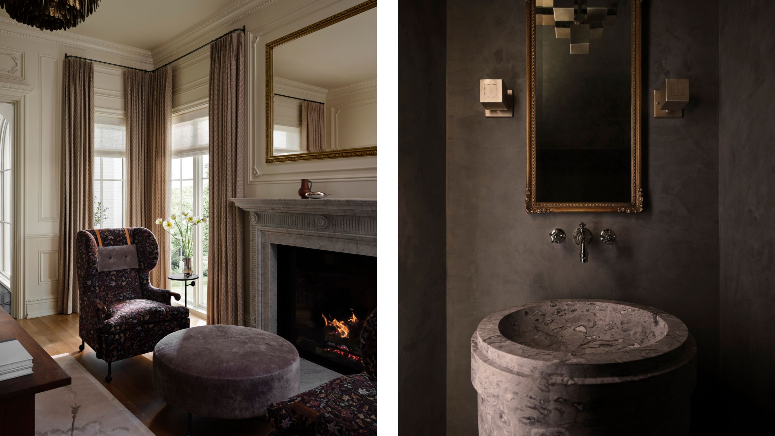
The office brings a softer, more traditional note, with tailored drapery, a floral-upholstered wingback chair, and a cozy fireplace creating a WFH space that feels both elegant and comfortable. Beside it, the powder room takes the opposite approach: dark walls, an antique mirror and a beautifully irregular stone basin give this small space considerably more drama than its footprint might suggest.
'Across the house, the individual pieces suggest homeowners who are confident in their taste and comfortable mixing serious antiques with things that are playful, sculptural or slightly unexpected,' they add. 'The design is polished, but it does not feel overly managed, and that balance was very important to us.' That is ultimately what makes the project work. 'The soul of the project comes from the dialogue between refined and rustic, formal and comfortable, serious and unexpected,' they add.
Shop the Look
Love beautiful design ideas, expert advice, and inspiring decor trends? Sign up for our newsletter and get the latest features delivered straight to your inbox.