There are few decor ideas as effective at transforming a room as a fresh coat of paint. And while your choice of paint color sets the mood, the most stylish rooms are embracing creative ways of using that color that go far beyond painting four walls.
From tonal interpretations of color drenching, high-gloss finishes, and painting often-overlooked architectural details in a room, 2027 is looking to be a color-confident year when it comes to using paint. Not only do these new ways of painting a room add design flair, but they can make spaces feel far more atmospheric.
As we look ahead to the coming year, we caught up with designers to get the lowdown on the paint trends predicted to lead the way. Below, you can browse each of them for some fresh paint inspiration while getting useful tips from designers on how to pull them off successfully and the color trends that make them shine.
1. Gloss Finishes
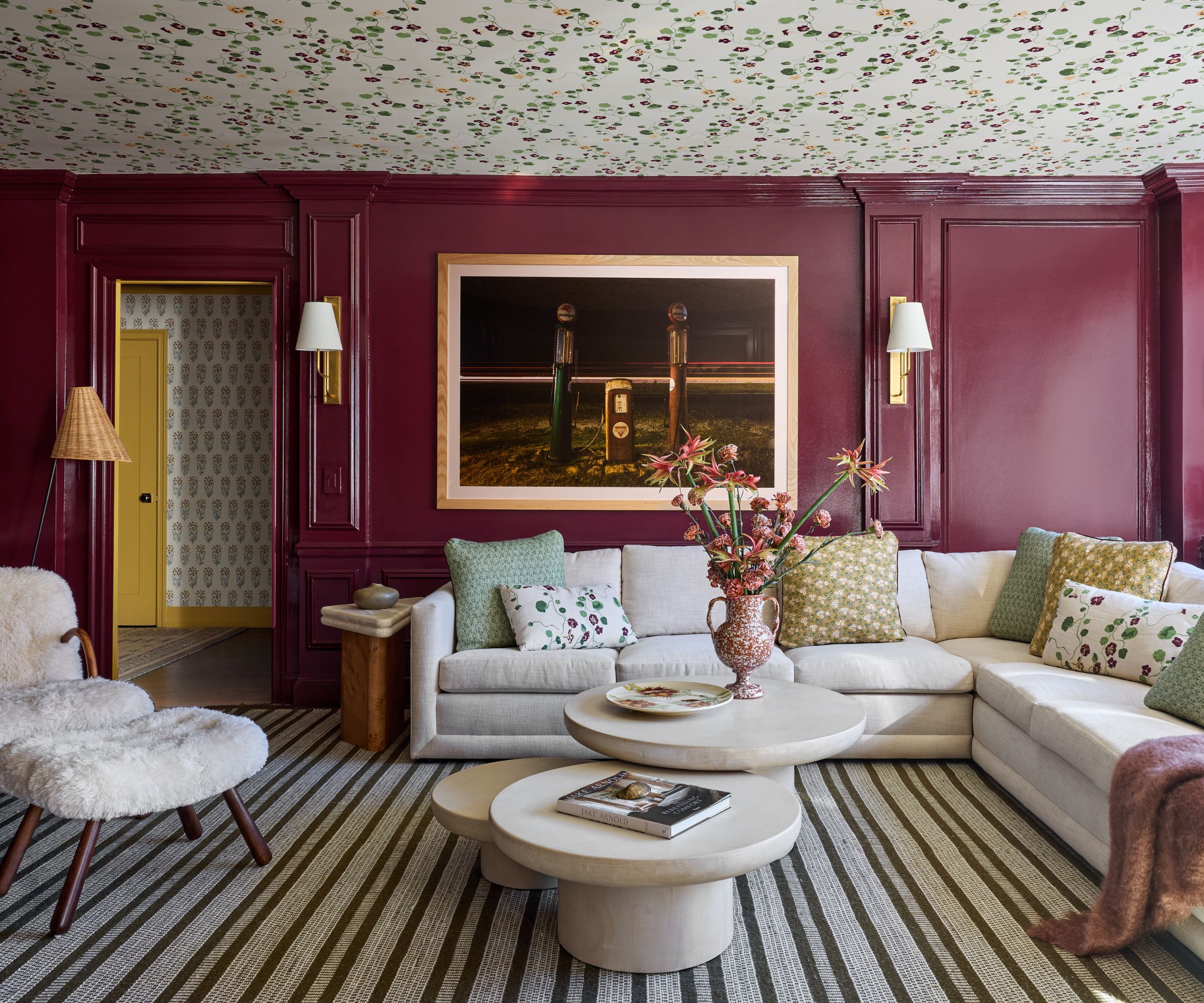
Recent years have seen plenty of appeal for decorating with dark paints, bringing a moody and immersive feel to rooms, but as we head toward 2027, designers are taking this a step further with gloss paint finishes. Not only does this give a room more dimension by reflecting light around the space, but it adds another layer of drama and intrigue.
In this living room, the NYC-based designer Jennifer Hunter chose Farrow & Ball's 'Brinjal' to drench the room (along with a fun floral wallpapered ceiling) in a 'Full Gloss' finish. 'I love how reflective a full gloss finish is and how it changes throughout the day,' she says. 'In natural light, it’s incredibly reflective, bouncing light around the room and keeping the space feeling light and bright. At night, it takes on a completely different mood. The sheen catches the warm glow of lamps and sconces and makes the walls feel almost luminous. It adds so much depth and dimension to a room, and I love the way it makes the color feel that much richer.' To achieve that much-desired rich coverage look, prep your walls first with Farrow & Ball's Wall and Ceiling Primer.
While it could be tempting to coat the ceiling in the same dark hue, Jennifer advises a lighter approach on the ceiling when using gloss paint finishes. 'One of my favorite tricks is to keep the ceiling white, which gives the eye a place to rest and helps balance all of the sheen on the walls,' she says. 'If I’m feeling a little more adventurous, I’ll wallpaper the ceiling with a pattern on a white ground. You still get that light, airy feeling overhead, but the wallpaper adds another layer of interest without competing with the glossy walls.'
2. Colorful Trimwork
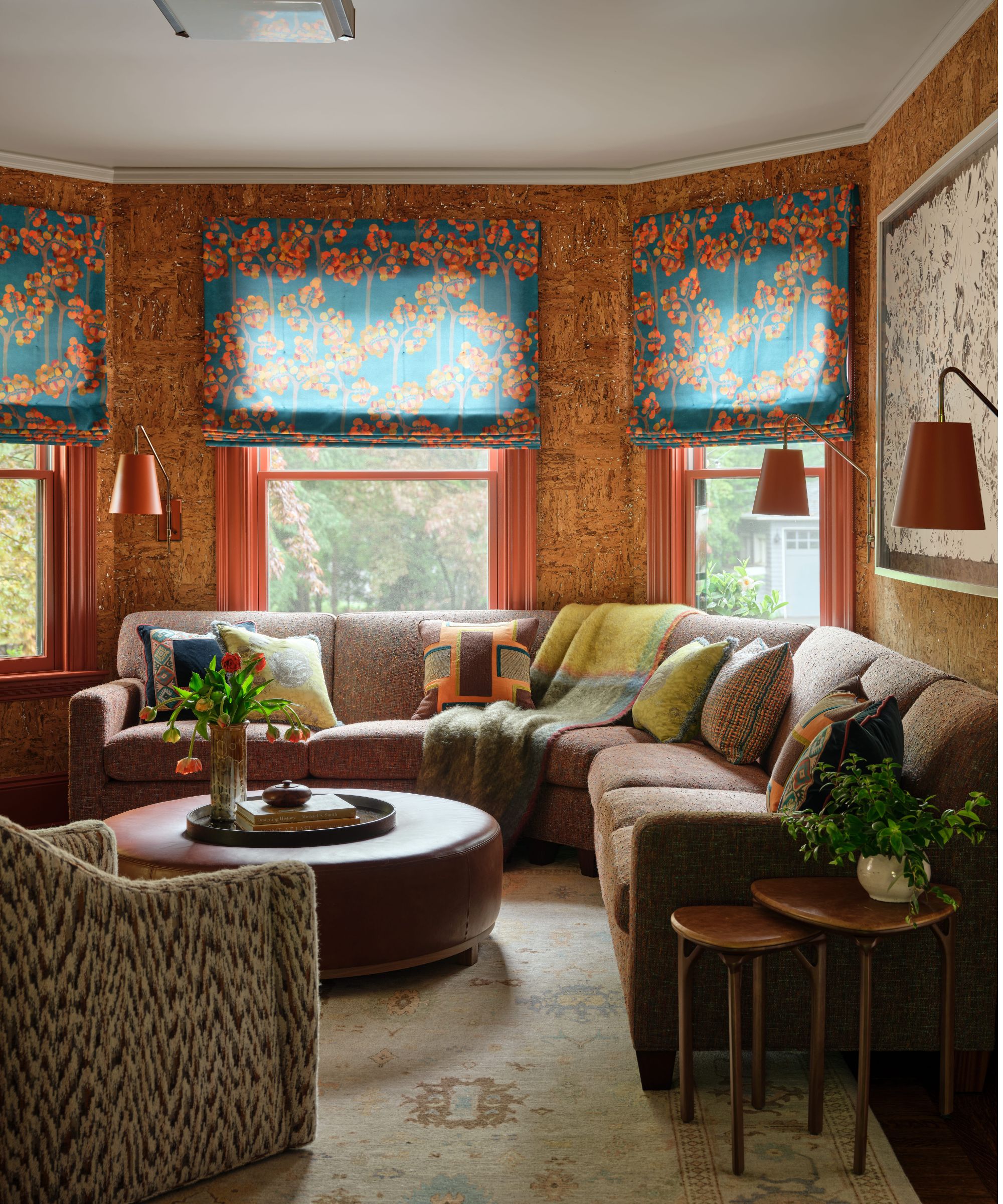
While trimwork is often painted default white – whether that be in neutral rooms or those with more colorful walls – designers are proving that this isn't a surface to forget about. In 2027, expect to see the boldest of colors used on architectural details, from door frames and baseboards to window frames and paneling.
Design expertise in your inbox – from inspiring decorating ideas and beautiful celebrity homes to practical gardening advice and shopping round-ups.
In this colorful living room, the red window frames not only add a fun pop of color, but they create a cohesive look alongside the warm-toned cork wallpaper. 'White would have distracted from the rich colors of the room and made it look busy,' says the Boston-based designer Cecilia Casagrande.
When choosing a color for the trim, Cecilia usually takes inspiration from the decor. 'I generally pull a color from either the wallpaper, window treatment, sofa, or art in the room,' she explains. 'And of course, making sure it is either a nice complement or contrast to the wall. The in-between can be wishy-washy.'
Don't forget to use a good Painter's Masking Tape when painting architectural details to achieve a neat edge.
3. Tonal Color-Drenching
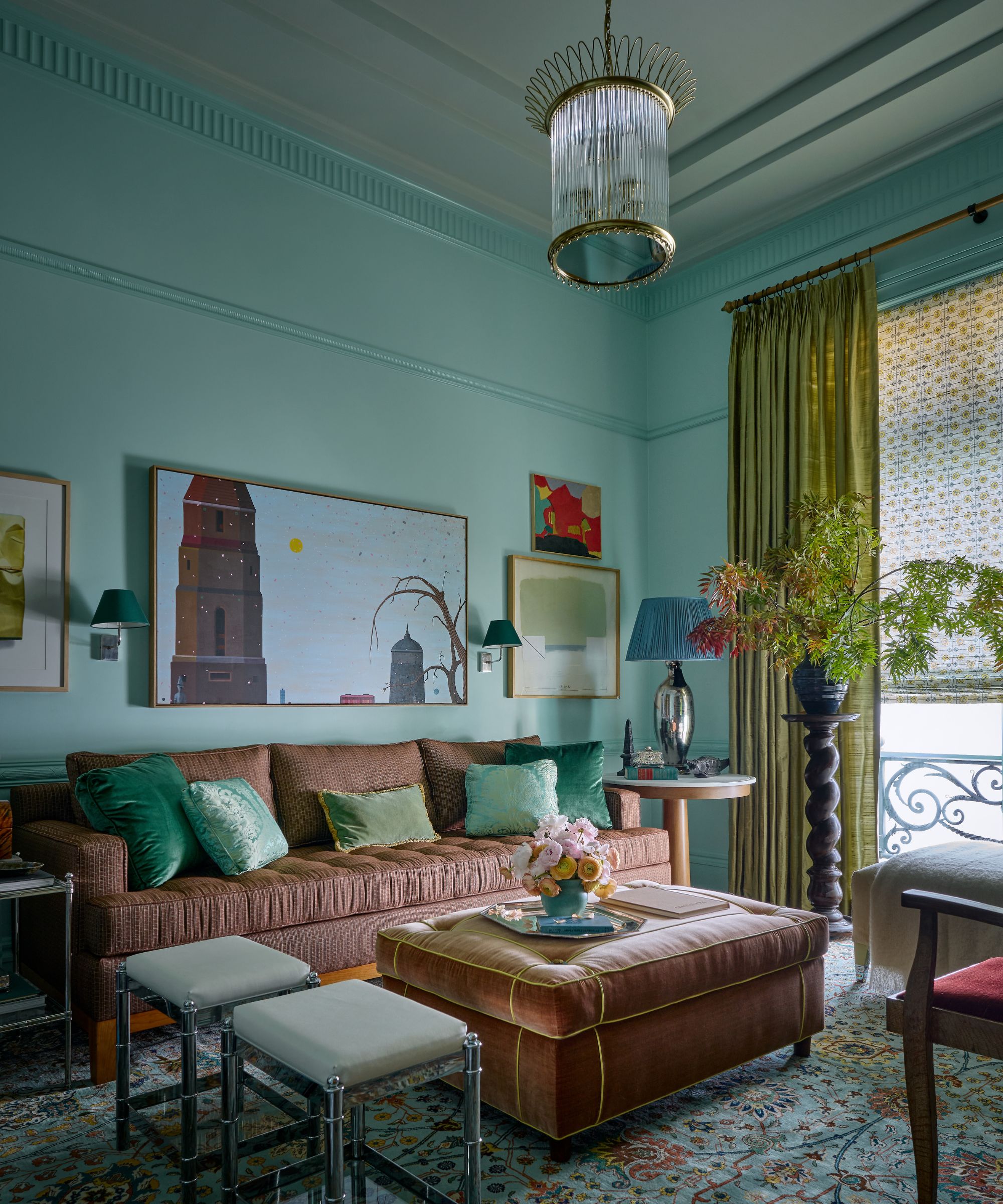
Color drenching has arguably been the biggest paint trend over the last few years. In rebellion against the controversial accent wall, color drenching provides a more modern, cohesive way of decorating with paint where the same shade is used all over a room. But as we look ahead to 2027, designers are taking the sentiment of this popular paint trend and adding more depth and movement by using a mix of tonal shades.
At first glance, you may think this living room is drenched in one color, but there are actually three different shades (and finishes) used. On the walls, Benjamin Moore's 'Robin's Nest' was used in an eggshell finish, 'Copper Patina' in a high-gloss finish on the molding and trim, and 'Par Four' in a flat finish on the ceiling.
'I wanted this room to feel completely immersive and transportive,' says designer Avery Cox, based in Austin. 'Drenching the room in these robin’s egg blues and pale gray greens helped to distort the experience of being in the space by altering the white balance completely and flooding the visual sense with color.'
'Color drenching shouldn't be interpreted literally,' she adds. 'Every room still needs some contrast, so choosing one color and finish for a room devoid of other elements may not give you what you’re looking for. Plan to use a few different finishes and tones near the original color to provide a bit of contrast. Adding structure to the room through applied molding or paint applied as architecture helps make the space feel more dynamic and layered.'
Looking for help choosing colors? Benjamin Moore's Classics fan deck allows you to compare similar shades, so you can see how they appear alongside each other before purchasing.
4. Colorful Joinery
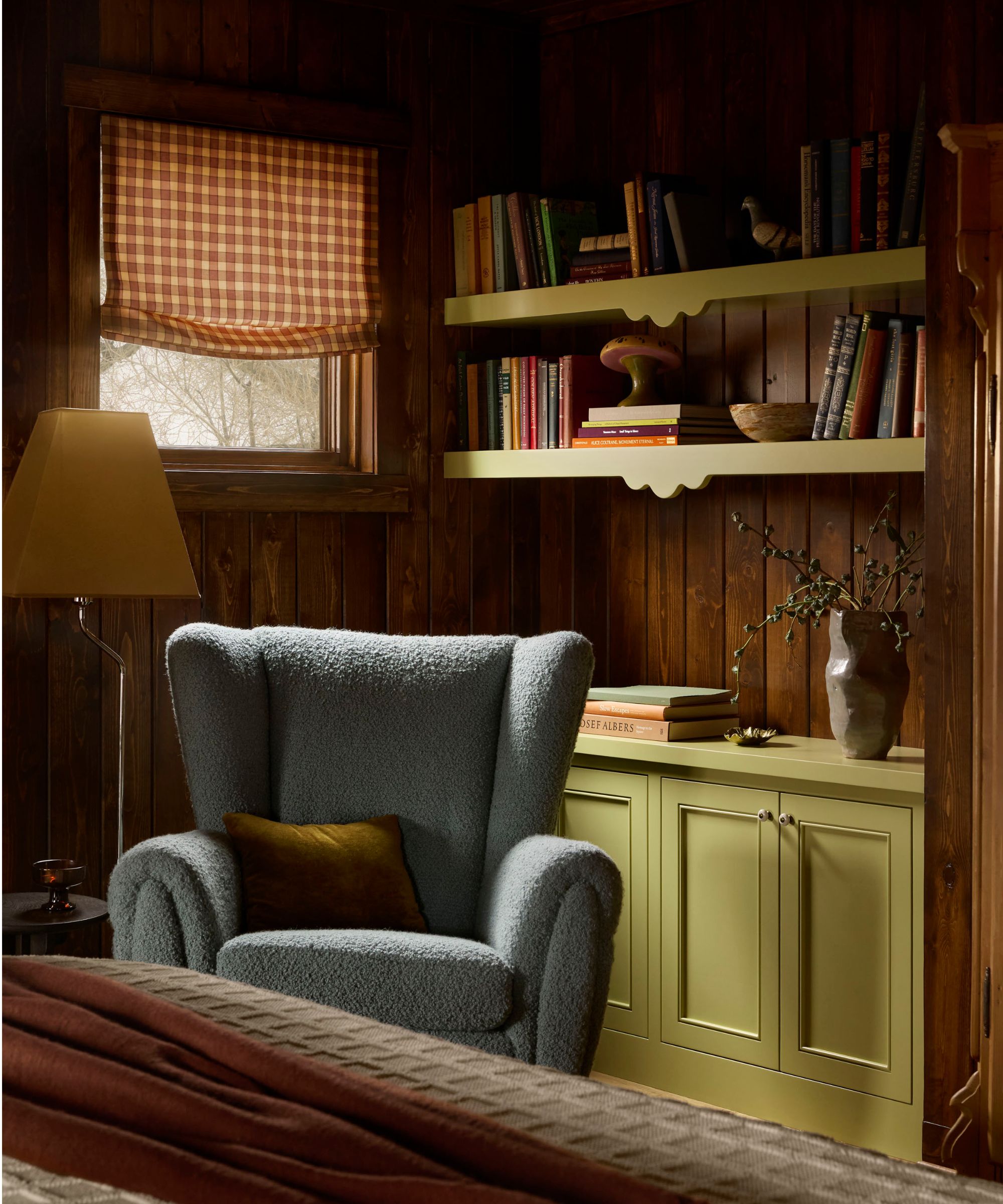
In the same spirit as a more colorful approach to trimwork, designers are making way for a new paint trend: colorful joinery. Rather than painting joinery, such as built-ins and shelving, the same color as the walls or defaulting to a neutral tone, a much more impactful look can be achieved with a pop of color.
In this case, the wood-clad walls meant that it wasn't about matching the joinery to the walls, but about giving them their own identity. The designer, Julia Miller of Yond Interiors, based in Minneapolis, chose Benjamin Moore's 'Henderson Buff', a soft yellow-green paint. 'We wanted the joinery to provide a little moment of contrast and playfulness against the dark wood,' she explains. 'The chartreuse also felt like a natural extension of the palette we had already established throughout the house. It brings some energy to the room without taking away from the warmth and character of the original paneling.'
'Adding color to the joinery can be a nice way to bring color into a room without covering up other materials that you want to celebrate,' Julia adds. 'In this cabin, we wanted to keep all of that beautiful dark paneling, so the painted built-ins gave us an opportunity to layer in another color and create some contrast.'
When painting woodwork such as built-ins, don't skip the primer, which can help achieve a more seamless finish. Benjamin Moore's Fresh Start Primer is designed for use on interior wood.
5. Hand-Painted Botanical Motifs
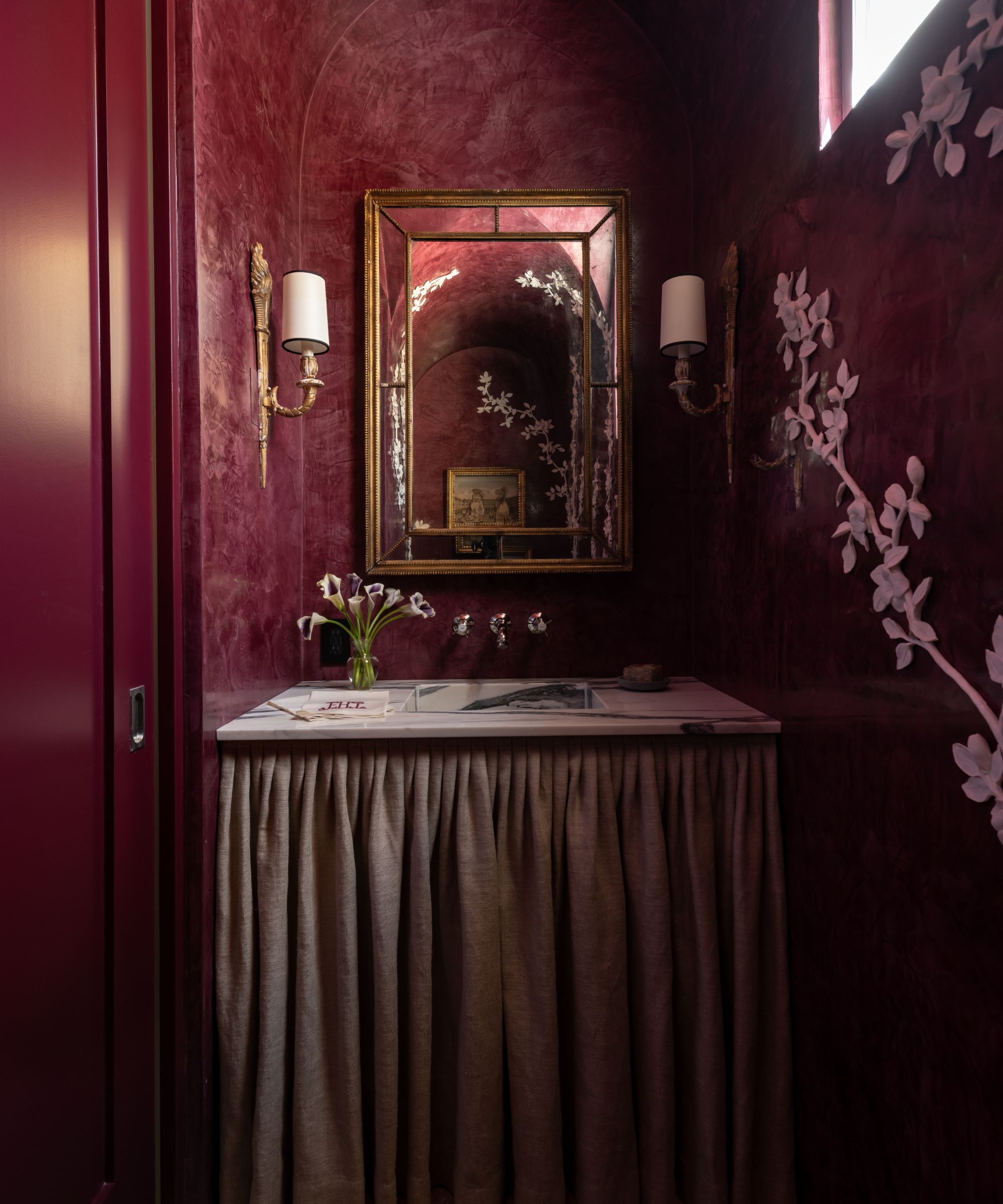
As interior design trends continue to favor decor ideas that feel truly personal, it makes sense that this is extending to paint trends. In this powder room, the burgundy color scheme gives the room a moody, sophisticated feel, but it's the hand-painted flowers that give it its personality.
'The walls are Venetian plaster by Segreto matched to our trim color,' explains designer Lindsey Herod, who is based in Houston. 'Then, Segreto hand-applied white plaster flowers on top of the Venetian plaster.'
Rather than being a random design choice, the floral motif nods to the homeowners' interests. 'Since our client loves gardening and the landscape designer planned a vine to grow up the stucco exterior just outside this window, bringing that botanical vining motif inside with these handmade chalky white plaster flowers, leaves, and vines felt appropriate as a reference to the outdoor spaces,' Lindsey explains. 'These elements juxtapose the shiny, varied texture of the Venetian plaster walls.'
'Think about the elements or motifs that bring you joy and find ways to bring them into your home,' she advises.
6. Lifting Neutral Rooms with Pockets of Color
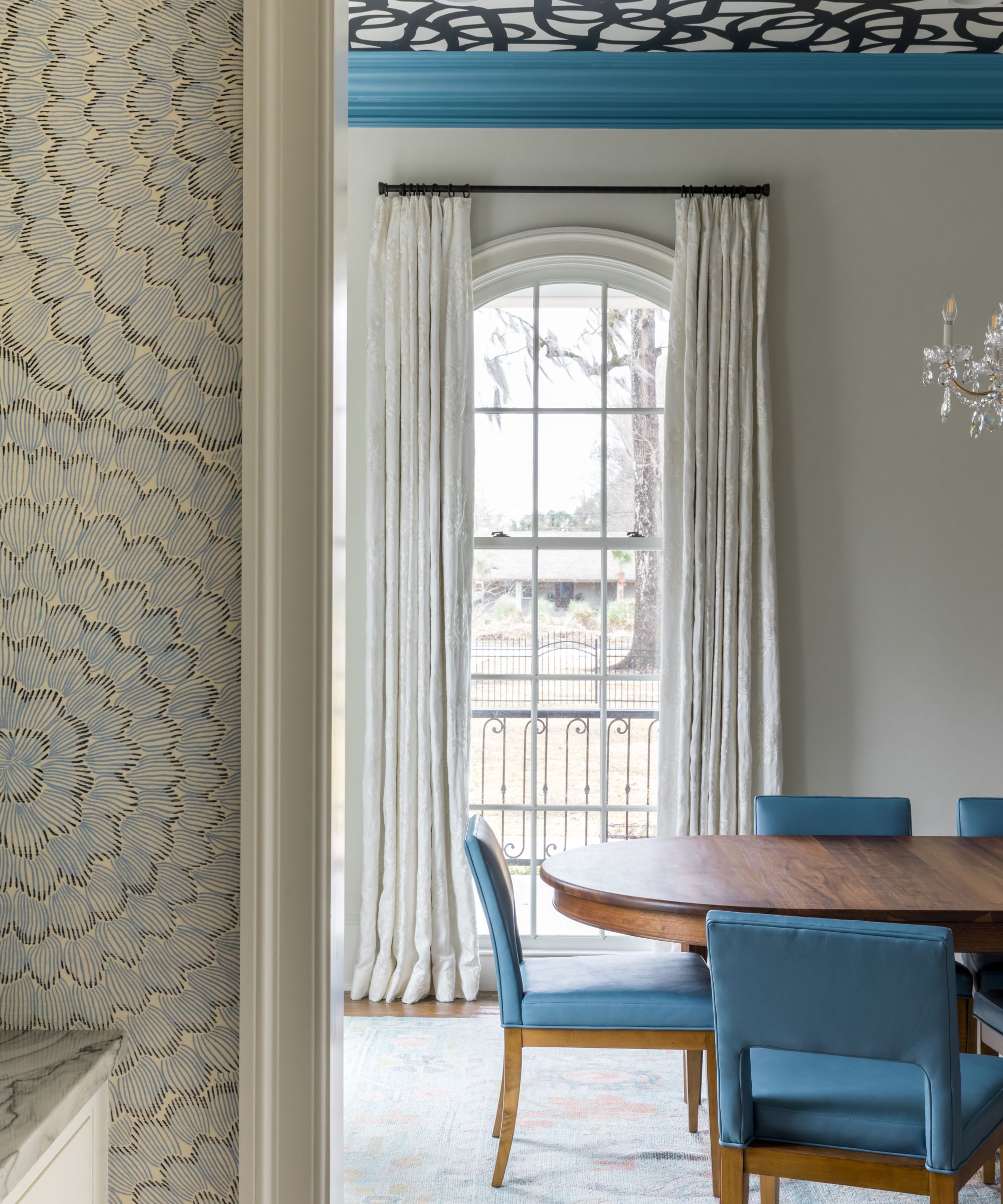
Using paint in an interesting way doesn't mean that the whole room needs to be colorful. As decorating with neutrals continues to evolve – moving away from all-white schemes to those with more contrast and interest – we're seeing designers use touches of colorful paint in the most pared-back schemes.
This can be an especially effective paint idea in large spaces that need some definition, suggests Louisiana designer Anne Underwood. 'The ceilings are tall in this dining room, and the blue-painted trim raises the eye to focus on what’s above – an energetically artful ceiling,' she says. 'It really puts an exclamation point on the thick-profile wood trim that might otherwise go unnoticed. Here, the trim is the focal point, creating a “frame” around the wallpapered ceiling.' Using an angled paintbrush can help you achieve a neat finish when painting architectural details like this.
'Keeping the rest of the room simple with strategically placed boldness feels crisp and fresh,' Anne says. 'While there are traditional furnishings in the room, the bold blue trim elevates the space in an unexpected, modern way.'
'If a homeowner is timid about using bold color or wants an easy way to inject some energy into a room, painting the trim is a great first step,' she adds. 'You can go bold because it’s a small part of the overall room and not a huge commitment. It will also aid in moving your eyes around the room.'
7. Colorfully-Painted Ceilings
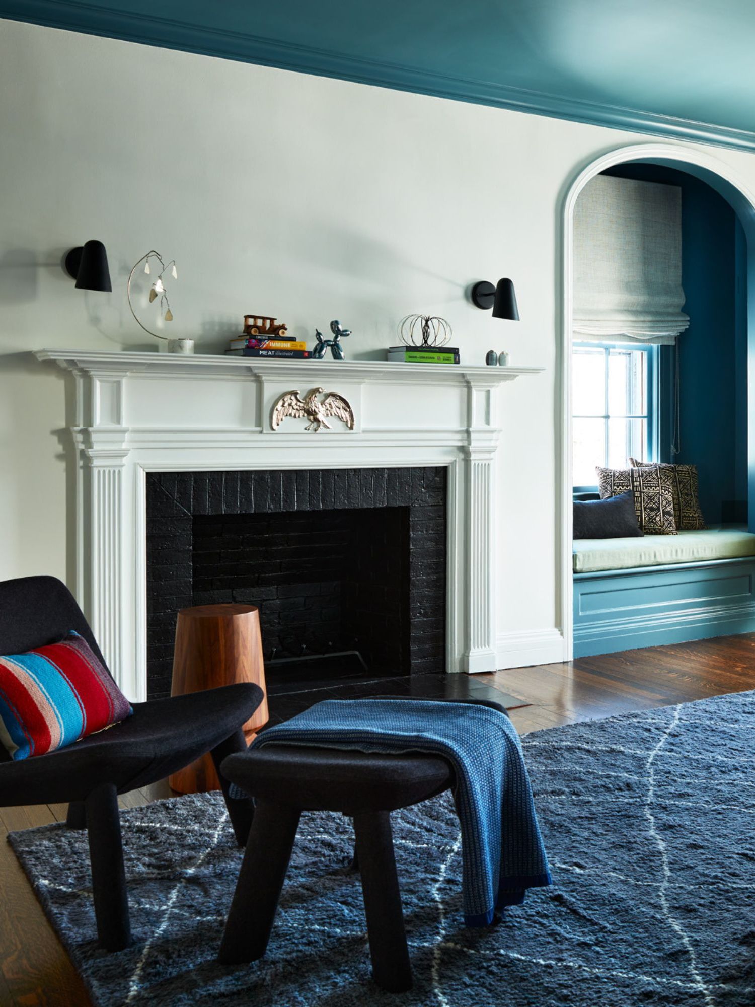
Ceiling paint ideas have been quietly emerging as a fun way to decorate with paint in recent years, but as we near 2027, expect to see rich and bold shades used on the fifth wall to add real depth and an immersive feel.
While soft, tonal colors are no doubt stylish when applied to the ceiling, using much bolder colors makes a statement and delivers impact. When paired with lighter walls, the look is easy to live with. 'When the room is white, you can get away with using almost any color, and it will still look classy,' says Boston-based designer Sarah Scales, who used Benjamin Moore's 'Bermuda Turquoise' on the ceiling. 'It brings a type of energy,' she adds.
When choosing the best bold paint shades for ceilings, it's all about the rest of the color scheme and the mood you want to create. 'Go for an off-kilter color,' Sarah advises. This teal paint is 'not a navy as one might use in a historic home,' according to Sarah, but 'it brings a certain energy to a kid’s bedroom.'
Shades such as Farrow & Ball's 'Vardo', a deep teal, would achieve a similar atmospheric look, but you could also explore warm paint shades such as Benjamin Moore's 'Garrison Red' to create a cozy and cocooning space. Once you've chosen your paint color, this Paint Roller Kit with Extension Pole can help you reach the ceiling.
The theme uniting the biggest paint trends for 2027 is a focus on creating interiors that feel dynamic, layered, and personal. Rather than using color sparingly or as an afterthought, it is being used boldly to set the whole mood of a room.
While new ways of color drenching set a truly atmospheric feel, creatively applying color to smaller architectural details or joinery can be just as impactful, especially if you're new to decorating with bold color.
Love beautiful design ideas, expert advice, and inspiring decor trends? Sign up for our newsletter and get the latest features delivered straight to your inbox.