There is a common assumption that transforming a home means changing its architecture. But when interior designer and architect Natalia Miyar first encountered this family home in Coral Gables, Florida, the bones were precisely what she wanted to keep.
The setting was familiar territory for Natalia, whose eponymous atelier has offices in London and Coral Gables. She has lived in Miami for more than 40 years and completed her master’s in architecture there, spending her student years studying and drawing historic houses like this one.
Set within Coral Gables’ French City Village, the house had already undergone several renovations, but its proportions and architecture remained beautifully intact. ‘My role wasn’t to redesign the architecture, but to reveal it,’ Natalia explains. ‘I wanted to bring warmth back into the house through color, texture, craftsmanship, art and carefully chosen objects.’
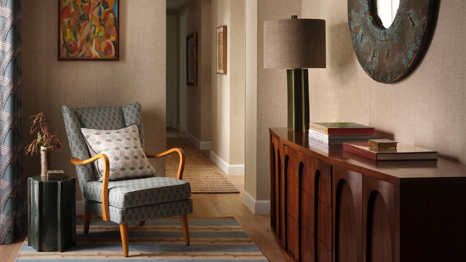
That familiarity with Coral Gables became fundamental to the redesign. Rather than applying a generalized idea of Floridian style, Natalia looked to the colors, textures, and materials she had known for decades, allowing the house and its surroundings to inform everything from grasscloth and raffia to saturated blues, leafy greens, and earthy terracotta.
The setting provided Natalia with her starting point. Coral Gables was developed in the 1920s as one of America’s early planned communities, with its original ‘villages’ drawing on different European and Mediterranean architectural traditions. French City Village, where this house sits, takes its cues from formal French architecture, characterized by symmetrical facades, stucco, and wrought-iron details.
Rather than imposing an entirely new decorative language on the building, she allowed its architecture to provide a framework for rooms that could comfortably belong to both the house and the contemporary family living in it.
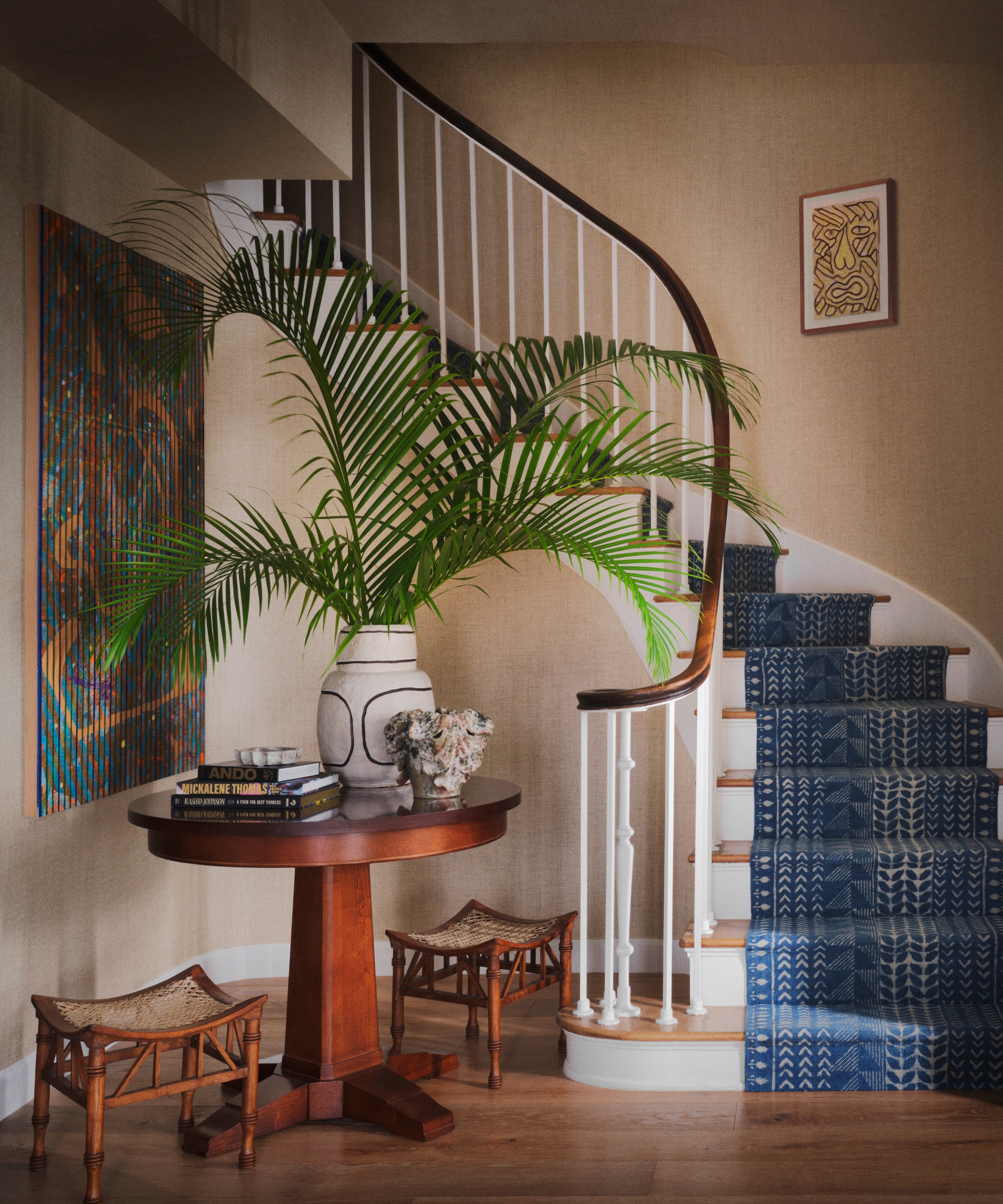
That balance is apparent from the entrance, where vintage furniture sits against subtly textured Phillip Jeffries wallpaper. A Swedish armchair upholstered in blue-patterned fabric is a nod to the owners’ Scandinavian heritage, while an antique table, vintage stools, and ceramics begin the sense of gradual accumulation that runs throughout the home. Even the blue stair runner was custom-designed by Natalia.
Design expertise in your inbox – from inspiring decorating ideas and beautiful celebrity homes to practical gardening advice and shopping round-ups.
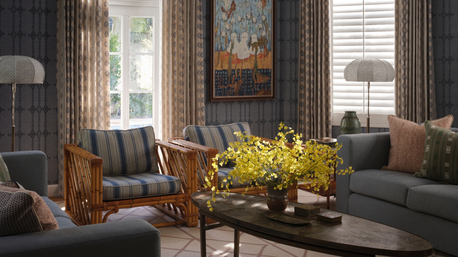
The living room was where the home’s distinctive color story really began. Natalia chose Peter Dunham’s ‘Berber Sky’ printed grasscloth in Indigo, covering the walls in richly textured blue. ‘I had been encouraging the clients to embrace wallpaper for years, and when I showed them this one, they loved it,’ she says. ‘It gave us the confidence to really commit to color and pattern throughout the house.’
Rather than introducing a rainbow of contrasting shades, Natalia prefers to explore variations within the same color family. ‘I would much rather explore twenty different shades of blue, for example, and then create variation through texture, pattern and material.’
Here, blue-gray sofas, striped vintage armchairs and patterned cushions pick up different tones from the walls, while bamboo, timber and linen prevent the palette from feeling overly coordinated. A sculptural vintage Philip and Kelvin LaVerne coffee table brings another layer of history and craftsmanship.
It is a useful approach for anyone nervous about decorating with stronger color. Saturation doesn’t necessarily create visual noise. Restricting the palette can actually give you greater freedom to layer pattern.
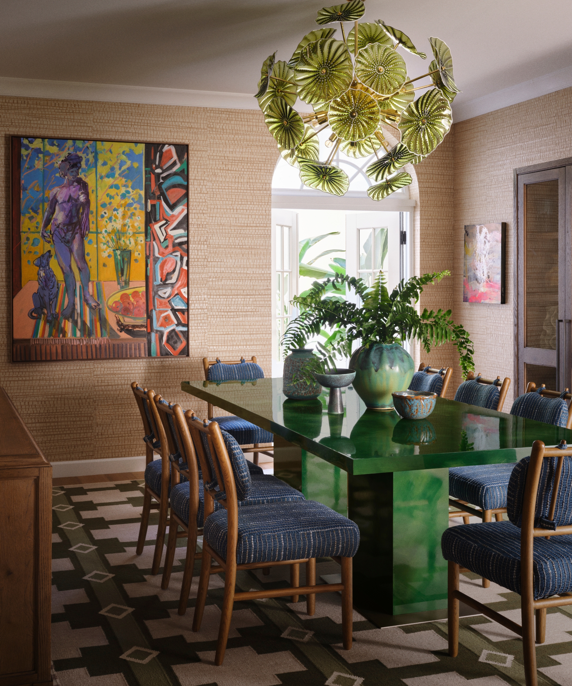
The adjoining dining room turns up the contrast. Honey-colored jute walls provide a warm, tactile setting for Natalia’s custom dining table, finished in glossy malachite green. Overhead, a vintage Murano glass chandelier introduces another variation of green, while blue upholstered dining chairs and a bold Deborah Brown painting bring still more vibrancy into the space.
Yet Natalia was careful that the table didn't become the room’s solitary ‘wow’ moment. ‘The art, lighting, wall color and other objects in the room all have enough presence to hold their own, so nothing feels as though it is shouting for attention,’ she explains. ‘For me, successful interiors are always about creating conversations between objects rather than relying on one statement piece.’
That philosophy extends to the home’s vintage furniture and accessories. Natalia spent months sourcing pieces from galleries, antique markets and local dealers, including the dining room’s drinks trolley and ceramics. ‘I never want a house to feel as though everything arrived on the same day,’ she says.
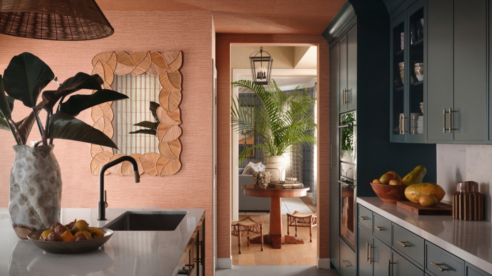
In the kitchen, deep green cabinetry is set against warm terracotta walls, but the palette wasn’t chosen simply because it reads as tropical. The wall color was inspired by a long terracotta wall in nearby Coconut Grove that Natalia has admired for years. ‘That particular shade has always felt very evocative of Miami to me,’ she says.
The combination is brought to life through material as much as color: Arte’s ‘Koumbala’ textured wallcovering, woven pendants and vintage objects sit alongside cabinetry painted in Benjamin Moore’s ‘Salamander’.
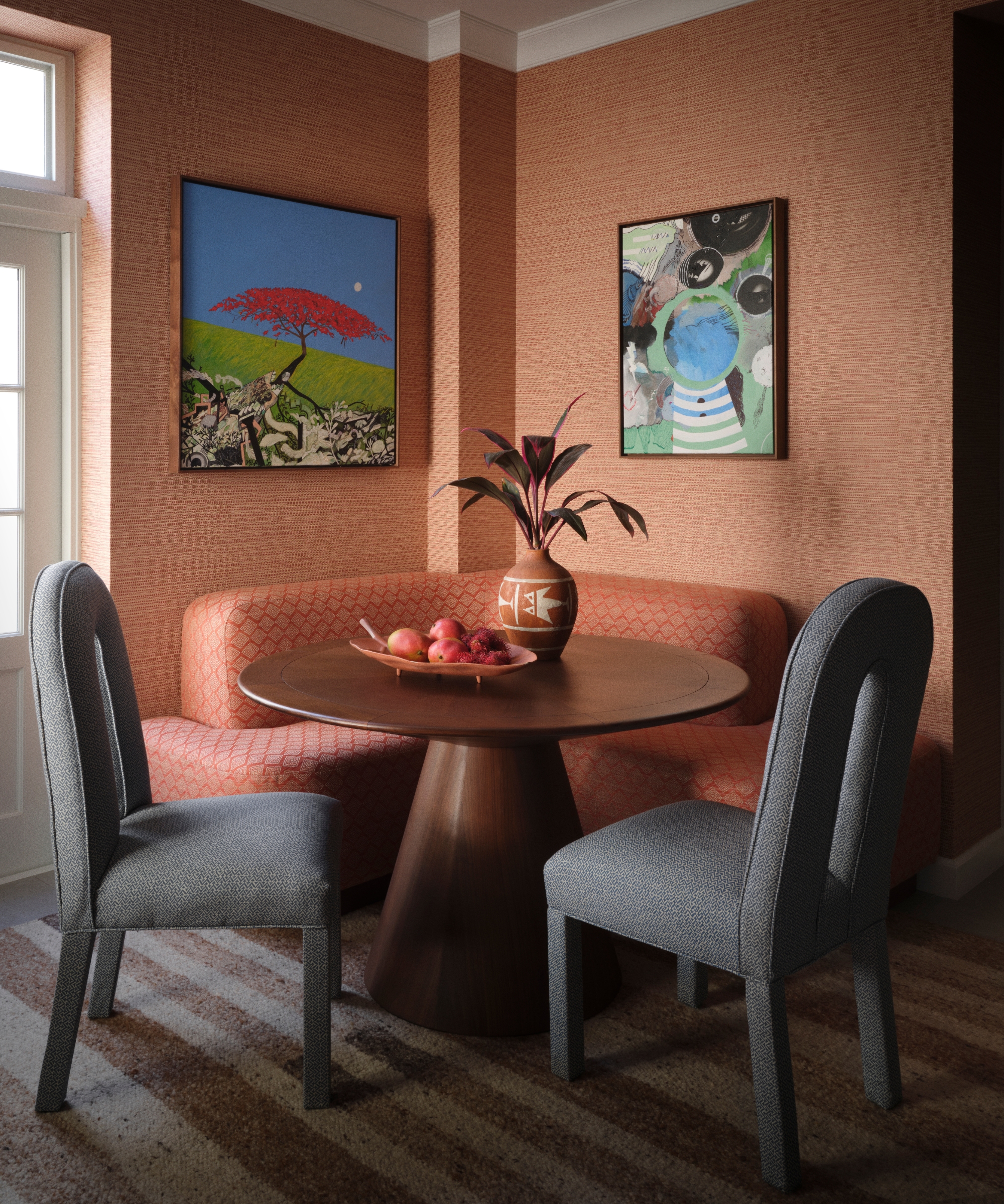
A breakfast nook creates an intimate counterpoint to the formal dining room. Patterned upholstery and vintage chairs make it feel deliberately distinct from the working part of the kitchen. ‘The main dining room is designed for gathering and entertaining, whereas the breakfast nook supports those smaller rituals of everyday family life,’ Natalia explains.
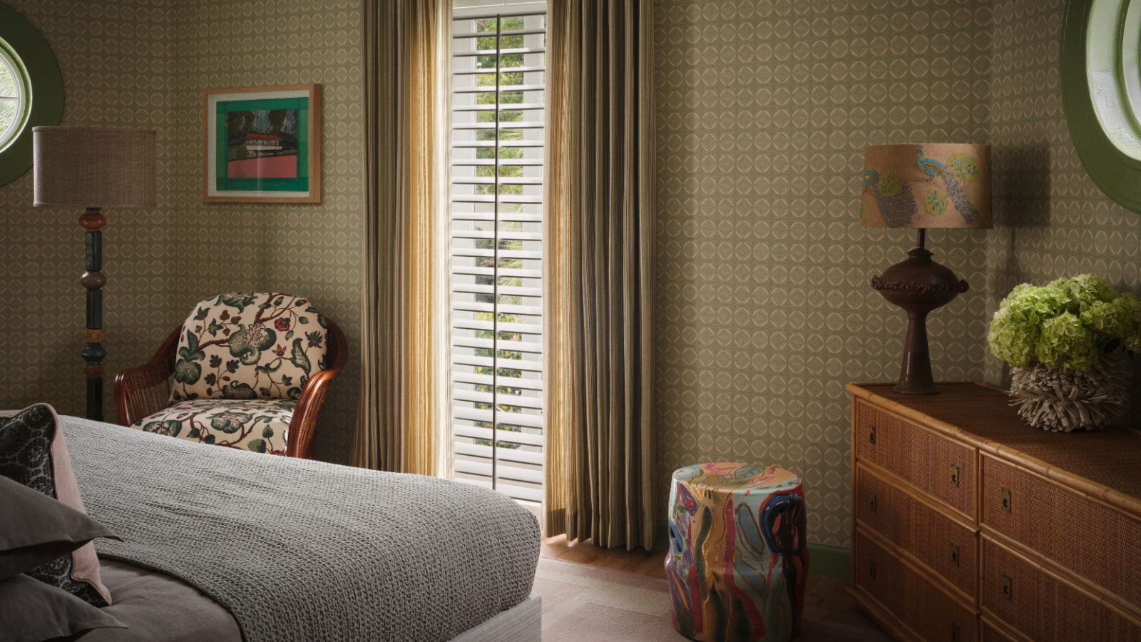
Upstairs, the same approach becomes softer but no less layered. The primary bedroom combines pale green patterned wallpaper with striped curtains, a blue vintage armchair, and warm timber furniture, while its dressing area deepens the palette with blue-green joinery and woven textures.
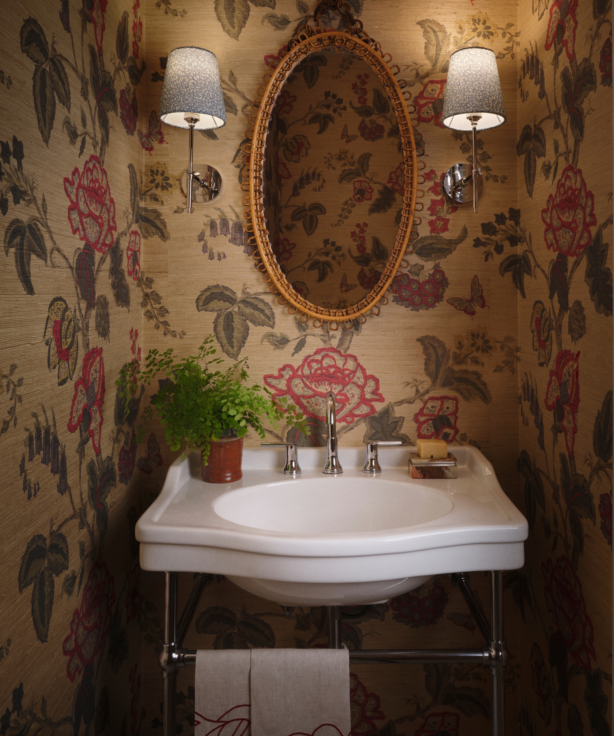
Pattern is particularly effective in the smaller spaces. A bathroom is completely enveloped in Peter Fasano’s ‘Chatsworth’ botanical grasscloth, creating a jewel-box moment around an otherwise simple white basin and vintage mirror. ‘Smaller rooms give you permission to be more immersive,’ says Natalia. ‘I love the idea of opening a door and discovering a completely different atmosphere.’
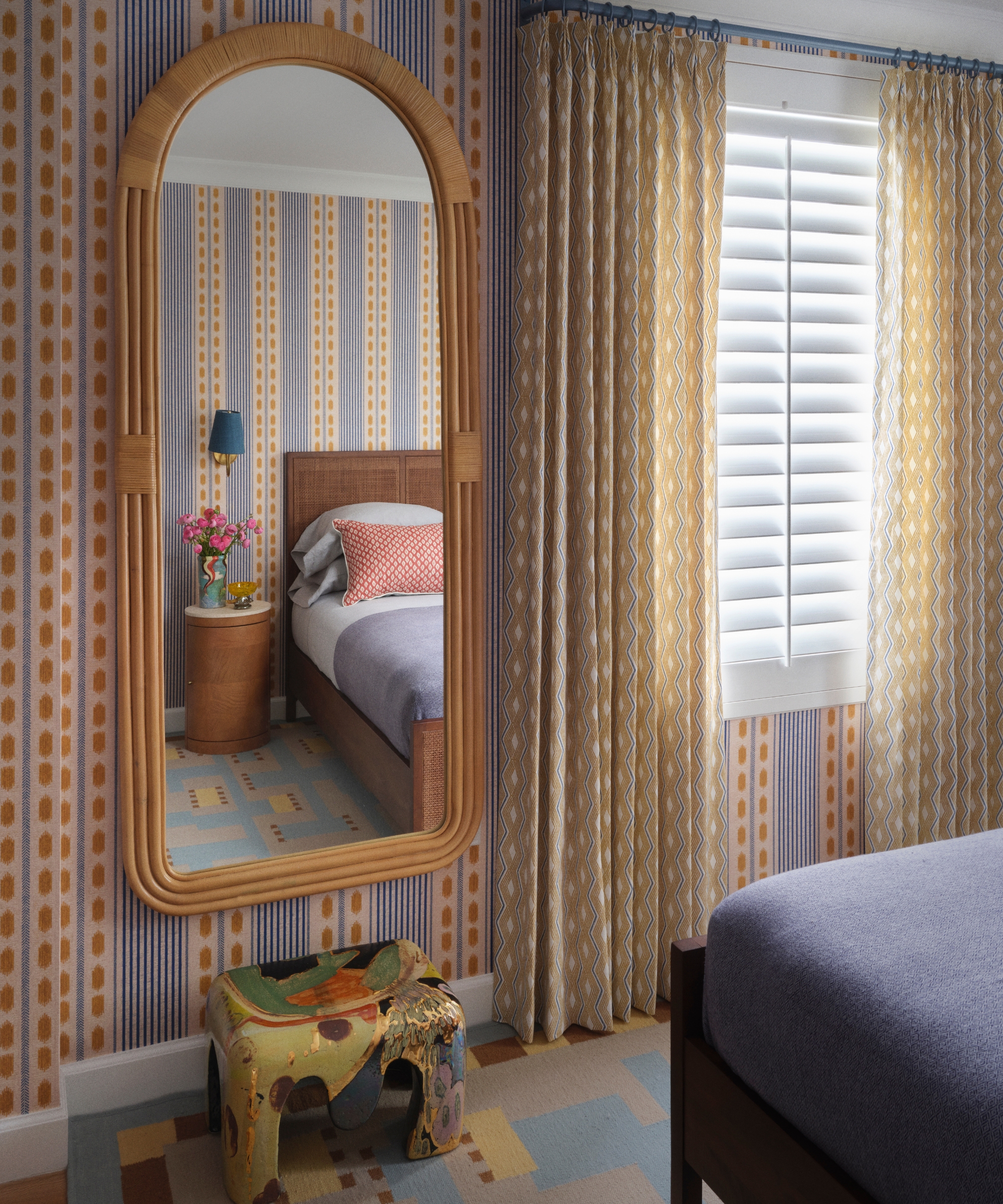
The guest bedroom shifts into a warmer register, with Mind The Gap’s ‘Mouassine’ striped wallpaper in Turmeric setting ochre, terracotta and powder blue in conversation. Jane Churchill curtains continue the golden tones, while a custom rug introduces cooler blue underfoot, and vintage furniture keeps the mix from feeling overly coordinated. It’s a neat illustration of Natalia’s approach to color families: shades don’t need to match exactly to belong together.
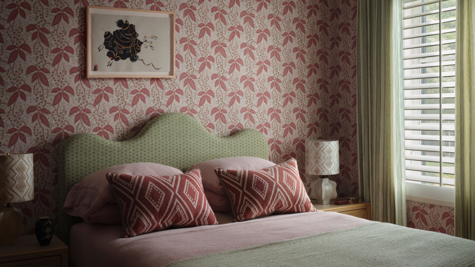
There is a similar confidence in the daughter’s bedroom, where a bespoke scalloped headboard in green sits against a pink-and-green botanical wallpaper. Rather than making the room overtly youthful, Natalia designed the headboard as a piece that can remain while the layers around it change as the child grows.
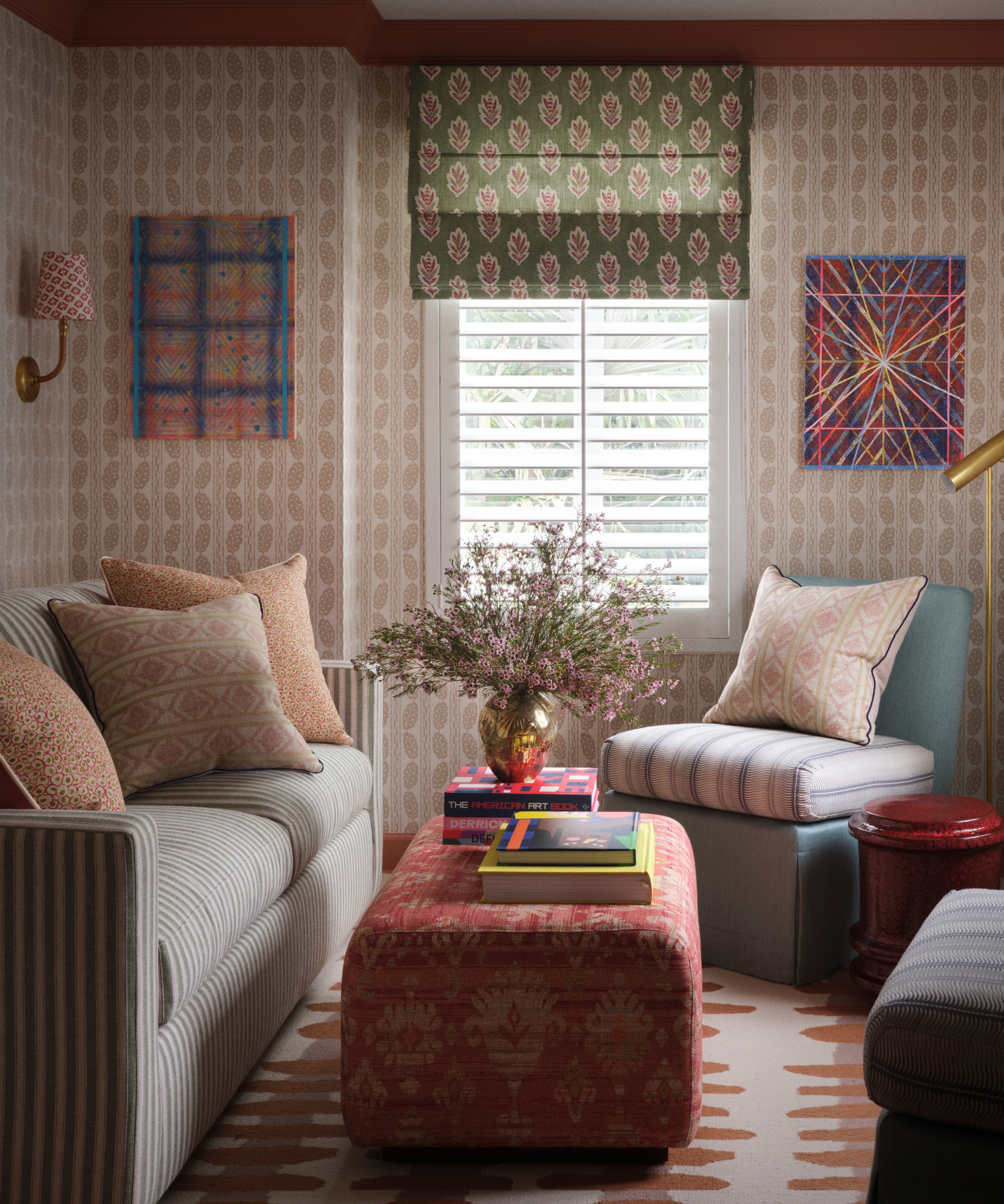
The same layering continues in the study, albeit at a gentler volume. George Spencer Designs’ ‘Berwick’ buff-toned wallpaper creates a textural base for moss-green seating and a forest-green botanical blind, while a russet-red ottoman introduces just enough contrast. It’s another example of Natalia’s preference for building depth within a controlled palette rather than introducing color for color’s sake.
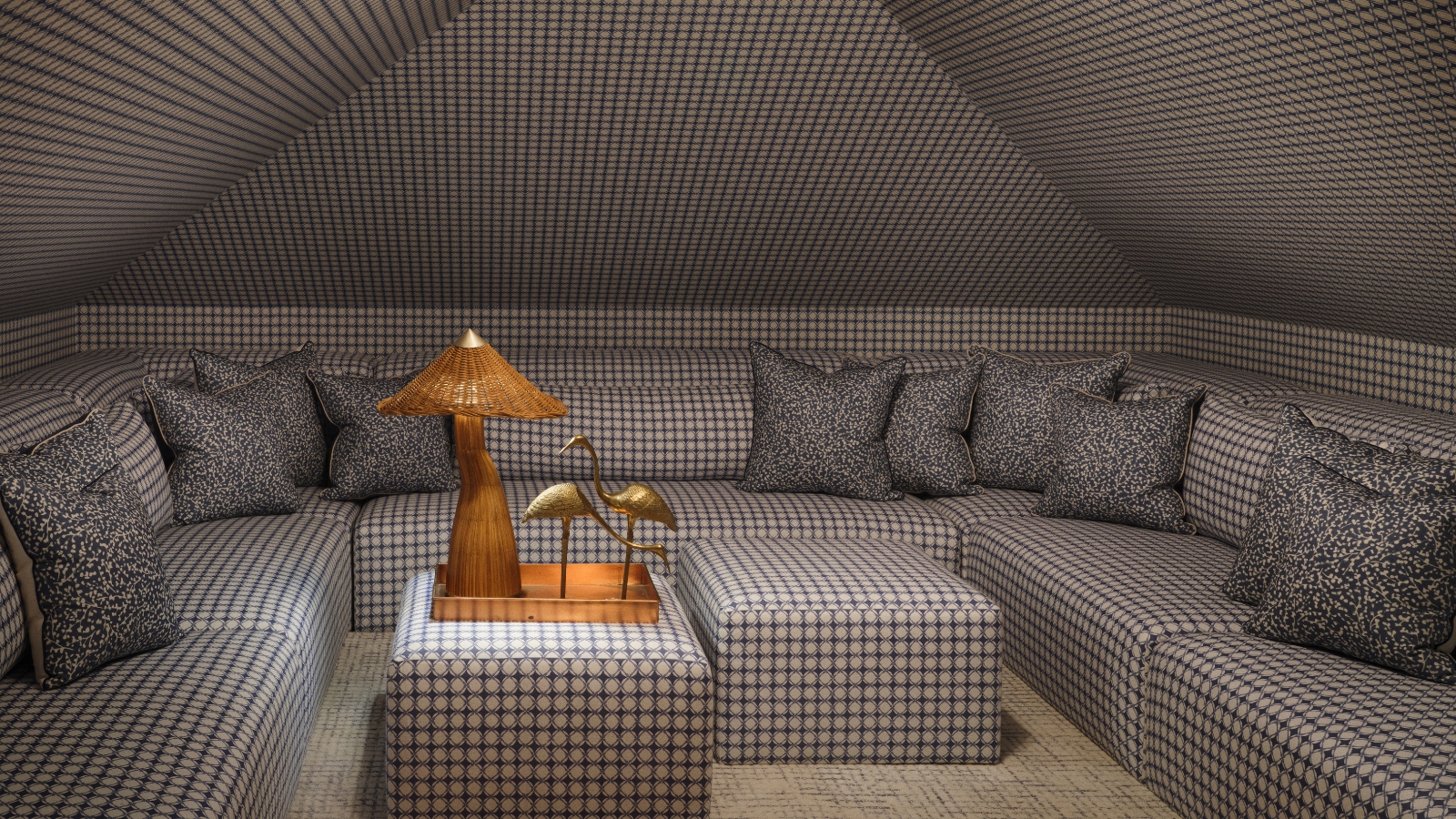
The home’s boldest decorating move is saved for the attic media room. Faced with its steeply pitched ceiling and awkward roofline, Natalia designed a sprawling modular sofa specifically for the space, maximizing seating where conventional furniture would have struggled.
Then she covered almost everything in the same tiny blue check. Stroheim’s ‘Lettie’ in Sapphire runs across the custom sofa, ottomans and cushions before continuing onto the walls and sloping ceiling.
Counterintuitively, the repetition makes the unusually shaped room feel calmer. ‘Your eye isn’t constantly moving between competing elements,’ Natalia explains. ‘I wanted it to feel like somewhere you immediately wanted to settle into and relax.’ It is perhaps the clearest expression of her approach to the whole house: richness doesn’t have to mean chaos, just as restraint doesn’t have to mean white walls.
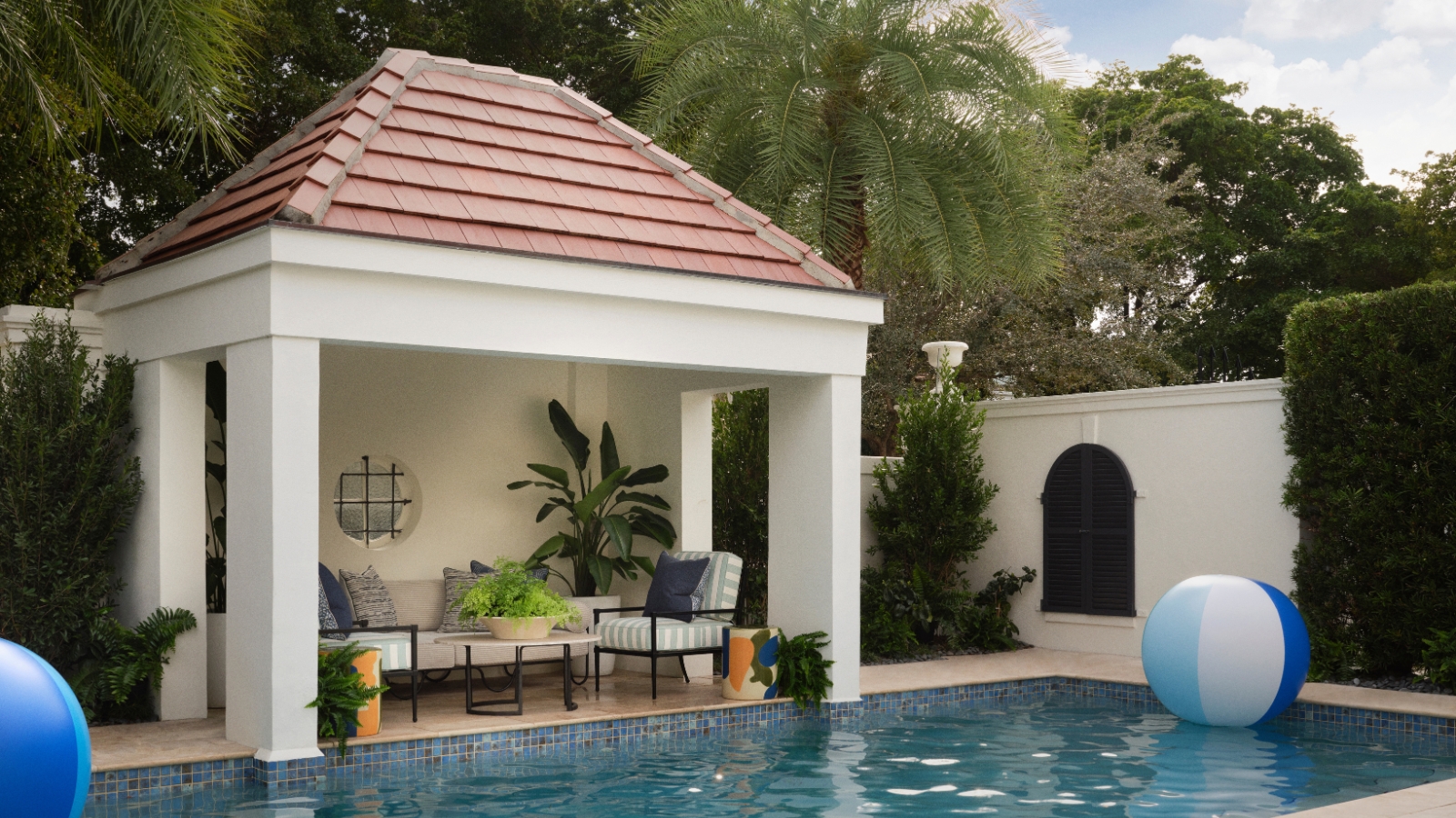
Beside the pool, a small open-sided gazebo effectively becomes another room, furnished with a striped outdoor sofa, aqua-upholstered armchairs and a vintage coffee table. The blues, natural textures and mix of old and new deliberately echo the interiors, making the transition outside feel evolutionary rather than abrupt.
For Natalia, creating a soulful interior is ultimately about making a home appear to have developed naturally rather than been decorated in a single moment. ‘I don’t see art or styling as something you add at the end,’ she says. ‘I begin thinking about those elements from the earliest stages because they influence the atmosphere of a room as much as the architecture or furniture.’
By allowing the existing architecture, Miami landscape, the family’s heritage and an eclectic collection of art and vintage finds to coexist, this house now has precisely what its earlier renovations had erased: a personality of its own.
Love beautiful design ideas, expert advice, and inspiring decor trends? Sign up for our newsletter and get the latest features delivered straight to your inbox.