The past year has been one of the most exciting for kitchens, especially when it comes to color. Rich, moody hues from burgundy to chocolate brown, and various wood tones have dominated, encouraging homeowners to be a little more experimental rather than playing it safe. But designers say it's time to start looking at new colors, and there are a few they are secretly wishing their clients would go for more often.
It's not because these kitchen colors are going out of style, but there's definitely space in designs right now for less expected palettes that feel unique and unexpected. It could be switching out rich browns for lighter tones, or replacing colors we have already seen a lot of with muddier, earthier versions. These are the seven shades they're placing under the spotlight, and how to bring them into your kitchen tastefully and timelessly.
1. Muddier Shades of Yellow
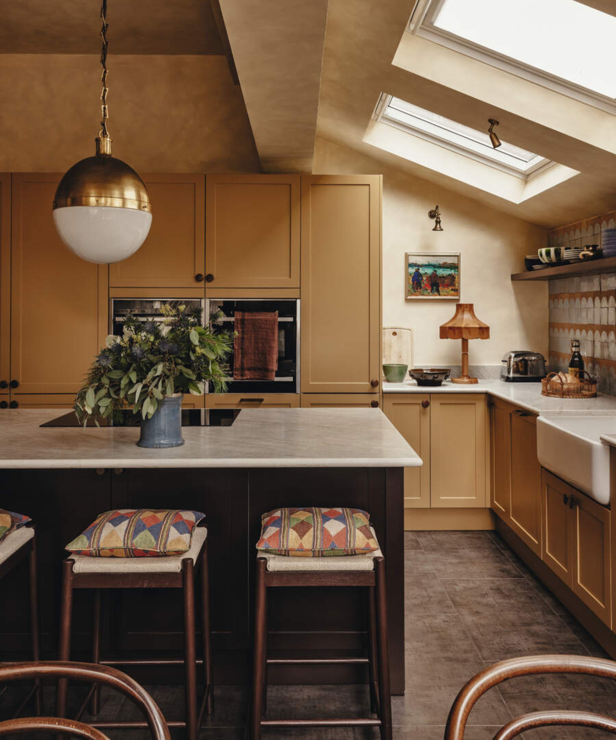
Butter yellow kitchens have made a mark on the design world this year. Soft, light, and utterly charming, it's a color that brings unexpected softness to a hardworking cooking space. But it's not the only shade that brings warmth to kitchens – and designers say it's time to start looking to muddier yellows.
'I’d love to see more of a faded straw or parchment yellow in kitchens. It’s a very gentle, almost aged-looking color that brings wonderful warmth to a space without dominating it. I’m always interested in colors with a little complexity, rather than feeling too clean or predictable. This kind of muted, earthy yellow has a quiet character to it and can work beautifully in both contemporary and more traditional spaces, bringing warmth and personality without feeling overly bold,' explains interior designer Laura Stephens.
Following that aged, earthy style, several designers are also wishing for more ochre color schemes in 2027. 'I love a yellow with some dirt in it. Out here in the desert, the landscape is all dusty ochres, weathered browns and sun-faded earth, and golden ochre has that same quality: the warmth of yellow without the sunshiny Brady Bunch hyper-cheerfulness. It feels familiar without looking like a period reproduction, and I’d love to see more people take a chance on it,' explains John Maloney McNamara of Coosa.
'I would love to see more kitchens embracing yellow-based browns – those wonderful earthy shades somewhere between cinnamon, caramel and ochre,' agrees Melissa Hutley, Co-Founder of Hutley & Humm. 'They are often overlooked in favor of safer neutrals or more familiar greens, but they have such warmth and depth. They feel grounded and timeless, but can also be surprisingly fresh when paired with the right materials. We used a rich caramel shade (Caddie) in a recent project, and it completely transformed what could otherwise have been a purely functional space into somewhere with real character.'
Decorating with muddier yellows proves incredibly versatile. For something classic, ochre cabinets with warm white walls feel elegant and inviting, while a space color-drenched in a muddier tone creates a bold, playful scheme without ever feeling trend-led. It's also a color palette you can introduce through textiles, like a kitchen towel, rug, or even upholstered seating.
From design inspiration and expert advice to the latest products and effortless hosting ideas, CUCINA from Homes & Gardens brings you everything to create a space that’s as functional as it as beautiful.
2. More Complex Blues

While blue kitchens have been popular this year, designs have been embracing moodier, inkier shades. They might work beautifully in many spaces, but designers are ready for brighter, lighter tones to make a comeback in kitchens.
'I love sky blue,' says interior designer Lizzie Green, who is keen to see this shade grow in popularity again. 'I feel like trends pull people into the safer navy territory, and there are so many incredible, braver blue shades that still give that feeling of serenity and calm.'
And even if sky blue feels a bit bold for your style, dustier blues are an alternative that still feels a little lighter, but with a more muted finish. 'For the more traditionalist, we would love to see more dusty blue or chambray colored kitchens. The southern hospitality that just spills from a soft blue kitchen is unmatched. It’s welcoming, cheerful, and pairs well with a light, bright home. We would drench the cabinets in the color since it is natural-adjacent; the more, the merrier,' says Sarah Fontanez of Pomme House.
'I’d love to see more of a dusty, slightly faded blue-gray in kitchens. Blue is a familiar choice, but I think we often gravitate towards either very pale blues or much stronger navy shades,' agrees Laura. 'A softer, more muted blue has a lovely depth to it and feels a little less expected. It can be calming without feeling cold, particularly when you bring in warmer tones and plenty of texture.'
If filling your kitchen with blue feels a little bold or overwhelming, smaller infusions feel just as stylish. 'I would use it on kitchen cabinetry, perhaps pairing it with warm off-white walls, natural timber and stone to stop the overall scheme feeling too cool,' says Laura. 'I also love the idea of bringing in small touches of a contrasting color through fabrics, artwork or a patterned blind, so the blue becomes part of a wider palette rather than the only point of interest.'
3. Rusty Reds
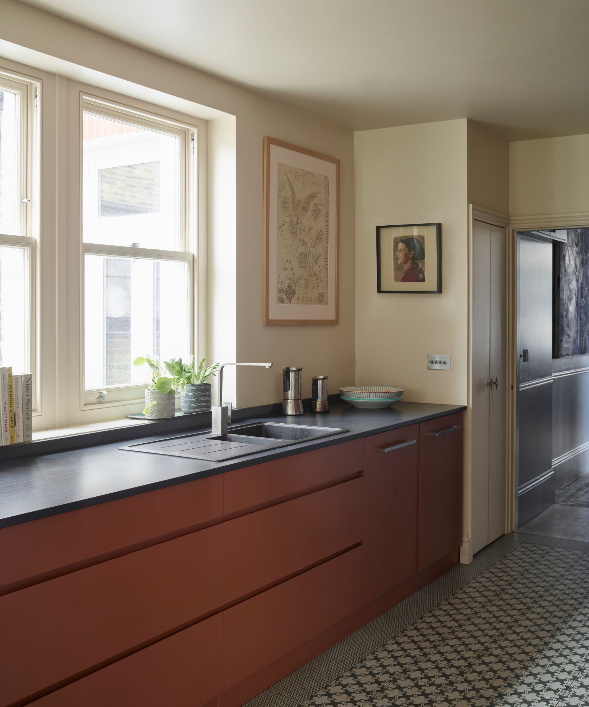
Burgundy and oxblood are perhaps the most coveted kitchen color trends of the past year, and show no signs of falling out of favor. While there's still a place for these richer, moodier tones, designers are ready for a greater variety of reds to be used in designs, particularly rustier reds with a bit of age to them.
'I’d love to see more kitchens using a muted, rust-red brown – something closer to the color of oxidized iron than a traditional red. It has warmth and depth, but feels more unusual and nuanced than the burgundies and deeper reds we’ve seen a lot of recently,' says Sophie Pringle, Founder of Pringle & Pringle.
'It’s a sophisticated color because it has an earthy quality that sits naturally alongside timber, stone and aged metal. I think people can sometimes be hesitant about using red in a kitchen, but when you move away from anything too bright and choose a more complex, brown-based shade, it can feel surprisingly timeless.'
It's the sort of color that adds a charming warmth when introduced in smaller doses, or creates a bold and beautiful scheme when used more confidently. 'I’d consider using it on an island or lower cabinetry, perhaps against softer, chalky walls and a natural stone countertop. It would also be beautiful alongside a characterful timber, particularly one with a darker or more expressive grain, with aged brass or bronze hardware to bring out its warmth,' Sophie adds.
'I’d be careful not to make everything too coordinated; the color is most interesting when it sits alongside materials with their own character and variation. For a more confident scheme, you could carry it onto the walls or pantry joinery, but I’d always consider the light in the room and the surrounding finishes before deciding how much to use.'
4. Olive-Toned Wood Stains
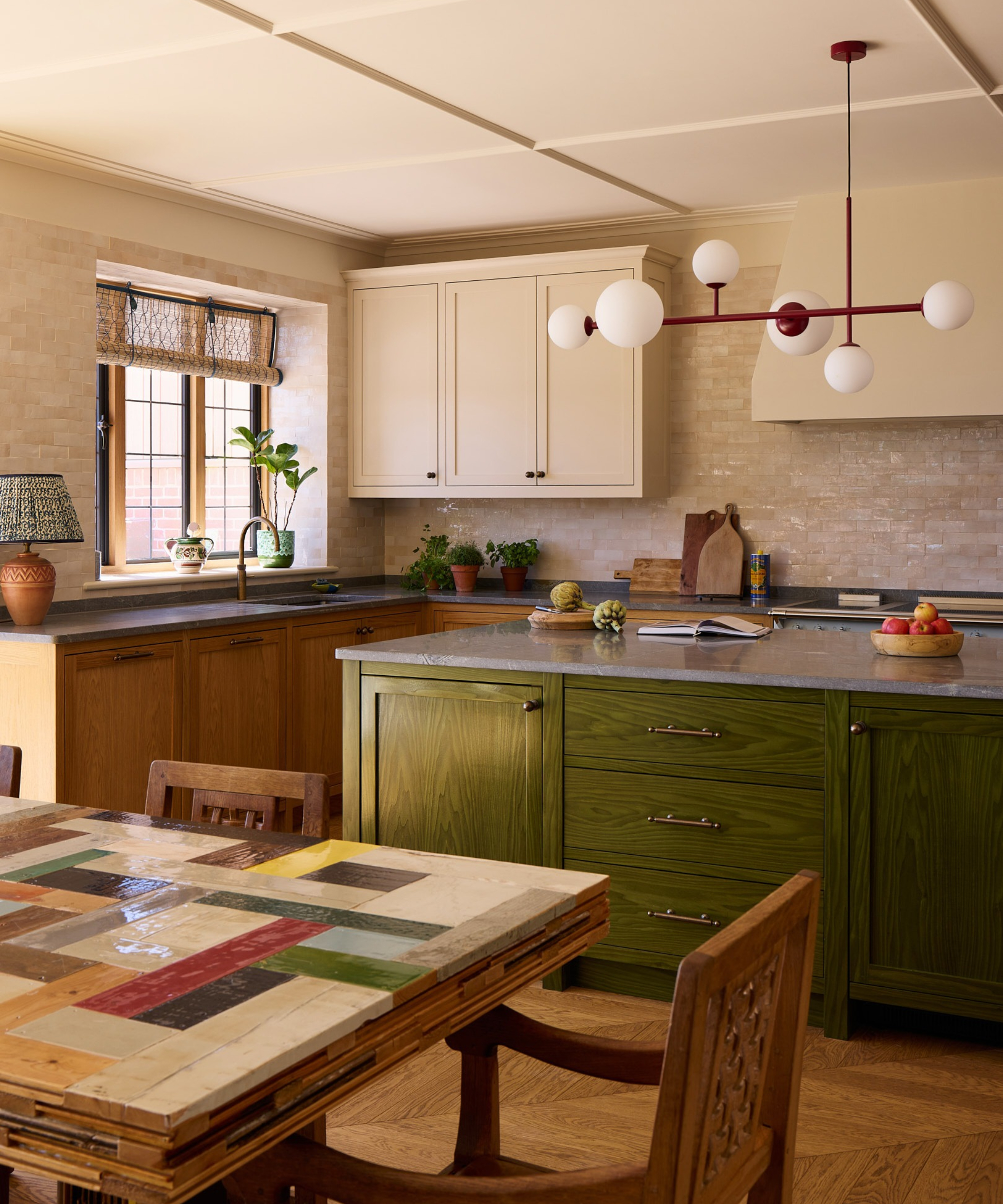
If you want to design a classic kitchen, wood cabinets are always a timeless choice. There's been a lot of conversation about the finish, from white oak to richer, darker tones, but in 2027, designers are ready for clients to choose more colorful stains, with olive green at the very top of the wishlist.
'I’d love to see more kitchens embracing colored timber, particularly wood stained in an earthy olive green. Rather than covering the surface with paint, staining allows the natural grain and character of the wood to remain visible, while introducing a layer of nuanced color. Olive is a particularly lovely shade for this because it has an earthy quality that works beautifully with natural stone, warmer woods and softer neutral tones. It feels unexpected without being overly bold, and brings color into a kitchen in a way that still celebrates the material itself,' says Sophie.
'I'd look at using an olive stain on an island or a run of timber cabinetry, allowing the grain to show through and giving the wood a slightly more individual, layered quality. It works beautifully with lighter stone countertops and warm, natural finishes, as well as darker timber elsewhere in the scheme. I think it’s important not to make the stain too uniform or opaque; the beauty is in the variation of the grain and how the color settles into the wood. It’s a lovely alternative to painted cabinetry if you want to introduce color but retain the warmth, texture, and character of natural timber.'
5. Softer, Muted Shades of Purple
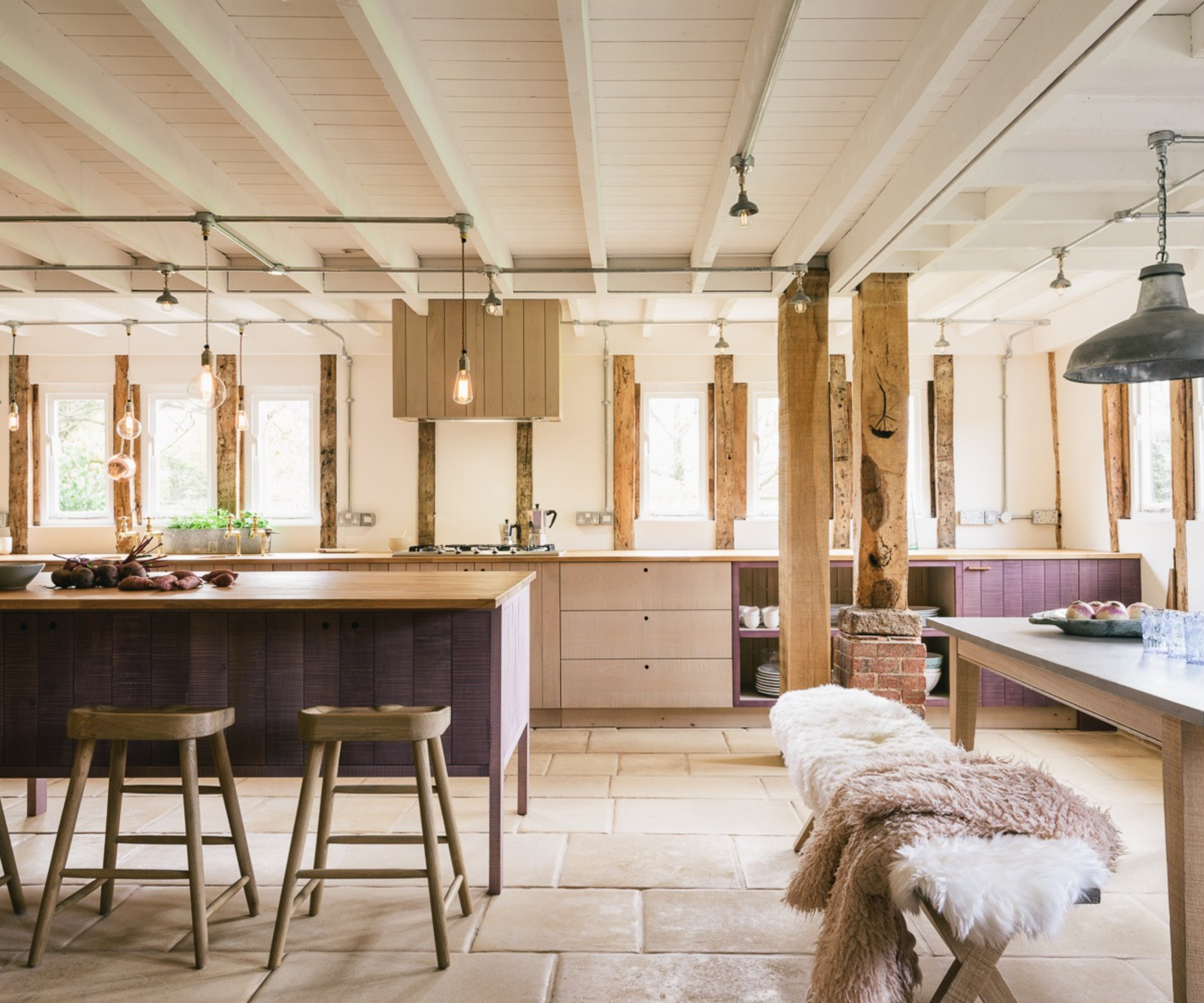
Purple has long been a controversial color in interiors, but plums and aubergines have been slowly emerging following the burgundy trend. As the taste for purple kitchens returns, designers are hoping for more muted shades, whether it's a softer take on plum tones or lighter shades, like lavender and mauve.
'Smoky lavender is a color I secretly wish more clients would choose. I’m thinking of a soft, gray-brown lavender rather than anything too sweet or pastel. It has the quietness of a neutral but brings so much more personality to the kitchen, and it shifts beautifully throughout the day as the light changes. I’d introduce it on the cabinetry, either throughout the kitchen with a simple door style or just on the island, then pair it with creamy stone, warm oak, and aged brass so it feels layered and sophisticated rather than overly colorful,' says Rayana Schmitz, Founder and Principal Designer of Firefinish Interiors.
Even shades of purple with a bit more depth work in this palette. 'I would love to see more clients choose a soft, muted plum for their kitchen cabinetry. Not a bright purple, but a plum with a little gray and brown in it. It’s warm and rich, and depending on the light, it can almost read as a neutral. This color reminds me of the beautiful, layered interiors you see in older British homes,' says interior designer Tanya Smith-Shiflett.
'I’d love more clients to consider a muted plum,' adds Melissa Selvaggio of Melissa’s Designs & Co. 'Something with a little brown in it, almost the color of a ripe fig. It has the richness people love in a dark kitchen, but there’s a softness and warmth that makes it feel inviting. It adds a little spice while still acting as a neutral, which makes it surprisingly easy to pair with so many different woods, stones, and metal finishes.'
6. Unexpected Brown Tones
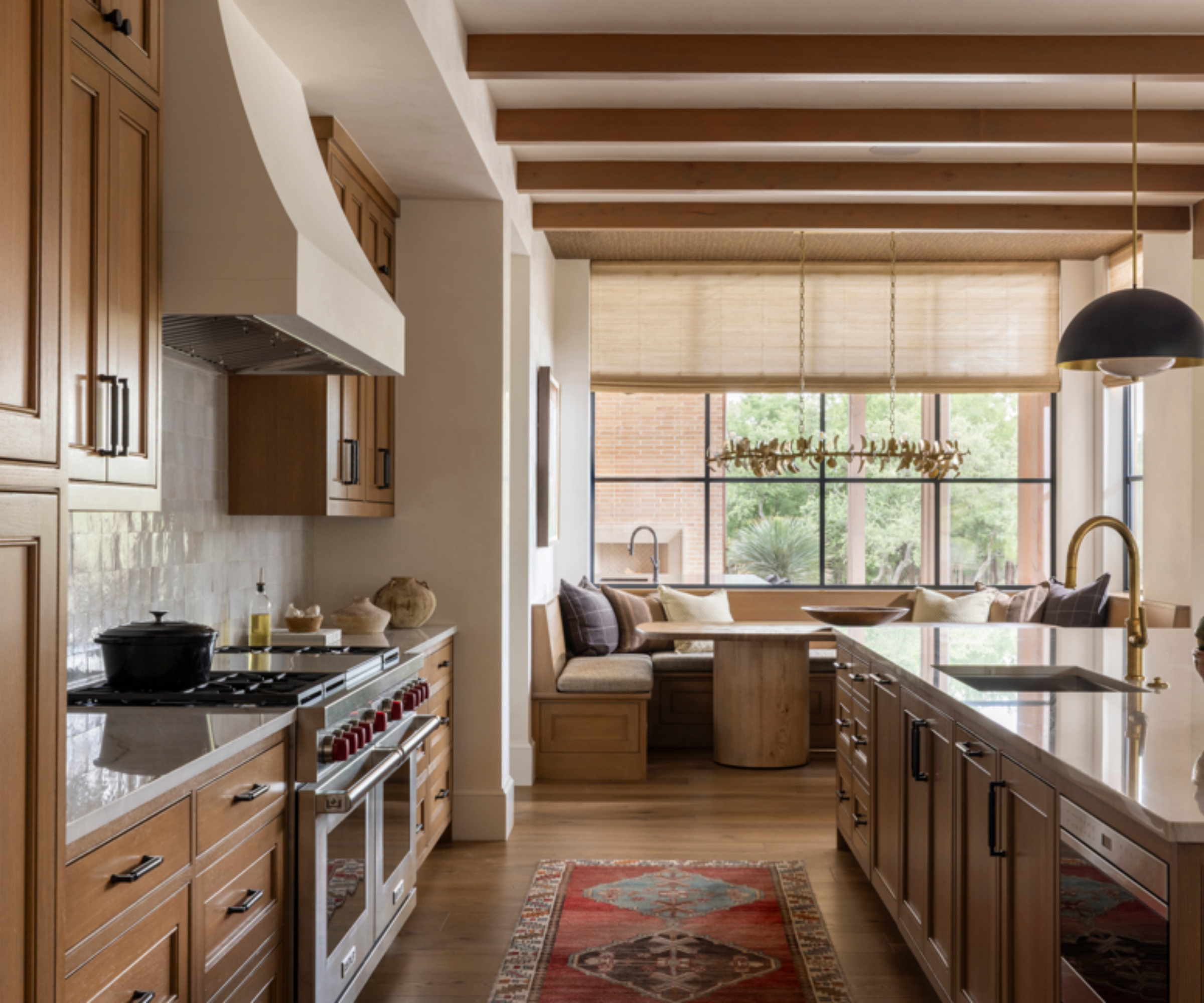
Brown kitchens might not sound new or unexpected, but the shades designers want to see more of in 2027 lean lighter and more complex than the richer chocolate tones of recent trends. Look to natural materials and landscapes for inspiration – colors inspired by the outdoors will never feel dated.
'I would love to see more clients consider brown for kitchens, particularly the warmer, complex browns: tobacco, chestnut, and cognac. Brown has often been treated as something that happens naturally through wood, but I think it deserves to be considered as a color in its own right. We shouldn't need wood to use brown. I would happily specify one of these rich browns as a paint color for cabinetry,' says interior designer Blair Burton.
'I'm really into brown painted cabinetry, which feels a little unexpected because you could just use a stain. But there's something about brown, and not just a true brown or a chocolate brown, but browns with undertones: green brown, red brown, even plum brown. Those are some really interesting colors that I feel could be really cute in kitchens,' says Kelsey McGregor, Founder & Principal Designer at Kelsey Leigh Design Co.
7. Warm Orange Hues

It's been a while since orange kitchens have trended. It's a bold color that can feel rather daunting to decorate a cooking space, especially as a room that's not as easy to repaint. But with terracotta kitchens falling back into favor, designers say it's time for bolder shades to make a comeback, too.
'Persimmon. A deep orange with red in it, like the fruit in late autumn. Clients are afraid of orange. They picture something loud. But a true persimmon is rich and grown up. It glows at night, flatters skin, and makes every meal look better. Fashion has trusted orange as a signature for decades. Kitchens never have,' says interior designer Vanessa Katzen.
'It's such a playful color, so she recommends getting creative with how you use it in a kitchen. 'In lacquer, on an island or a bank of lower cabinets, against a quiet room,' she suggests. 'Pale plaster walls, a creamy honed limestone, oiled walnut, and dark bronze hardware. The persimmon becomes the room's focal point. For a bolder client, run it floor to ceiling in a pantry so it is a discovery behind a door.'
It's clear to see why designers want to see more of these kitchen colors in 2027 – they feel more unique and unexpected after trends filled with lots of similar shades. You don't have to fully commit to any of these hues, either. A few decorative pieces in a bold color can instantly transform a kitchen.
Love beautiful design ideas, expert advice, and inspiring decor trends? Sign up for our newsletter and get the latest features delivered straight to your inbox.