‘Oh, she just loves color – she was a woman after my own heart!’ says New York-based interior designer Katie Lydon of the client who lives in this four-story Brooklyn family home, which Katie recently completed. But as well as the project being a meeting of minds, it was also a meeting of hues, patterns, and ideas that, in someone else’s hands, could have been competing. Yet here, Katie manages to bring them all together as one.
‘The client loved peaches and blues, and one of the first things she said to me was that she didn’t want a white kitchen. I just thought, “Thank God!” She was an inspiration,’ Katie says. That love of being bold with color and print is evident everywhere. Various blues envelop spaces, blush tones creep in, and heritage patterns enliven corners. Yet the overall mood – despite all of this – is one of curated calm.
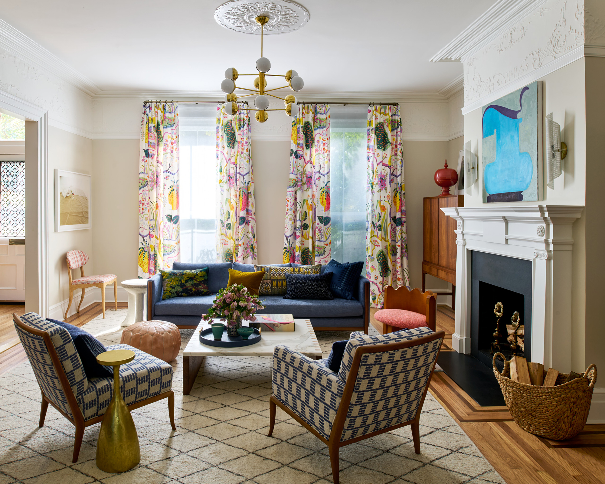
The starting point for the whole project was the curtains in the living room. ‘The client loved Josef Frank,’ Katie says, referring to the midcentury artist behind the print on this fabric. ‘And she told me this was the pattern of her dreams. So I had to figure out a way to make them work in a home that I already knew was going to have a lot of color.’
Katie’s approach was to keep the walls – on the whole – pretty muted, so that they didn’t fight with the livelier pieces. ‘You know, the curtains set the mood for the whole house,’ Katie says. ‘They’re one of the first things you see when you walk into the entryway, and so I’m really glad we incorporated them. They say how happy this house is, they say who the client is. They’re casual but classic and make for a really joyful arrival home.’
That sense of joy was part of the brief. ‘The family who live here are super-casual,’ Katie says. ‘So they wanted a robust interior that could withstand three kids and lots of entertaining.’ The house hadn’t previously been touched since the 1980s, so it was, in Katie’s words, ‘very dated.’
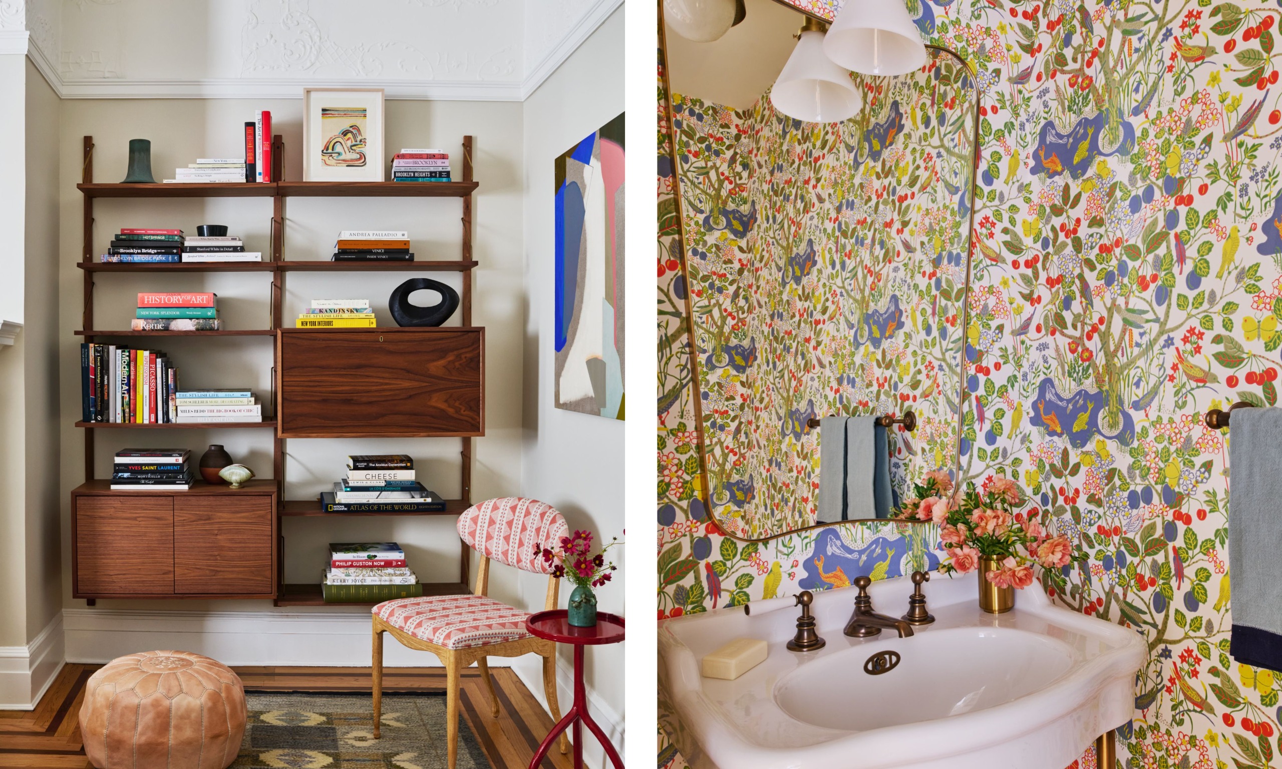
Another way Katie managed to incorporate those curtains was to make them feel less like an outlier by calling back to them at various other moments throughout the house. In the corner of the living room sits this patterned chair, which picks up the red in the drapes, while the powder room is drenched in wallpaper featuring another Josef Frank print.
‘We looked at many, many different wallpapers, and then decided to double down on having something from Josef Frank,’ Katie says. ‘It made the curtains seem intentional, to nod to them again like this elsewhere, and helped to make the overall effect of the decor feel curated and organized, while also being unique and personal.’
Design expertise in your inbox – from inspiring decorating ideas and beautiful celebrity homes to practical gardening advice and shopping round-ups.
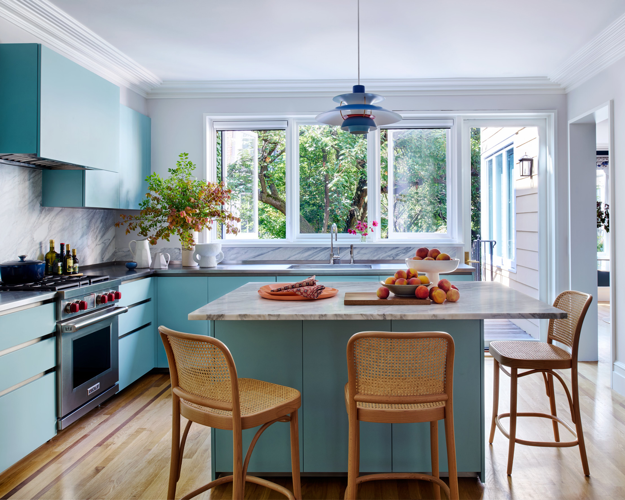
Another unifying theme is the color blue, seen on the sofa and twin chairs in the living room, and now here in the kitchen (with more appearances later on). ‘Blue is definitely the common denominator in this home,’ Katie says. ‘Why? Because it gives that warm-cool feel, a contrast to the pinks, terracottas, and red we’ve also used throughout. Blue is such an atmospheric color, and I love to be able to walk into a space and have it feel interesting and vibrant but calm, too. Blue does all of that. It’s calm, but never boring.’
Katie says it took a number of tries to get this exact blue right, but that going lighter here helps keep this bright space feeling airy and large. ‘There would have been nothing wrong with going for a classic gray kitchen here, but it just wouldn’t have been quite as exciting,’ she says.
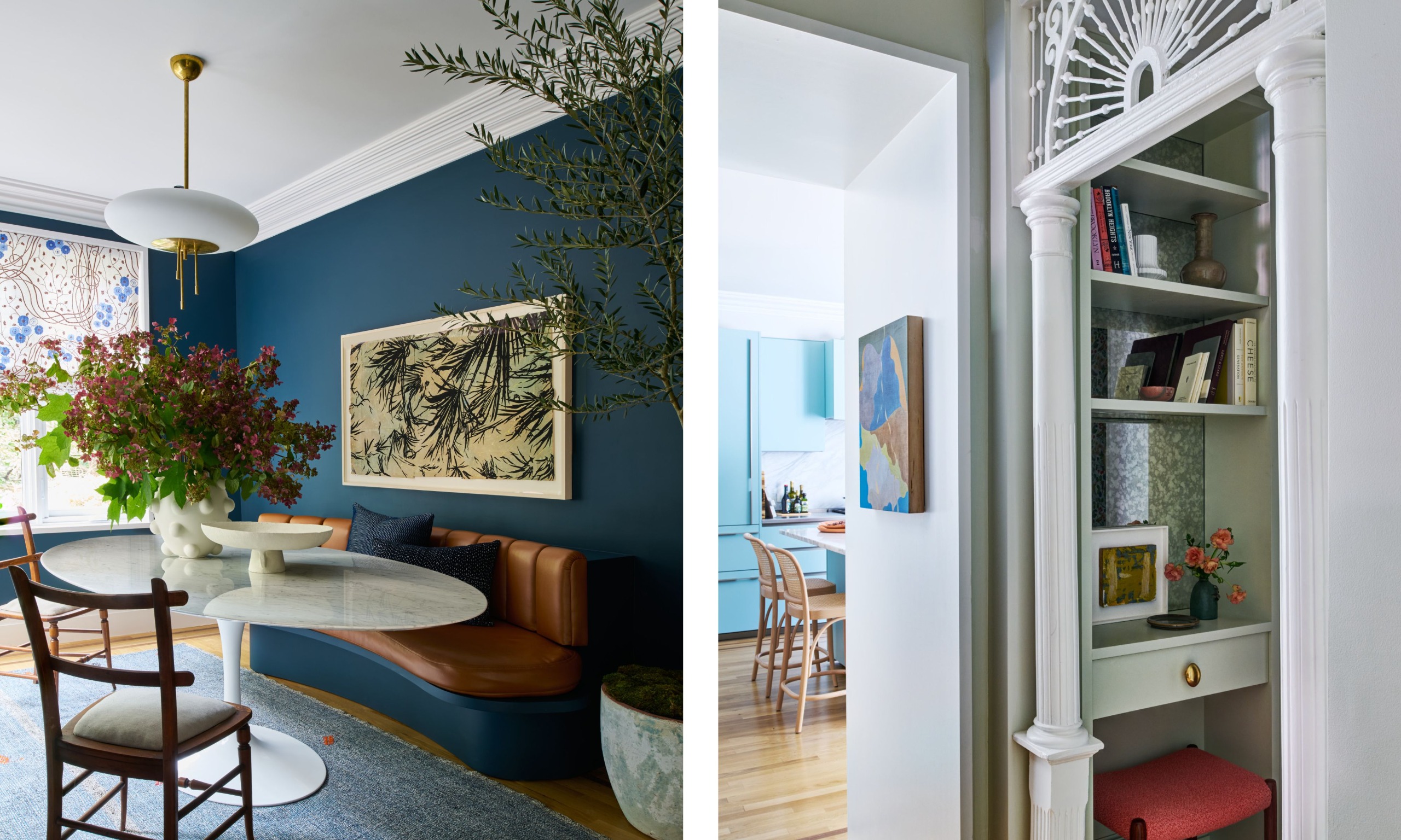
There was a richer blue at play in the dining snug, a small area that had previously been used as the kitchen but didn’t feel big or central enough for the way a modern family lives today. ‘It’s a little bit of a tight space – it’s only got room for the table,’ Katie says. ‘And had we gone for chairs all the way around, it wouldn’t have felt as anchored as it does with a built-in bench. That banquette makes the area seem complete.’
Just off the kitchen is another very clever use of a tight space, turning a little closet area into a home office. ‘I am delighted with this!’ Katie says. ‘We had this little space and were about to turn it into a coat storage area, and then thought it had so much more potential. By turning it into an office area, it gets so much use. Plus, it’s close enough to the kitchen that a grown-up can work in it and still keep an eye on the kids doing their homework at the island.’
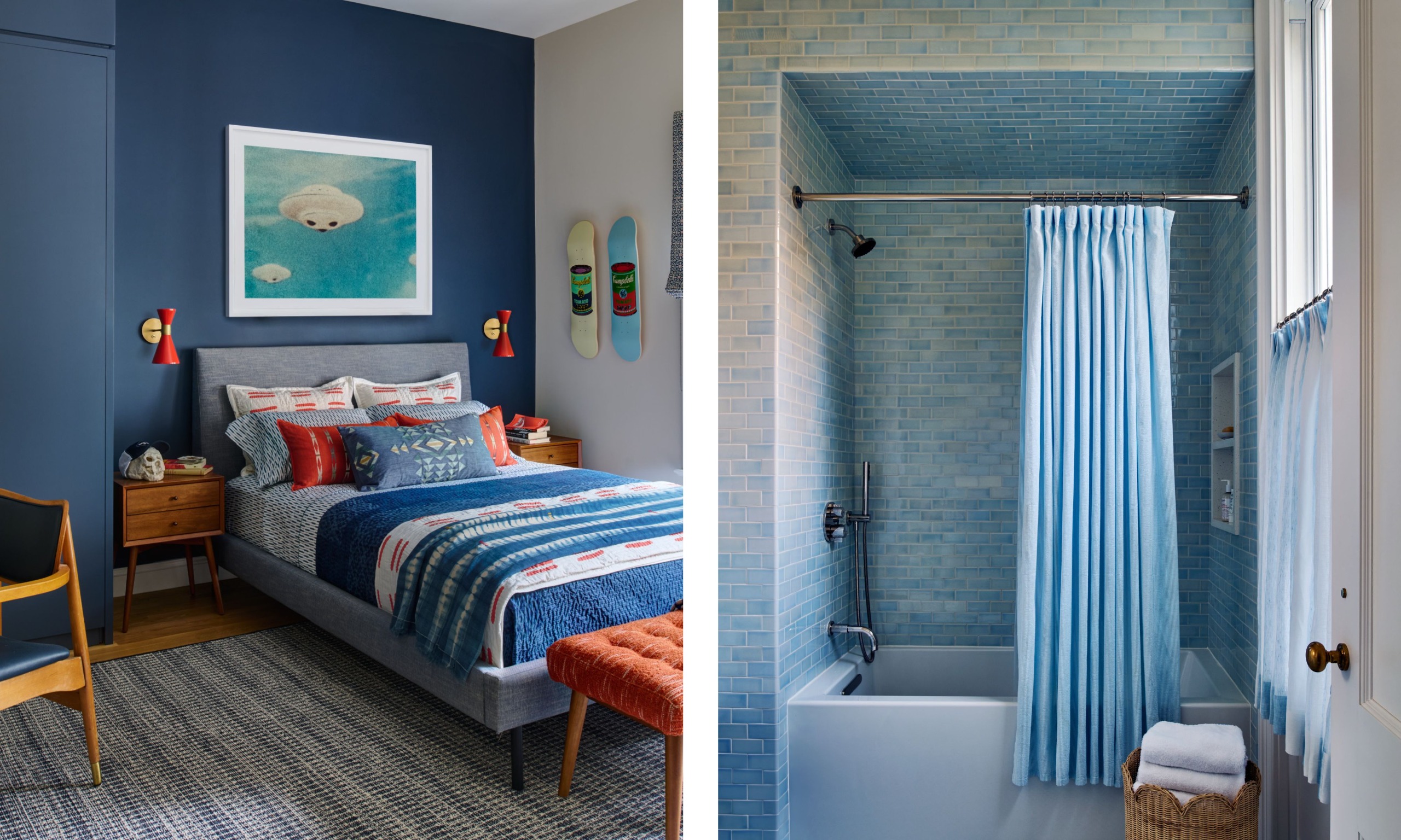
Heading upstairs, the blue theme continues in both the son’s bedroom and the family bathroom. ‘The kids are all young, but not super-young, so the idea was to create relatively grown-up spaces that would age with them and wouldn’t need too much changing,’ Katie says. Meanwhile, in the bathroom, the handmade tiles are charmingly irregular, in keeping with the aim of giving every space character. ‘They have such a lovely inflection,’ Katie says. ‘Those tiles are truly perfectly imperfect.’
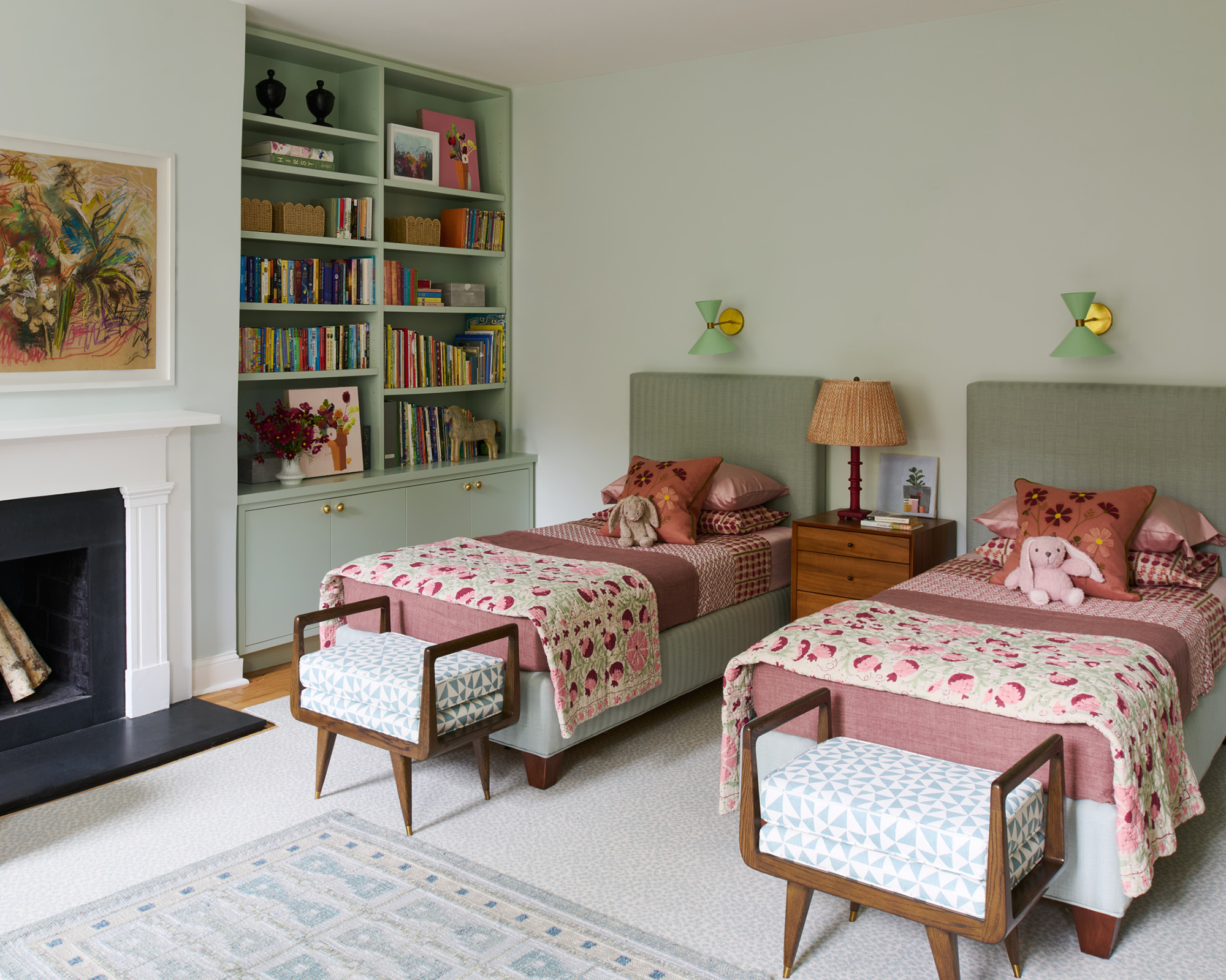
The same principle applies to the bedroom shared by the two daughters – currently so cute and adorable with its matching twin beds, but with millwork painted in a color that could just as easily suit a teenager or an adult.
‘You don’t want to spend too much money on a kid’s room,’ Katie says, ‘as they’ll grow out of whatever you do soon enough. But paint is a really smart choice because it elevates details like millwork and can easily and affordably be redone if their tastes change as they get older.’
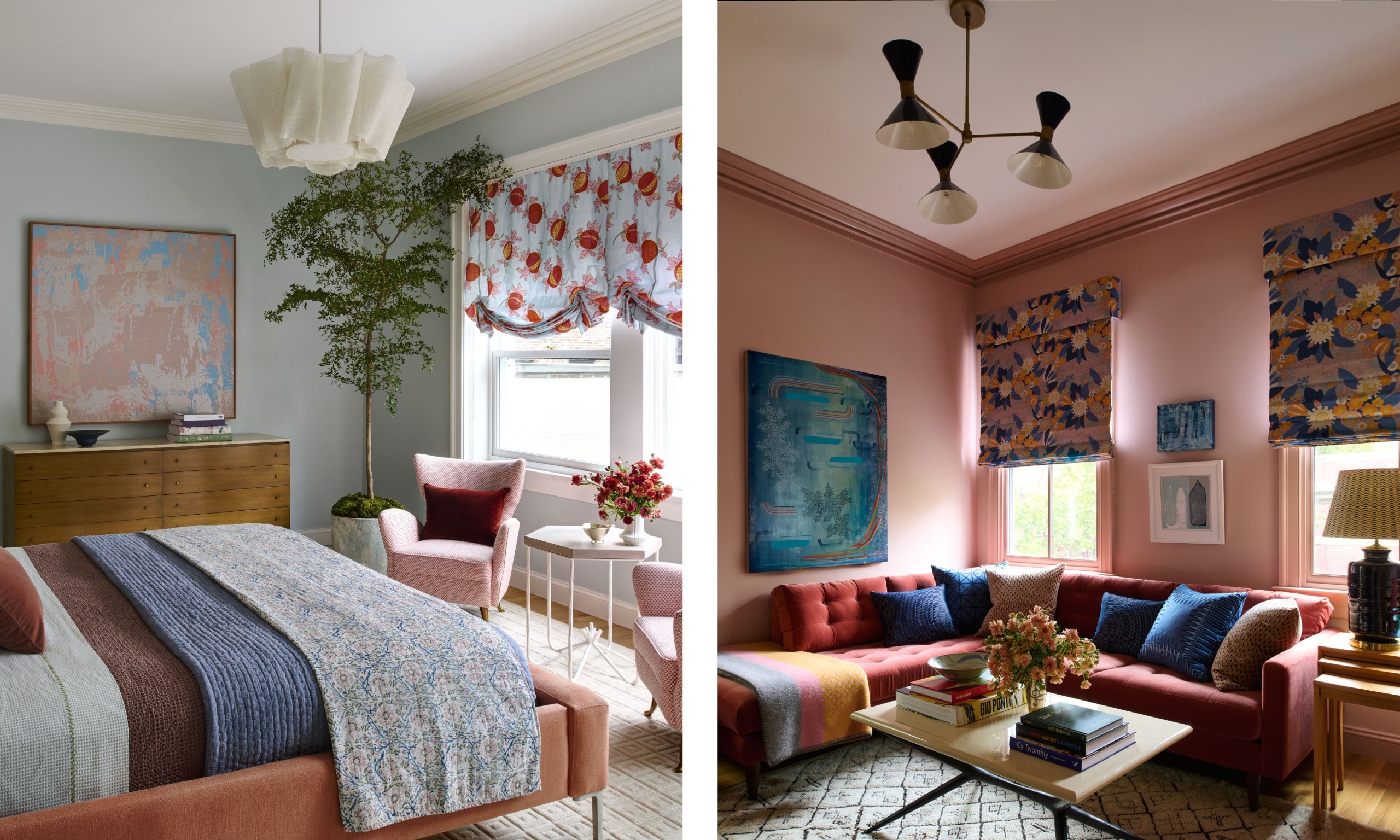
On the very top floor are the main bedroom and a multifunctional den, a place where the kids can come upstairs and sit comfortably with their parents, or where they can retreat to a quiet space. Truly multifunctional, the room also has a desk along one of the walls.
‘This space had to work really hard,’ Katie says. ‘And I looked at it alongside the main bedroom. While that room is blue with blush tones, this one leans into blush but is very complementary to the other space. I kind of feel like they have a yin and yang effect on each other – one is cooler in tone and the other warmer, but they go together well.’
What Katie has shown in this home is that it’s possible to include a vivacious array of patterns, prints, and paint colors while still achieving an overall sense of curation. The trick is to allow space for those louder ideas to breathe by strategically keeping many of the walls more neutral, while linking the bolder pieces through common threads of color. There is a lot of method here, preventing this brilliant scheme from becoming madness and, in fact, helping it feel calm.
Love beautiful design ideas, expert advice, and inspiring decor trends? Sign up for our newsletter and get the latest features delivered straight to your inbox.