There is a familiar shorthand for a restful bedroom: reach for a pale blue, soft gray, or cool green and let the color do the calming. Yet serenity cannot be selected from a paint chart by temperature alone. A cool shade can feel soothing, but it can just as readily turn chilly, flat or clinical once it meets the room’s particular light, finishes and furniture.
The bedroom color mistake, designers agree, is not choosing a cool color; it is choosing one on the assumption that cool automatically means calm. Warm whites, mineral neutrals, earthy pinks and even ochres, browns and muted reds can be every bit as restful. What matters is nuance: the undertone, the saturation, the light at different hours, and the way the whole room works together.
The Bedroom Color Mistake Designers See Again and Again
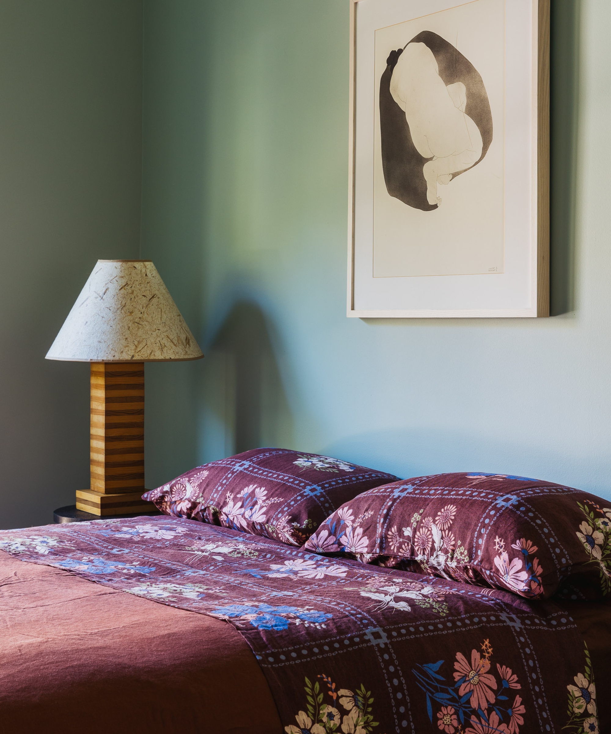
A paint chip is never the whole story. In a bright showroom, a blue-gray might appear crisp and composed; on the walls of a north-facing bedroom, it may read steely by afternoon and dull after dark. Pair it with brilliant-white trim and cool bulbs, and the effect can be closer to a clinic than a rest-inducing retreat.
‘Cool tones can go from serene to waiting room surprisingly quickly,’ says Tamara Kaye-Honey, creative director and principal designer of House of Honey. ‘It usually happens when the color is too blue, too clean, or lacks enough warmth and depth to balance the room’s natural light.’ She is not opposed to cool hues, but favors versions that feel ‘a little dirty, moody or unexpected,’ with gray, green or earthy undertones rather than an icy cast.
Amanda Leigh and Taylor Hahn of House of Rolison often see the problem in developer-led interiors, where true whites and cooler neutrals form a bright shell but bear little relationship to the woods, textiles, art and furniture inside it. ‘That disconnect is often what makes a space feel more like a building than a home,’ they explain. Under the 2700K lighting they typically specify, a markedly cool wall can look bluer while every warm element looks more yellow, visually dividing the room.
The room’s orientation can amplify the effect. Ali Childs, founder of Studio Alexandra, notes that a clean blue or gray can feel especially stark in a north-facing bedroom when it is teamed with brilliant-white woodwork and other cool finishes. Sam Goold and Katie Bolton of Danebury Design Studio make the same observation: clean whites, pale neutrals and gray-blues can become flat in limited natural light, particularly on a gloomy afternoon or in the evening.
This is not an argument for banishing blue or green. Evan Shane Krenzien and Pierce Jordan of Shane & Pierce use what they call ‘warm blues,’ including Portola Paints’ ‘Sirene’, whose depth makes it enveloping rather than stiff. Goold and Bolton similarly look for enough depth and ‘muddiness’ to make blues and greens comforting. The distinction is subtle but important: calm comes from the character of the color, not its category.
Design expertise in your inbox – from inspiring decorating ideas and beautiful celebrity homes to practical gardening advice and shopping round-ups.
Cool Colors Aren’t the Only Way to Create a Calming Bedroom
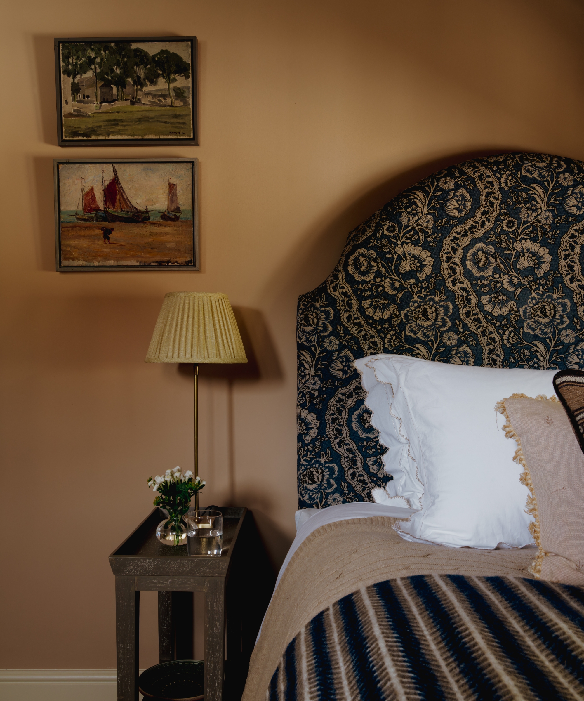
Warmth does not have to mean high energy. The most restful warm shades tend to be softened, desaturated, or grounded with brown, gray, yellow or red, giving them complexity without visual noise. Think creamy white rather than optic white; mushroom instead of silver-gray; plaster pink in place of candy pink. Clay, tobacco, ochre, warm stone and mossy green can all create a sense of shelter.
Kirsten Blazek of A1000xBetter gravitates toward colors drawn from nature, particularly ochres, rusts and rich, brown-based greens. In lighter rooms, she values a creamy off-white such as Dunn-Edwards ‘Historic White’: soft and inviting, without pulling too strongly toward another color. Jennifer Sucher, founder and lead designer of Sucher Studios, often turns to a desaturated peachy pink. She describes its radiance as a ‘warm hug,’ particularly welcome in places with cold weather and gray skies.
Pink’s calming potential is a recurring theme, provided it is earthy rather than saccharine. House of Honey’s favorites include Farrow & Ball ‘Setting Plaster’ and ‘Dead Salmon’, while Studio Alexandra used Edward Bulmer ‘Rose Pink’ at its Vivian Road project for the shade’s soft, barely pink warmth. In a small, north-facing bedroom, Danebury chose Edward Bulmer ‘Clove’, a shade the studio calls a ‘tomboy pink’: earthy enough to sit comfortably beside a dark patterned headboard, pictures and layered textiles.
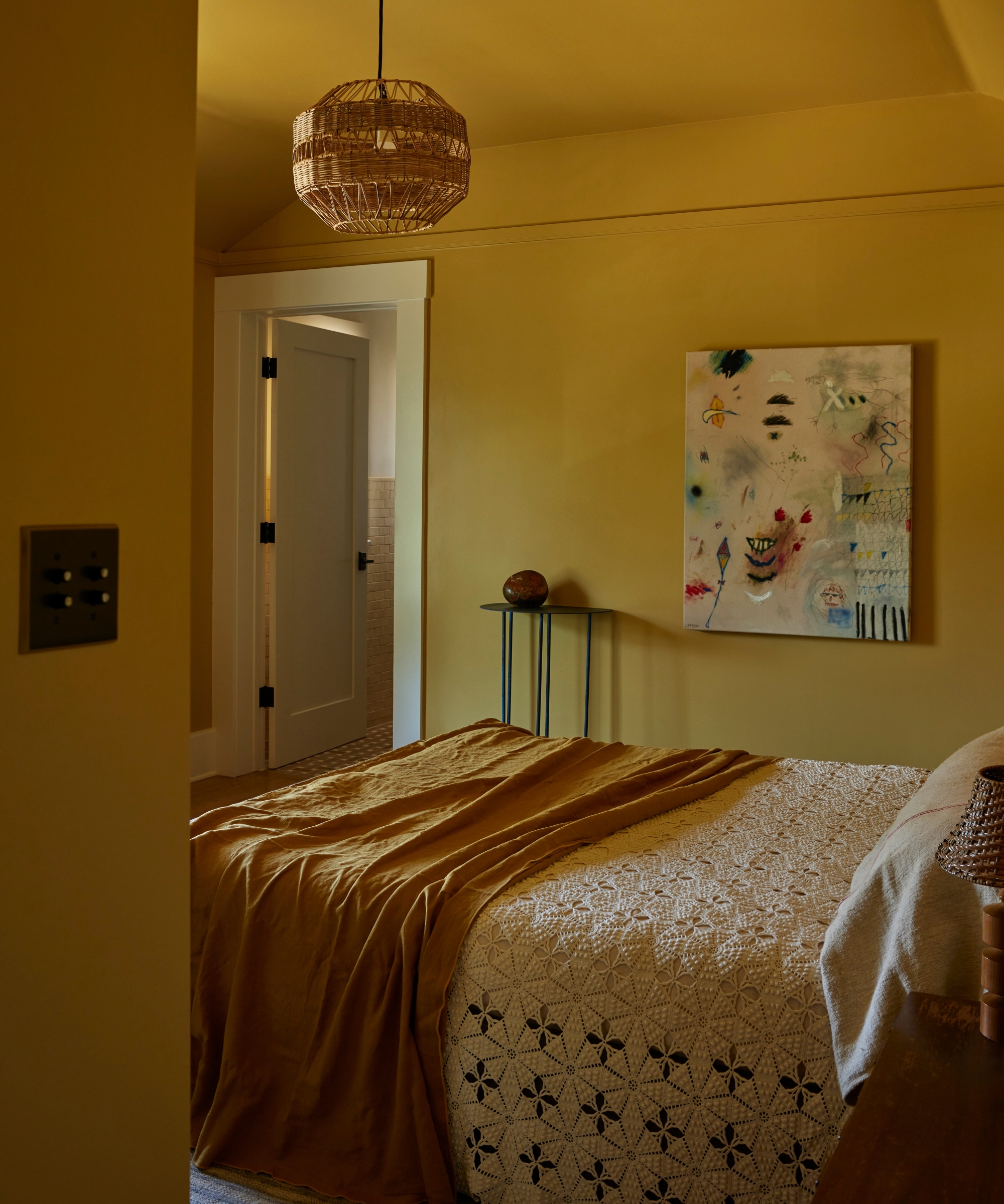
Ochre can be equally gentle. In the guest bedroom of its Pasadena Craftsman project, Electric Bowery used Benjamin Moore ‘Citrine’ as a sunny but soothing backdrop to natural bedding and vintage pieces. Deeper earth tones can work almost like neutrals, too. House of Rolison recommends Benjamin Moore ‘Barista’ for an enveloping brown, ‘Nicolson Red’ for a muted historic red, and ‘Mohegan Sage’ for a subdued green. Its go-to light neutral, Benjamin Moore ‘Dulce de Leche’, has enough pigment to connect naturally with wood, stone, plaster and aged materials without the sterility of true white.
Dark does not mean disruptive, either. Jessica Blue of Jessica Blue Interiors likes to color-drench bedrooms from ‘head to toe’ in shades ranging from blues and greens to flesh tones, warm grays and marigolds. Benjamin Moore ‘Aegean Teal’ and Sherwin-Williams ‘Arugula’ are among her top choices. Shane & Pierce suggests Portola Paints ‘Costes’ for an earthy, moody effect, or ‘La Catedral’ and ‘Rustica’ for darker rooms. A deep shade can allow a bedroom to become intimate rather than forcing it to look bigger and brighter.
It’s All About the Undertones
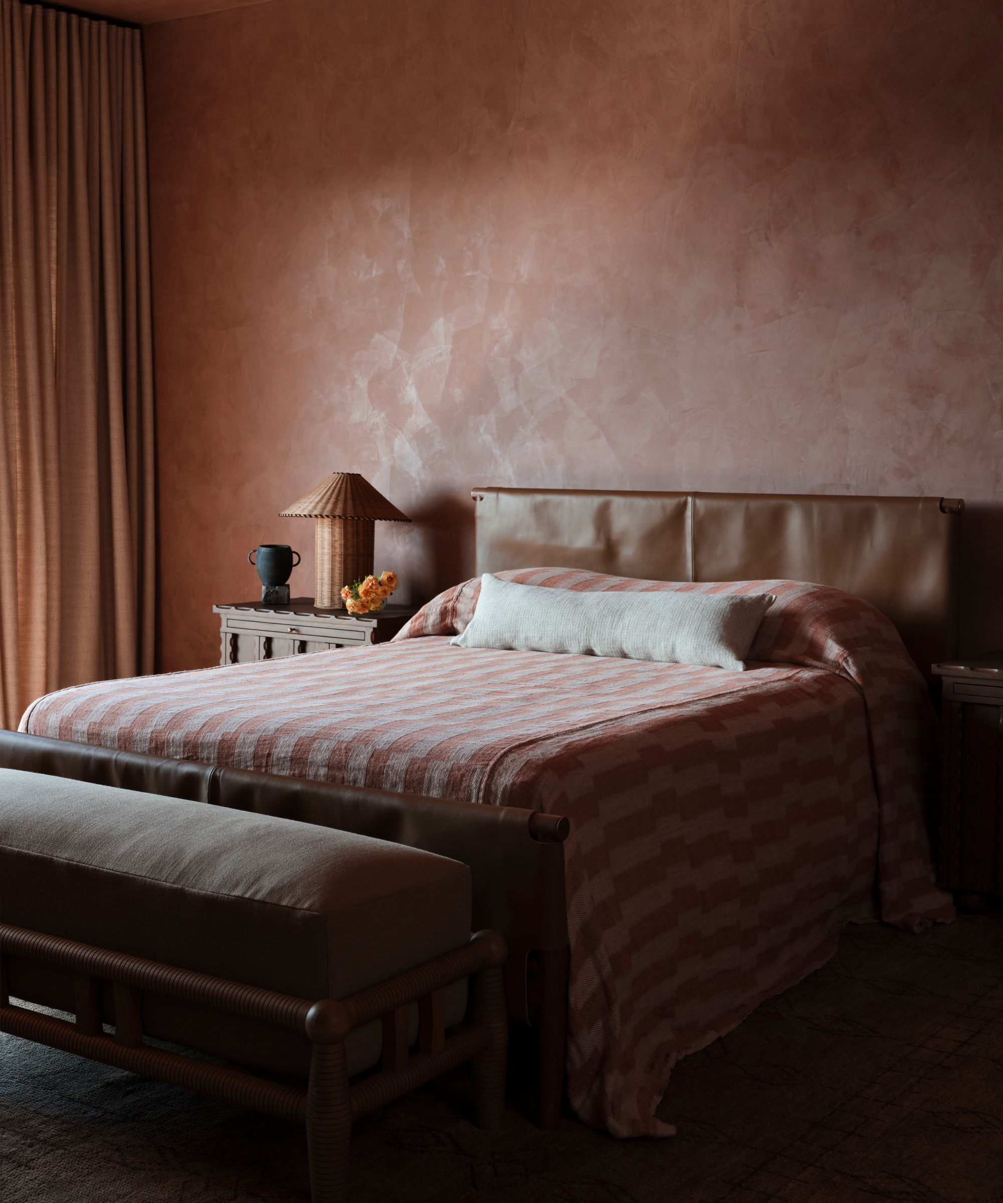
Two paints with the same broad label can behave like entirely different colors. A white may carry blue-gray undertones that sharpen in cool daylight, or creamy yellow or pink notes that soften beside timber and linen. One beige can glow gently; another can tip toward green or gray. The undertone is the quiet influence determining what the eye actually sees once the room is furnished.
‘Undertones are the entire plot,’ says Kaye-Honey. ‘A gray can suddenly go lavender, a beige can go yellow, and a white can become aggressively blue.’ Her advice is to paint large samples in the room, then inspect them in morning light, afternoon light and lamplight. A bedroom has multiple personalities, and the color must work with all of them.
House of Rolison assesses paint beside flooring, wood species, stone, upholstery and window treatments, and under the project’s specified artificial lighting. ‘We want to know what that color is going to do at eight o’clock at night when the natural light is gone,’ the designers say. A cool wall beside something very warm can exaggerate both, making blue look bluer and yellow look yellower.
For Sucher, slightly green undertones make blue feel aged and lived-in; orange tempers pink’s nursery associations; rusty brown makes burgundy less jewel-like; and yellow gives green warmth. Blazek takes a different but compatible approach, searching for ‘true colors’ that remain relatively consistent as light and neighboring shades change. Both demonstrate why the descriptive name on the can matters less than testing the color in context.
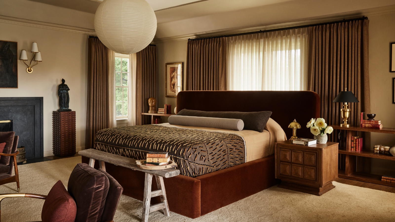
Alexandra Azat, founder and principal of Plaster & Patina, extends the idea beyond a single paint. High contrast creates visual tension by continually pulling the eye toward abrupt transitions. Tone-on-tone palettes and color drenching soften those boundaries, allowing the eye to move more easily around the room. Her preferred restful neutrals take their cues from outdoors: warm browns, stone hues and moody creams such as Farrow & Ball ‘Stony Ground’ and ‘Oxford Stone’.
The Colors Designers Recommend for a Restful Bedroom
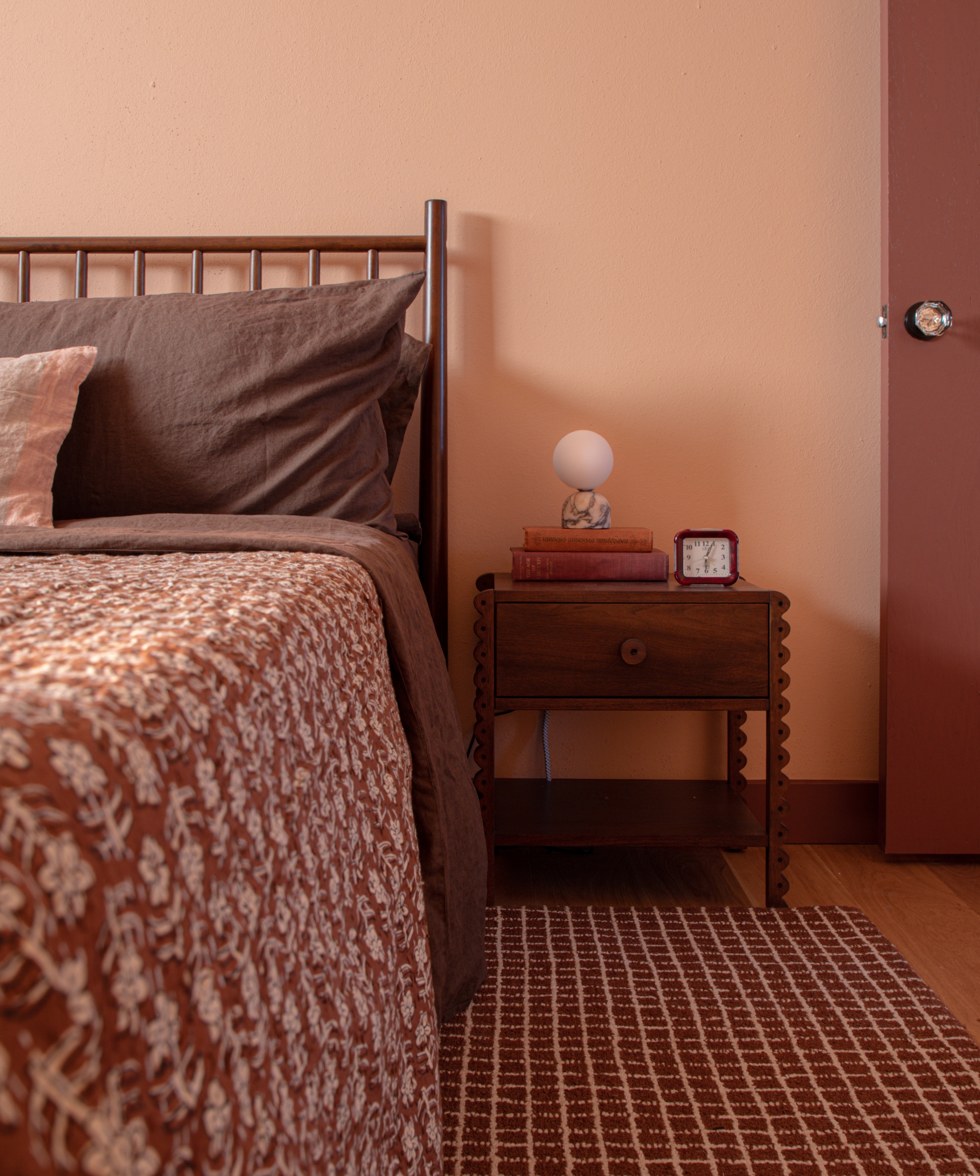
No single color family owns the idea of calm, but designers repeatedly return to nuanced colors that are difficult to define in one word. Mushroom taupe, dusty blush, muddy olive, putty and warm stone sit between familiar categories; that ambiguity gives them depth and helps them shift gracefully through the day.
For a warm base, Shane & Pierce favors Farrow & Ball ‘Joa’s White’, whose reddish undertone adds depth without reading pink, alongside Farrow & Ball ‘Off-White’ and Sherwin-Williams ‘Shoji White’. House of Rolison uses Dunn-Edwards ‘Cottage White’ when a room needs brightness and Benjamin Moore ‘Swiss Coffee’ when it needs still more, retaining warmth even as the palette approaches white.
For mineral neutrals, Childs recommends Paint & Paper Library ‘Stone III’, used at Studio Alexandra’s Hill House project to support the soft furnishings without feeling bland. Azat’s ‘Stony Ground’ and ‘Oxford Stone’ offer moodier interpretations of cream and stone. House of Honey suggests Benjamin Moore ‘Pale Oak’ or Farrow & Ball ‘Mouse’s Back’, while its deeper picks, Farrow & Ball ‘Pigeon’ and Benjamin Moore ‘Vintage Vogue’, become cocooning with soft textiles and warm lighting.
For richer color, Jessica Blue favors earthy shades with an offbeat edge: Benjamin Moore ‘Pelham Gray’, ‘Palace Ochre’ and Sherwin-Williams ‘Dried Thyme’, a sophisticated green-gray. Sucher’s options range from Benjamin Moore ‘Apricot Beige’ and ‘Richmond Green’ to Portola Paints ‘Fairview’. Danebury often returns to Edward Bulmer’s ‘Lute’, ‘Jonquil’, ‘Lilac Pink’, ‘Invisible Green’ and ‘Azurite’, several of which are available in different strengths for a quieter dose of color.
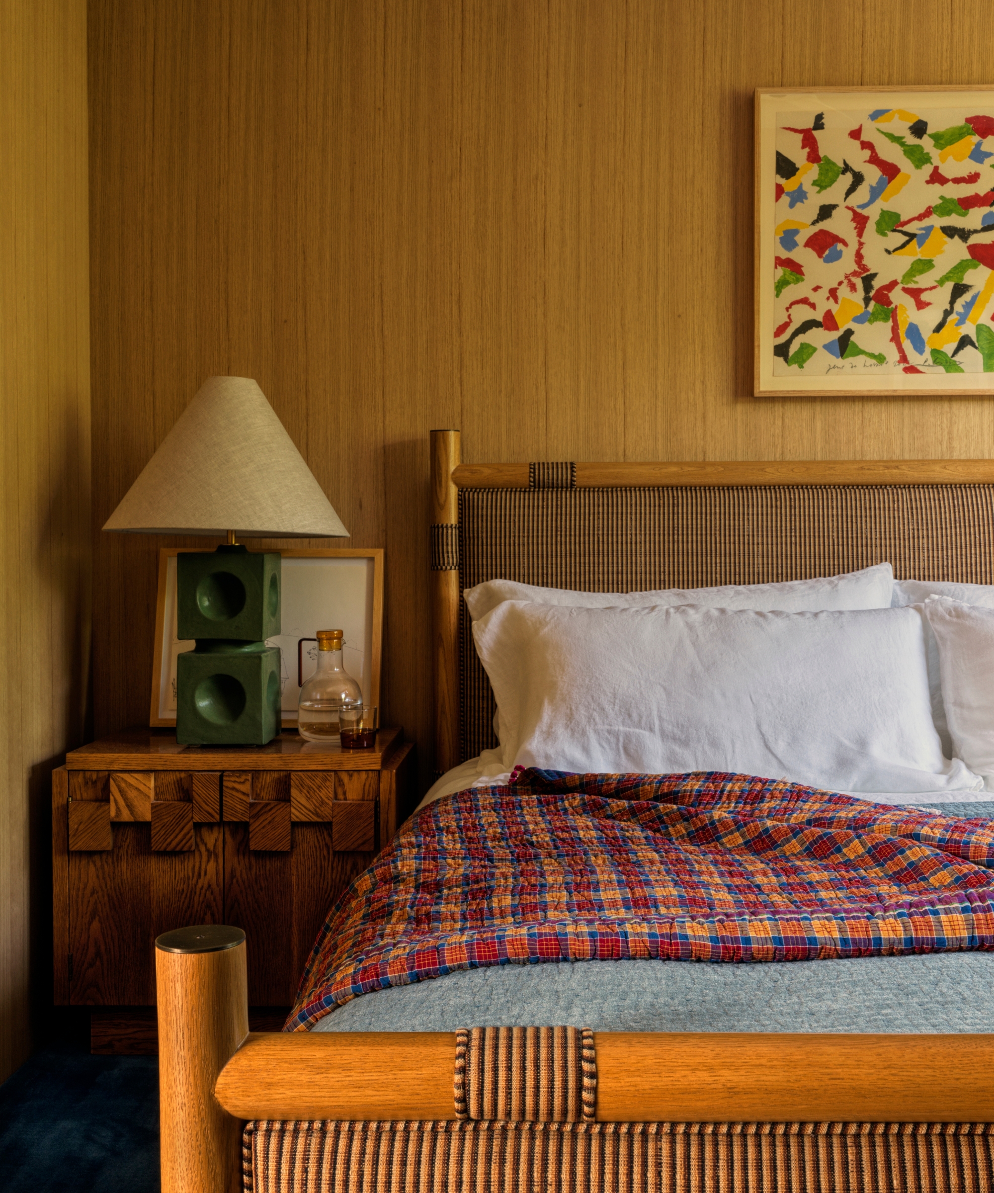
Not every warm bedroom needs painted walls. In her Montauk project, Nina Freudenberger used warm white-oak paneling as a neutral, allowing the grain and tonal variation of the wood to supply depth. It is a useful reminder that the room’s dominant color may come from a natural material rather than a paint can.
How to Make Any Bedroom Color Feel More Calming
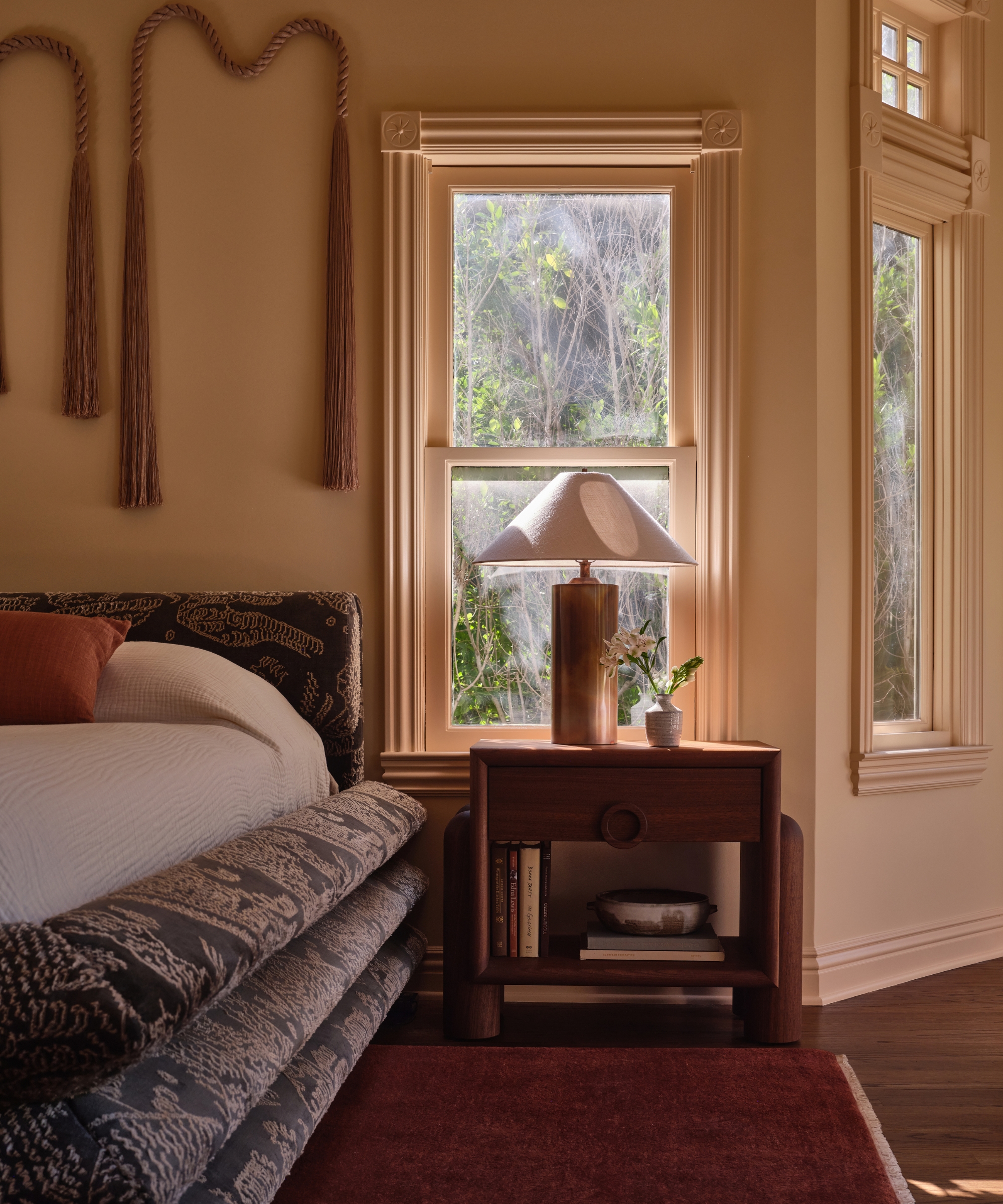
Wall color sets a mood, but it cannot create a restful room in isolation. The best schemes are layered rather than matched: linen and wool, natural wood, an antique rug, aged metal, woven details, art and pattern all temper the painted envelope. A dark wall may need pale bedding for relief; a light wall can take deeper woods and upholstery. The push and pull gives the room dimension without making it busy.
Childs treats wall color as one layer among texture, furniture, lighting and pattern. Blazek looks for a similar level of saturation across the colors in a room, allowing different hues to feel tonal and cohesive. Jessica Blue takes a more complementary route: she might balance a blue bedroom with red or pink, then add a touch of green, uniting the mix through varied scales of pattern and tactile pieces such as a rug or hand-knit throw.
Danebury often begins not with paint but with a curtain or headboard fabric a client loves, allowing the wall color to grow from the broader decorative scheme. The studio considers the ceiling and woodwork at the same time, too: brilliant white can interrupt a nuanced wall, while matching woodwork creates an enveloping effect and a complementary neutral adds definition.
Lighting deserves equal attention. Warm, low-level sources soften color after dark and create pools of illumination rather than flattening the room beneath a single glaring bulb. Kaye-Honey layers bedside lamps, sconces and even candlelight, observing that ‘nobody wants to relax under a 4000K LED.’ The exact color temperature is only part of the answer; placing light at different heights makes the room feel intimate and useful.
Finally, allow the scheme to feel collected rather than purchased as a set. House of Rolison combines pattern, worn woods, leather, linen, wool and pieces with patina so that the room feels personal. The designers’ test for success is revealing: when the temperatures and undertones work together, you stop noticing paint, lighting, furniture and textiles as separate decisions. The bedroom simply feels settled.
That is the more useful definition of a calming bedroom. It need not be pale, cool or perfectly coordinated. It should feel comfortable at the hour you use it most, connected to the materials around it and personal enough to invite you to unwind.
Love beautiful design ideas, expert advice, and inspiring decor trends? Sign up for our newsletter and get the latest features delivered straight to your inbox.