A London townhouse and a spacious, light-filled home might not always go hand in hand, but designer Sophie Garland had a clever way around that. The Next in Design winner took on the challenge of giving her family more room to spread out in her West London Home, without sacrificing the character that makes a house feel like a home. But she was equally keen to avoid creating one enormous, cavernous space. Her solution involved removing the walls between the front and middle rooms traditionally found in London houses and giving that precious square footage back to the living room. Proving that sometimes, the best design decision is knowing what you can do without.
Inside, the mood is colorful, layered and wonderfully personal, with patterned upholstery, vintage finds and contemporary pieces sitting happily alongside one another. Sophie wanted the house to feel 'full and vibrant, but also have a sense of calm', a balancing act she achieves through soft, pale wall colors, tactile fabrics and plenty of characterful furniture.
'I think it’s important to mix things up and make sure the overall look doesn’t feel overdone,' she says. Art plays an equally important role, from statement paintings to works by members of her family, including her late father. Add in antiques discovered at auction and furniture that has followed her through the years, and this is a home with real charm.
Sophie knew what she was looking for long before she found it. 'We had a really clear idea of the type of house and layout we wanted, so when we came to see this house, we immediately knew it was perfect for our vision,' she says. Crucially, she didn't want someone else's recently renovated version of a London townhouse.
'I didn’t want a house that had already been recently renovated, as I was keen to do that myself and create the exact home we wanted.' Fortunately, the property was in good condition, so aside from extending out the back, she could focus her budget on the interiors rather than getting caught up in a full-gut, structural rescue mission.
There were still plenty of decisions to be made. Much of the original architectural detail had disappeared over the years, although Sophie was keen to preserve the pretty plasterwork on the living room ceiling. More significantly, the ground floor needed to work harder for family life. She wanted to create an uninterrupted view from the front door to the garden, while still creating rooms that each felt distinct and inviting.
That meant thinking beyond the typical London Victorian home layout. Removing the 'corridor' – a middle room which links the front door through to the back of the house – gave the living room valuable extra width, while lowering the kitchen floor and introducing wide steps helped establish a natural division between the two spaces. 'I was also keen that [the house] didn’t feel like one massive room,' she explains.
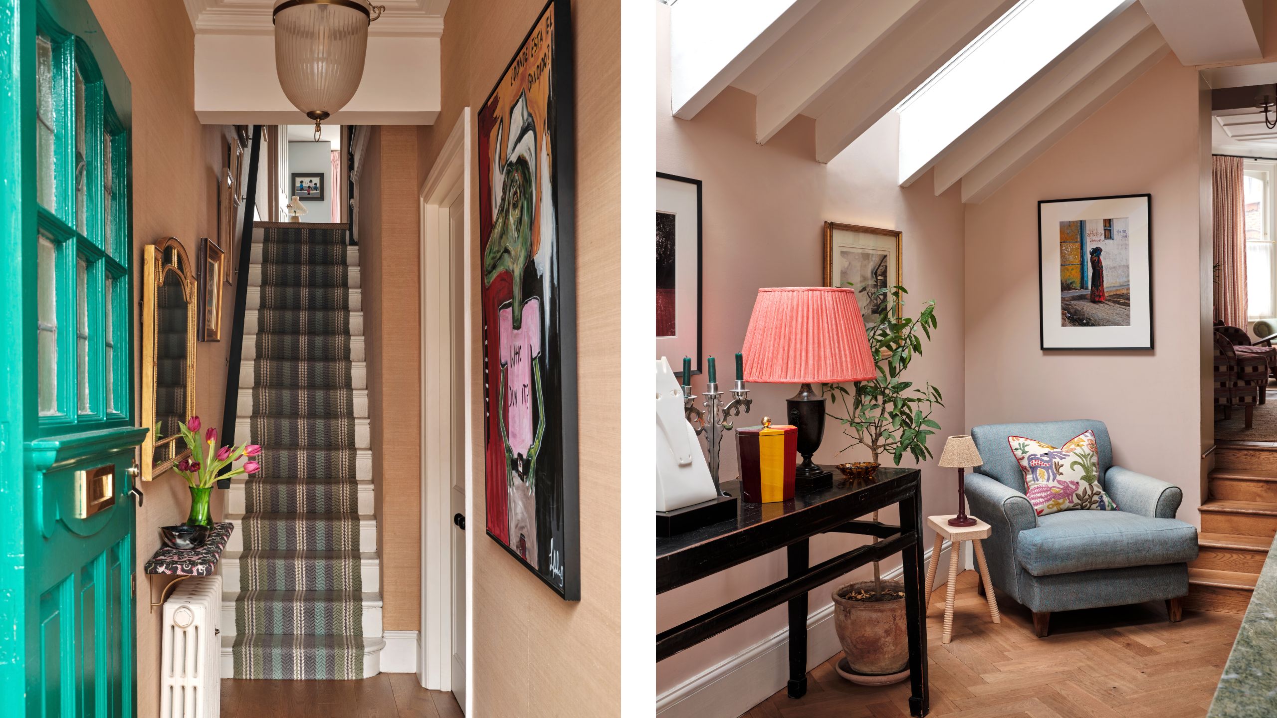
With the bones of the house sorted, Sophie could turn her attention to the fun part: making the interiors feel like her own. Rather than attempting to make every element match perfectly, she let each scheme develop much more organically. 'Most rooms started with one fabric, and then the rest of the scheme developed from there,' she explains. While the walls remain 'relatively pale and calming', Sophie really found joy in pattern mixing. 'I like combining patterns, plains and textures, as this helps to create a layered feel without the overall look becoming too overwhelming,' she adds.
Just as important – or perhaps even more so – is the mix of old and new. Much of the upholstered furniture was made specifically for the house, while antiques and vintage finds bring history and a sense that the home has evolved over time. Art is another essential layer to Sophie's home.
'We were also lucky to have so much art, as I have a few artists and photographers in the family. My godfather was a wonderful photographer, and his work, combined with paintings and prints, creates a lovely variety of art throughout the house,' she adds. Going up the stairs, Sophie has filled the walls with oil paintings by her dad. 'He was a wonderful painter, and passing his pictures every day is a special way to remember him,' she adds.
Of course, a beautiful home also needs to work on a mid-week afternoon when the toys are out and everywhere. For Sophie, designing around family life was just as important as getting the aesthetics right. 'We specifically wanted the downstairs space to be somewhere we could all be together, without feeling like we were always getting in each other’s way,' she explains. The trick was making room for the realities of life with two young children without letting the house feel like one enormous playroom.
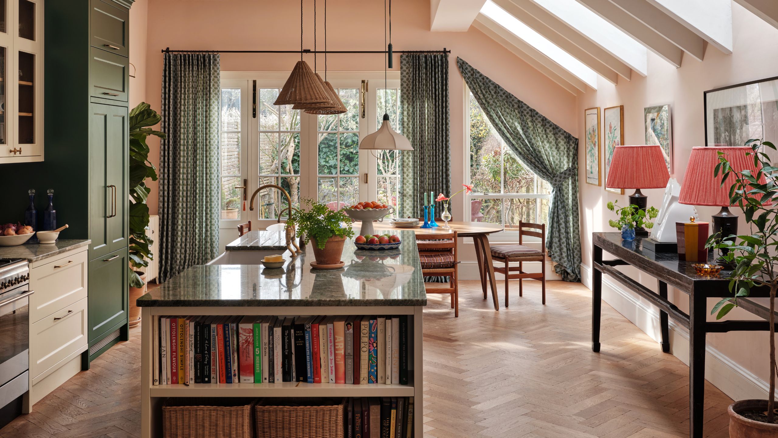
Upstairs, the children's bedrooms were designed with longevity in mind. 'There is lots of color, but nothing too young that would mean we needed to redecorate in a few years,' she adds. 'There are lots of places to tuck away toys and children’s books,' she continues. The kitchen island is particularly hardworking, concealing a huge cupboard full of Lego alongside drawers for games, arts and crafts.
Despite its generous proportions, high ceilings and abundance of natural light, Sophie was conscious that the new kitchen could feel a little too contemporary for the rest of the house – but she needn't have worried. 'I was worried it could feel too modern and that wasn’t the look I was going for,' she explains. Traditional-style doors and windows helped establish a more familiar feel, while curtains, lamps and an armchair soften the architecture and make the room feel as inviting in the evening as it does during the day. Green granite countertops, with their varied color and movement, bring another layer of character to the scheme.
'I really wanted a stone with an interesting color and plenty of movement and variation,' Sophie says. It's a room designed to work hard without looking as though it does – and one that has become a natural gathering point for everything from everyday family life to entertaining friends. 'We spend so much time in here,' she continues, 'whether we’re together as a family or having people over.'
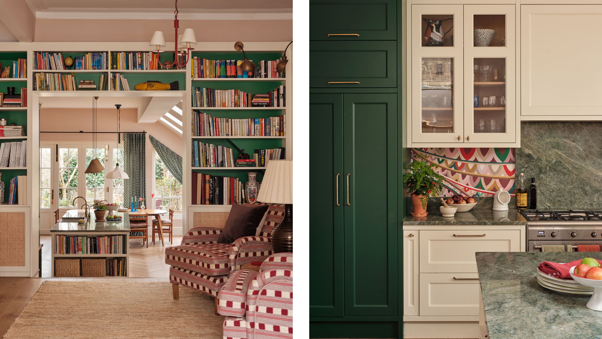
Oversized double doors lead from the front door into the living room, which Sophie chose deliberately to give the entrance more presence. With so much of the ground floor visible at once, getting the furniture and finishes to work together was particularly important. Instead of having a formal and awkward 'middle room' to dress, the home now boasts a seamless flow through to the kitchen.
To frame that transition, a custom bookcase, built by Blockhouse Build, acts as both a striking feature and a place to display books, objects, and oddities. 'Next to the huge bookcase, which helps to divide the sitting area from the kitchen beyond, is a small table for the record player with two red lacquer chairs, opposite a pair of oversized, deep armchairs. I particularly love the bookcase, as it adds so much character to the room,' says Sophie.
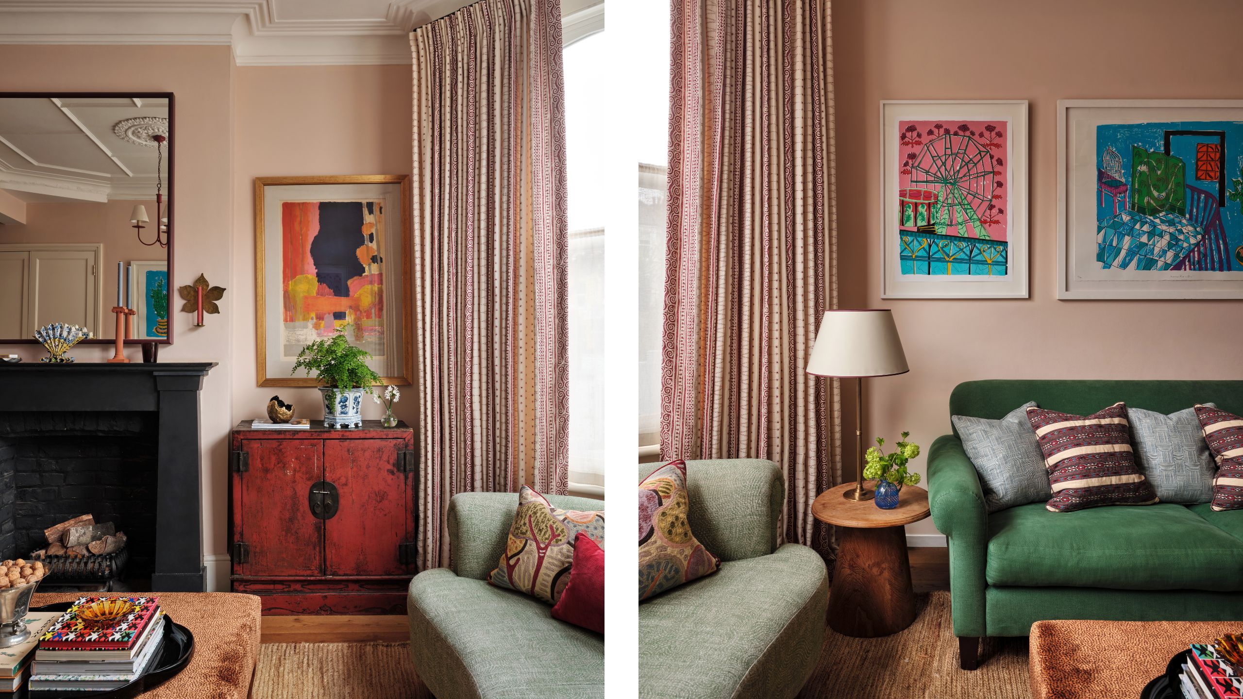
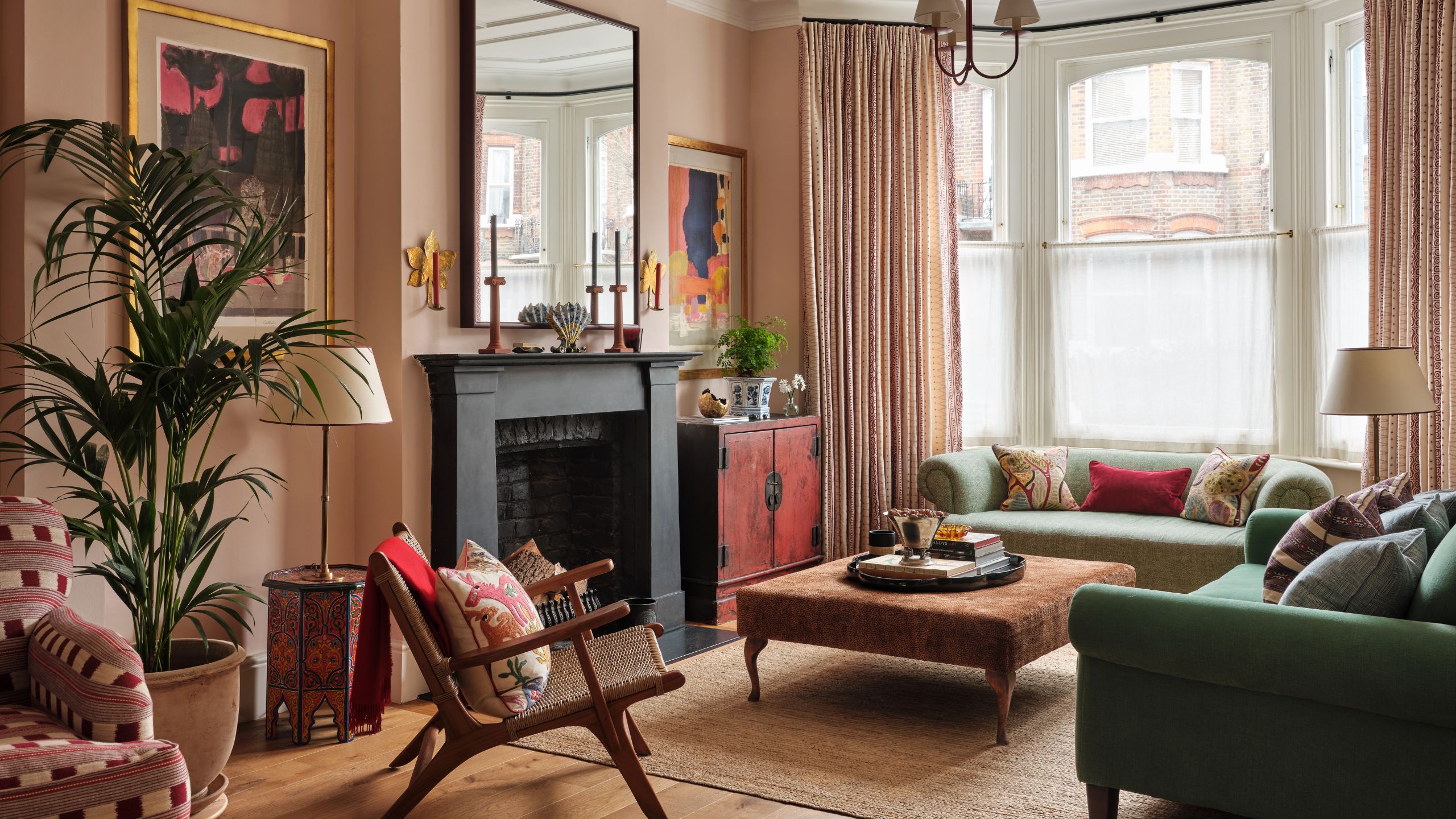
At the very front of the house, the main sitting area is arranged around the fireplace, with a collection of seating that makes the most of the room's generous proportions. A large ottoman anchors the main seating area, while the bay window presented a slightly trickier design challenge.
'Bay windows can often be tricky when it comes to finding seating in the right size and shape,' Sophie explains, 'so I was really pleased with how the kidney-shaped sofa made the most of the space,' she says. Its curved silhouette follows the shape of the window beautifully, while a verdant couch, patterned pillows and blush-pink walls create a playful but oh-so relaxed palette. A red antique cabinet adds another hit of color tucked beside the fireplace, with artwork and collected objects giving the room a further dose of personality.
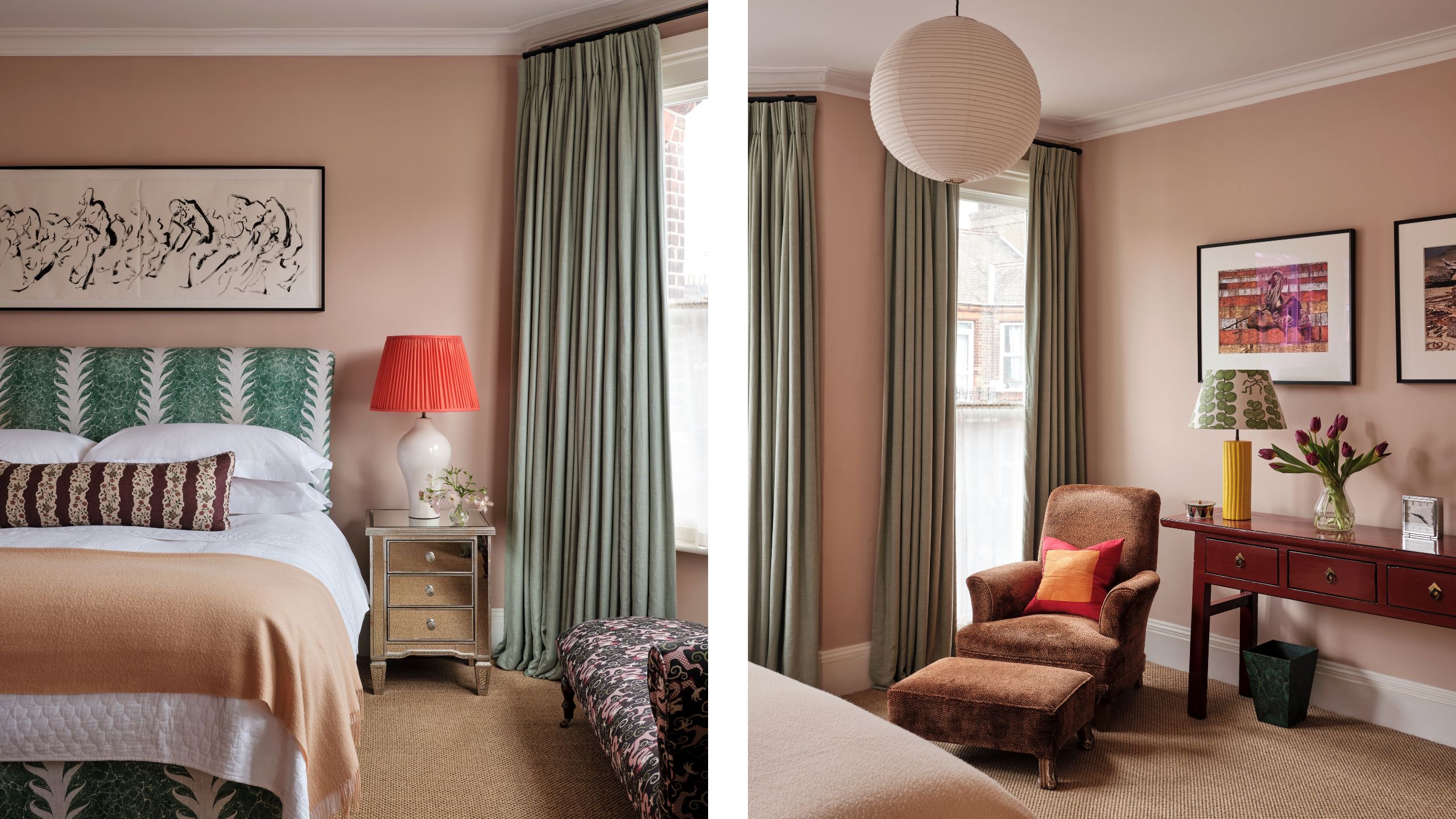
Upstairs, Sophie's bedroom displays her knack for combining pattern and color without letting it run too wild. Blush-pink walls continue up here, making a soft backdrop for the patterned bed, while sage drapes and crisp white bedding keep the palette feeling fresh. She chose a playful fabric from Beata Heuman for the bed, letting it shine against simpler curtains to 'keep the room feeling calm,' she explains.
Opposite, a chaise lounge purchased at auction adds further charm, while the armchair and ottoman are wrapped in a leopard velvet. 'The red console at the end of our bed is one of the only pieces of furniture we brought with us from our last house,' she adds. 'It was an eBay find about 15 years ago, which cost £50.'
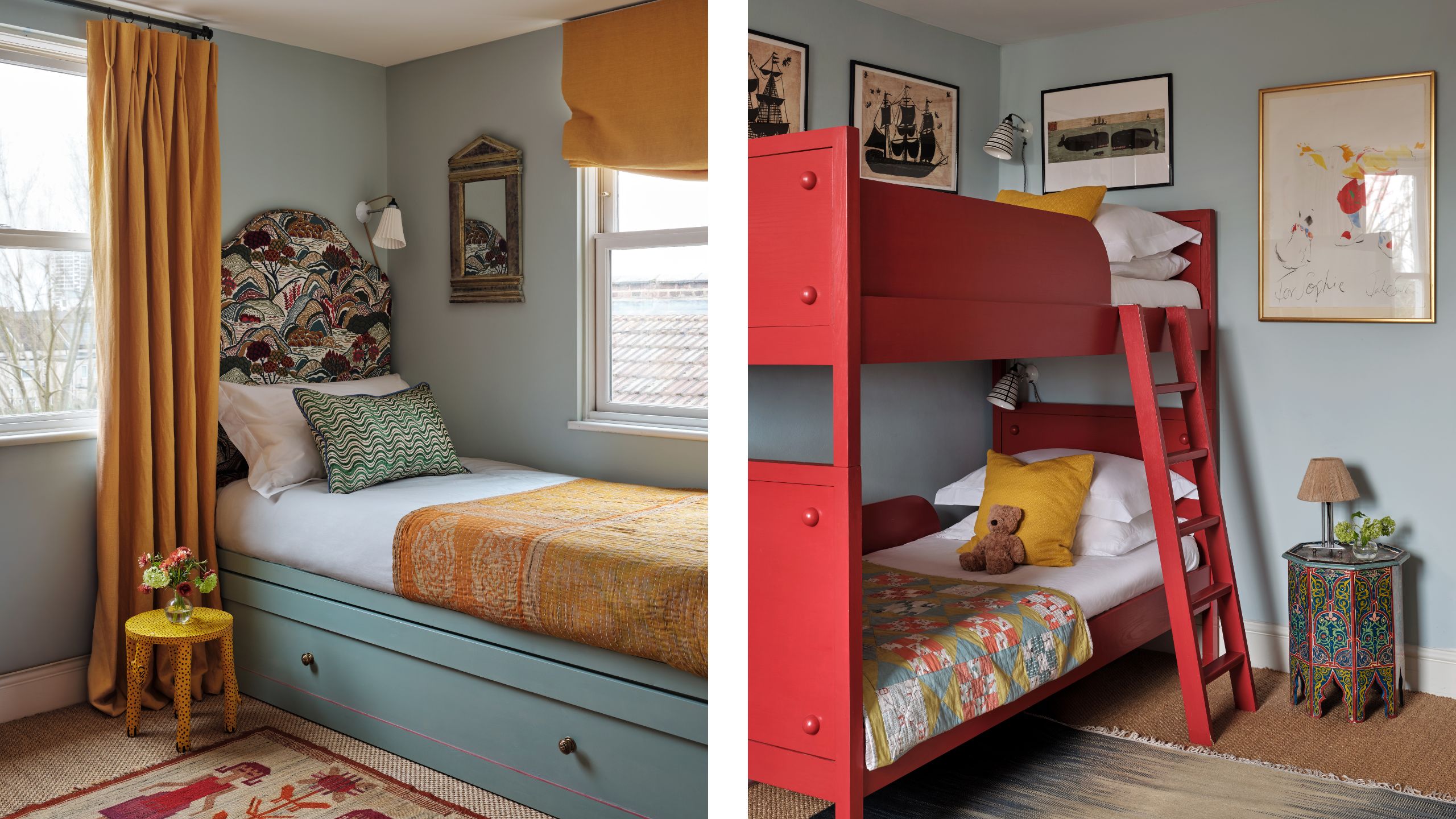
In the children's bedrooms, Sophie has embraced color and pattern while keeping longevity in mind. 'The idea behind both [my son's] room and my daughter’s was to create spaces that would work as they got older,' she explains. Her son's room is painted in Farrow & Ball's Borrowed Light, a soft blue that Sophie often returns to because, as she puts it, 'it’s calm without feeling cold.'
Both rooms make thoughtful use of space – in her daughter's bedroom, Sophie had a bed and wardrobe built in to maximize storage, with a pull-out trundle tucked beneath the bed for future sleepovers, only rivaled by the zingy red bunk beds in her son's room. An old Ministry of Defence desk and an auction-found armchair, painted dark blue and reupholstered in a Kit Kemp fabric, bring a vibrant mix of old and new. Artwork by Sophie's aunt, Edwina Sandys, completes the space.
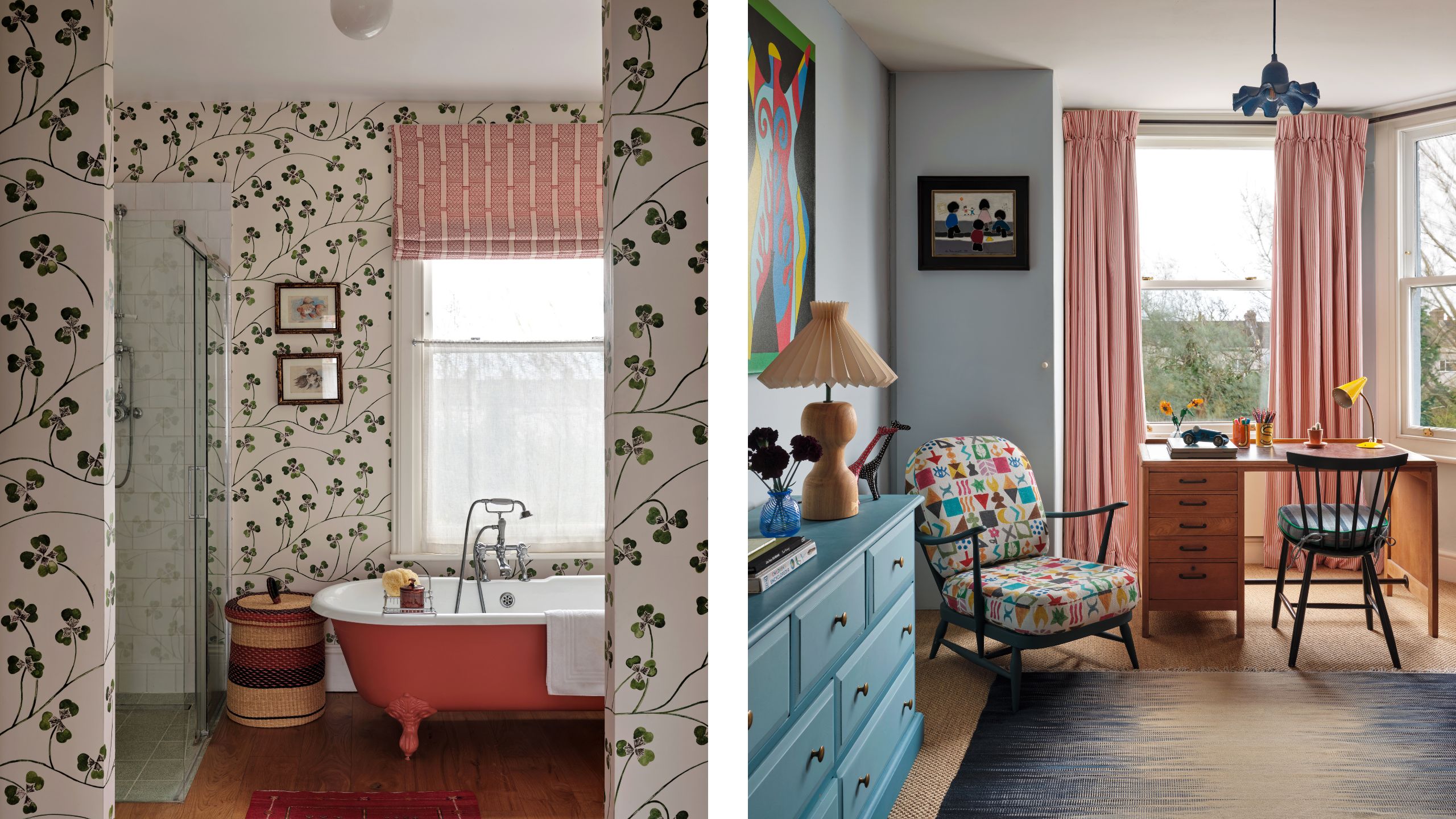
In the bathroom, Sophie hasn't shied away from pattern, wrapping the walls in CommonRoom's Lucky Leaf wallpaper, where the delicate foliage brings a garden-like feel to the space. 'I love using wallpaper in a bathroom,' she says, and this leafy design makes a lovely statement around the freestanding bath, painted in Farrow & Ball's Red Earth. The warm terracotta hue provides a striking contrast to the walls, while warm oak floorboards add another layer of warmth underfoot. It's a relatively simple combination, but one that gives the room plenty of character, proving that even a practical space such as a bathroom has permission to have a little fun.
Shop the Look
What makes Sophie's West London townhouse so successful is the way it balances considered yet joyful design with the realities of everyday life. Clever layout decisions have created room to breathe, while layered fabrics, vintage finds and confident color choices ensure the interiors never feel too serious or overly polished. There are plenty of clever ideas to take away, but it's the sense of personality running through every room that makes the house memorable.
Love beautiful design ideas, expert advice, and inspiring decor trends? Sign up for our newsletter and get the latest features delivered straight to your inbox.