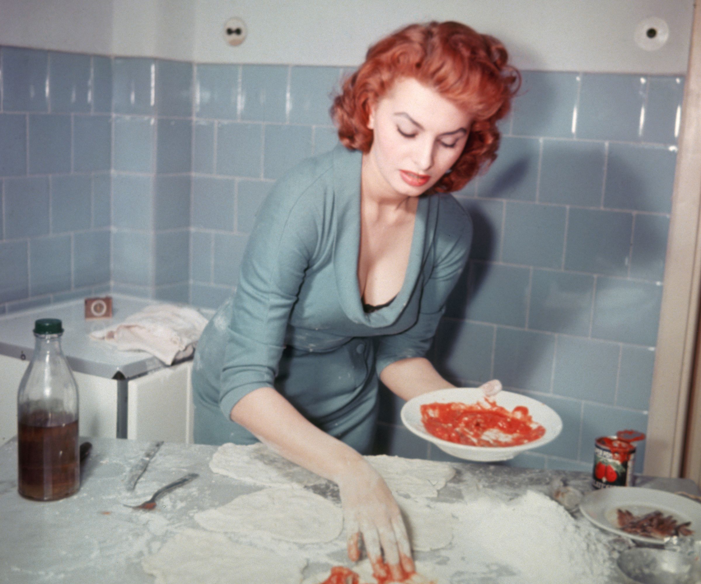
There are plenty of ways to measure the passage of time, but interiors have their own calendar. Kitchen colors fall in and out of favor, yet blue has never quite had its moment of departure. Sophia Loren understood its staying power in 1965, when the powder-blue tiles in her Roman estate taught a lesson in using color without overcomplicating a space.
Located in Marino, just outside Rome, Villa Sara was a 16th-century property rich in history. But at the heart of the grand estate was a welcoming kitchen, with blue tiles covering the walls.
Photographs from 1965 show Loren making pizza at the counter, offering insight into how the kitchen was used every day. The contrast between the historic villa and its relaxed kitchen is what makes the space so beautiful. More than 60 years later, her blue kitchen tile ideas still feel just as fresh.
Today, I'd use these similarly glossy tiles from The Home Depot, whether on your backsplash or throughout your space (as she demonstrates).
Shop the Powder Blue Kitchen Edit
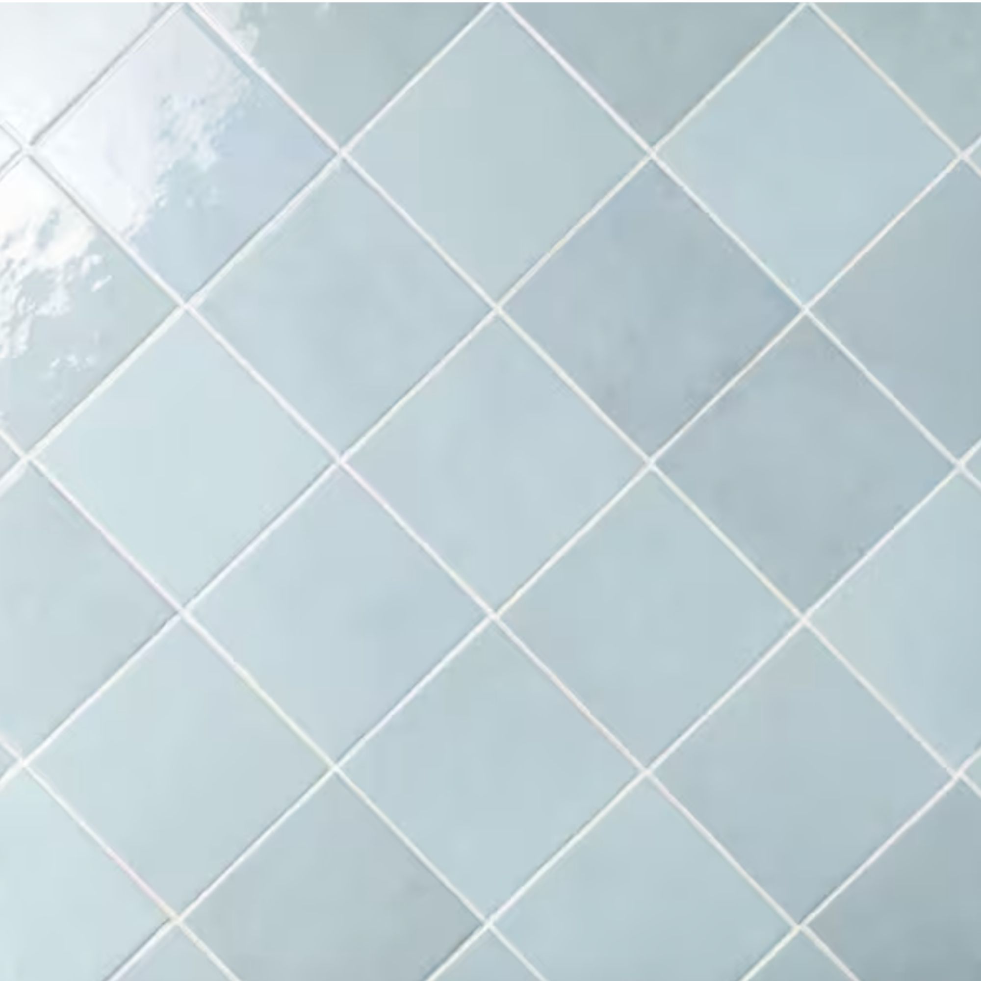
Cloe Glossy Baby Blue Tiles
Inspired by the beautiful tiles in Sophia's kitchen, this baby blue design is an easy way to bring color into a kitchen without going too bold. The glossy finish catches the light, while the handmade look gives the tiles an old-world feel that suits Sophia's style.

AERIN x Williams Sonoma Scalloped Placemats
These powder blue placemats bring a touch of Italian elegance to the table, with scalloped edges that feel both classic and curated. I'd pair them with white linens and ceramic plates for a setting that feels straight out of a European summer home (even in these cooler months).
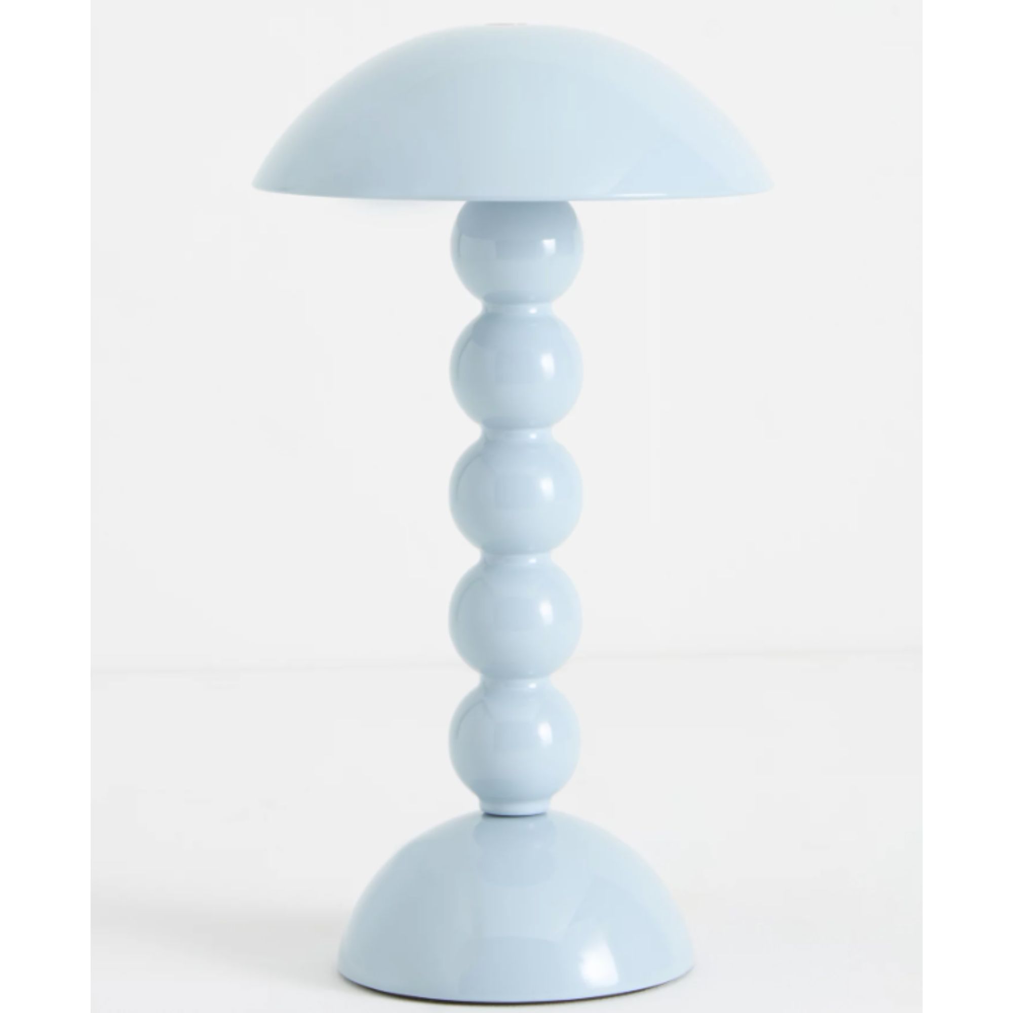
Addison Ross Bobbin Rechargeable Table Lamp
I have one of these lamps in my kitchen, and it's a lovely way to add personality to the countertop. The bobbin-style base gives it a playful twist, while the baby blue finish adds color without feeling out of place among more classic kitchen pieces.
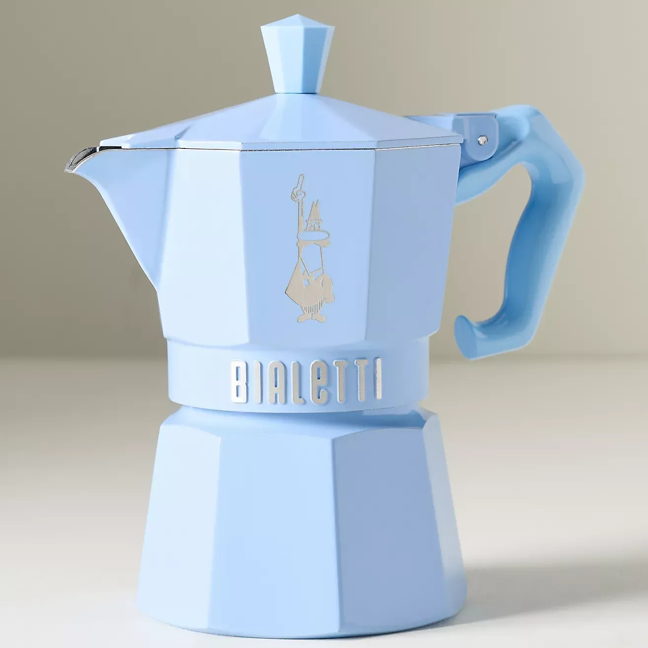
As an Italian staple, the Bialetti moka pot feels perfectly at home in kitchen inspired by Sophia's space. This powder blue version adds a pop of vibrancy to the countertop, making the everyday ritual of making coffee feel so much more special.
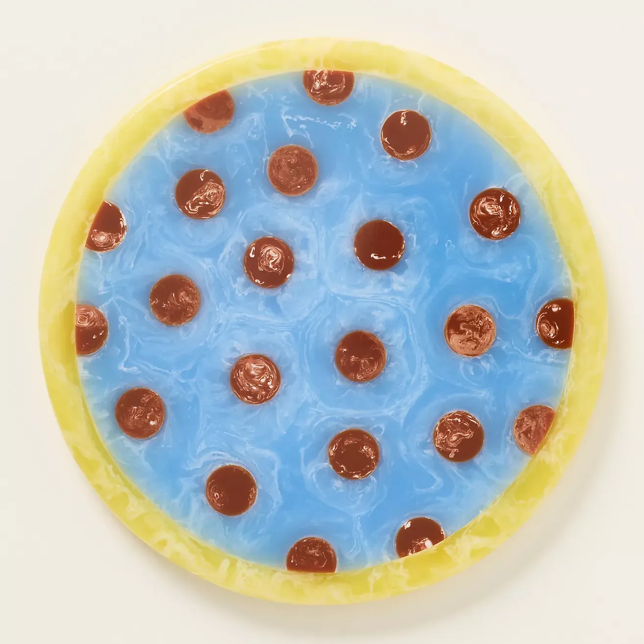
With its playful polka dots and glossy finish, this cheeseboard makes a welcome change from plain wood or marble. Style it with a few favorite cheeses and a bowl of olives for an Italian-inspired aperitivo spread, even if you're oceans away.
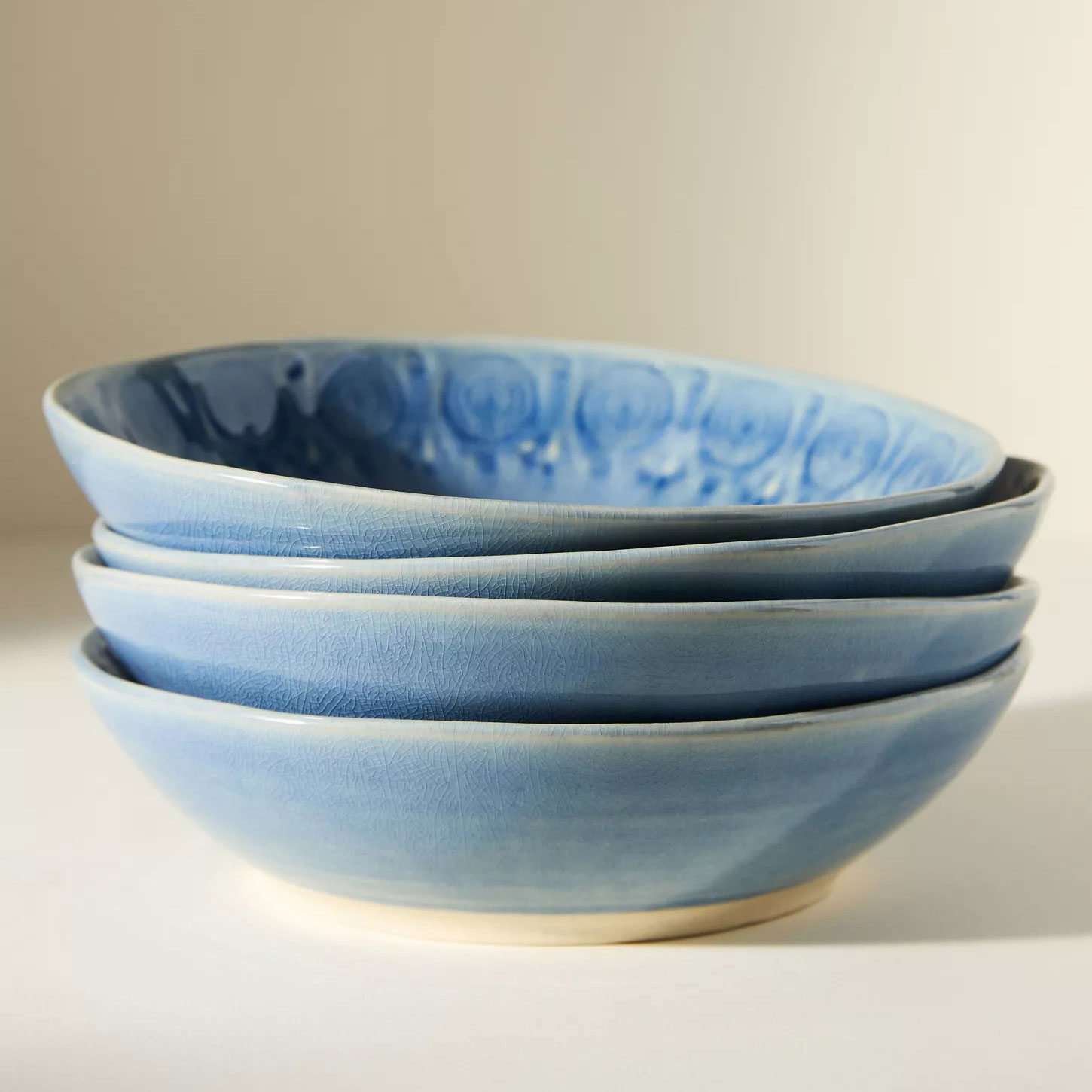
Old Havana Pasta Bowls, Set of 4
The Old Havana collection has been a favorite since 2012, and it's easy to see why. Made in Portugal, each piece features a distinctive glaze that adds color and character to the table. Mix different finishes, or stick to one palette for a more classic look.
Grazzie Wilson, Head of Creative at Ca’ Pietra, believes this lasting appeal comes down to the balance blue strikes between color and neutrality.
'Baby blue is one of those colors that never really packs its bags and leaves,' says Grazzie.
'It might disappear from the spotlight occasionally, but it always finds its way back into our kitchens, and for good reason. It has all the freshness of a neutral, but with a little more charm and personality. There’s something wonderfully nostalgic about it, too. It reminds us of old-fashioned country kitchens, mismatched crockery and the sort of home where there's always something delicious in the oven.'
Design expertise in your inbox – from inspiring decorating ideas and beautiful celebrity homes to practical gardening advice and shopping round-ups.
Part of the enduring appeal is how easy it is to decorate with blue alongside other colors and materials. You don't need to commit to a single palette, as it pairs well with warmer shades and natural finishes, giving a kitchen a more personal feel.
'What I particularly love about blue tiles is how easily they can change character depending on what you put around them,' Grazzie explains.
'Pair baby blue with butter yellow, warm cream and honey-toned wood, and suddenly you've got a kitchen that feels like a little slice of the French countryside. Add burgundy, chocolate brown or even a splash of tomato red, and things get much more interesting. Blue is surprisingly happy to share the limelight, so don't feel you have to keep everything else quiet.'
When it comes to putting the look into practice, Grazzie recommends resisting the temptation to match every element.
'I'm also a big believer in letting blue tiles have a little fun. Rather than automatically reaching for perfectly matching cabinetry, play with contrast, mix in vintage furniture, hang some interesting artwork and bring out the patterned crockery,' Grazzie adds.
'A kitchen should feel like somewhere you actually live, not somewhere you're afraid to spill the tea! There's a reason we've loved this combination for centuries, but that doesn't mean we can't give it a thoroughly modern twist. The trick is to embrace its history without making the whole kitchen feel like a museum.'
Sophia's kitchen is a reminder that good design doesn't need to follow the latest color trend to be endlessly beautiful. Blue tiles, neutral paint, and collected pieces can work just as well today as they did in 1965, and I expect they'll look just as chic in another 60 years from now.