There's a home in Pacific Palisades that has served as a sanctuary for Goldie Hawn and now for her daughter, Kate Hudson. As one might expect from a home with this kind of history, it is a trove of nostalgia, most evident in the sage-green living room.
Curated in collaboration with the revered studio Pierce & Ward, the space is layered with pieces that celebrate its heritage. Designers Emily Ward and Louisa Pierce, along with Kate, used a whimsical wallpaper (Morris & Co.’s Pimpernel, available at Anthropologie, to be exact) to cover the walls. Pierce & Ward's collection at West Elm is another beautiful way to bring this design duo's aesthetic home.
Kate's wallpaper's white blooms are set against a muted sage ground, while matching green wainscoting carries the color across the lower half of the room, where she has decorated with antiques and wooden furnishings like a pro.
The sage green base brings the scheme together, giving the layers of pattern a versatile backdrop to play against.
Shop the Sage Green Living Room Edit
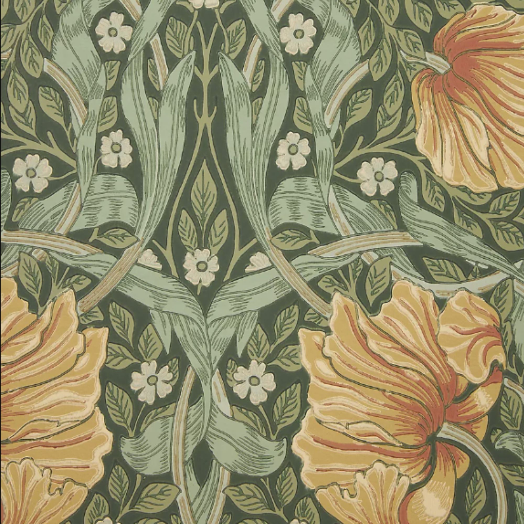
Morris & Co. Pimpernel Floral Wallpaper
Designed by William Morris in 1876, this iconic wallpaper features delicate white blooms across a muted sage backdrop. Its botanical motif brings an immediate sense of nostalgia that Kate herself can't resist in her home.

Sage Green Small Round Scallop Tray
A decorative tray is an easy way to give sage green a purpose beyond the walls and upholstery. I love this one from Addison Ross because its hand-polished lacquer and scalloped edge bring the same old-school charm as Kate's space.
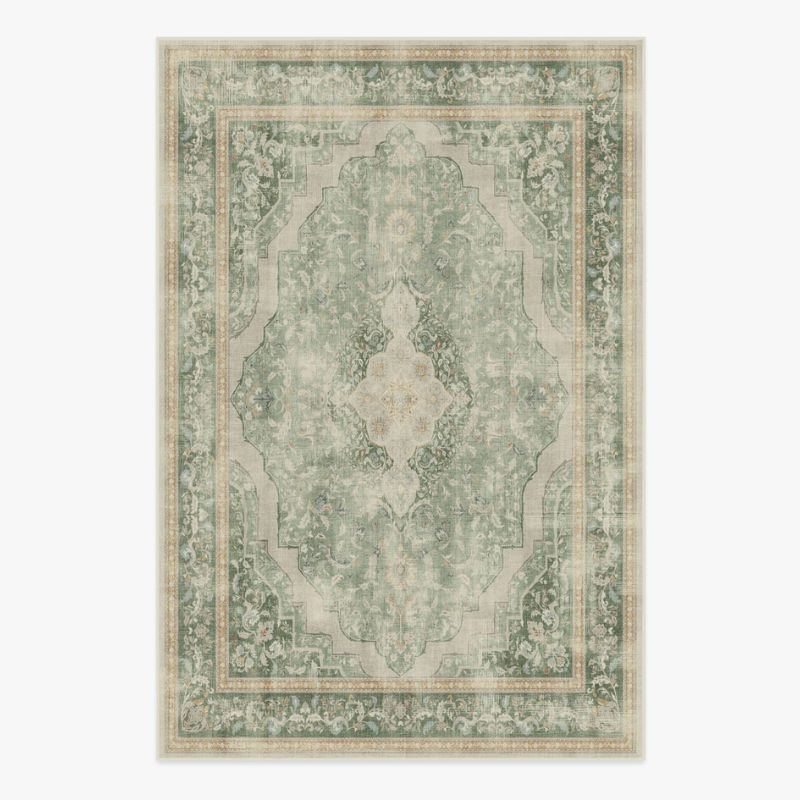
A rug is an easy way to give a sage green living room more character, bringing in a pattern that can stop a green scheme from feeling too flat. I particularly like that it has a vintage feel, while being machine washable and designed for real spaces.
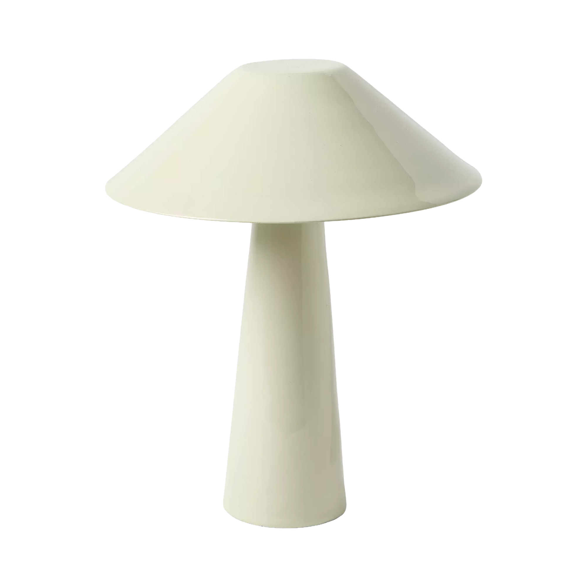
Brooks Tapered Cordless Table Lamp
The power of a beautiful table lamp lies in its ability to instantly elevate a room's mood. This rechargeable design is especially lovely for creating a layered glow wherever you need it, without worrying about being close to a socket.

Wooden Vintage Arched Wall Mirror
While it's not sage green, Kate still exhibits an ornate mirror at the center of her living room. A clever accessory that acts as a focal point and creates the illusion of more space, a mirror is an understated staple that will add ambiance against any wallpaper.
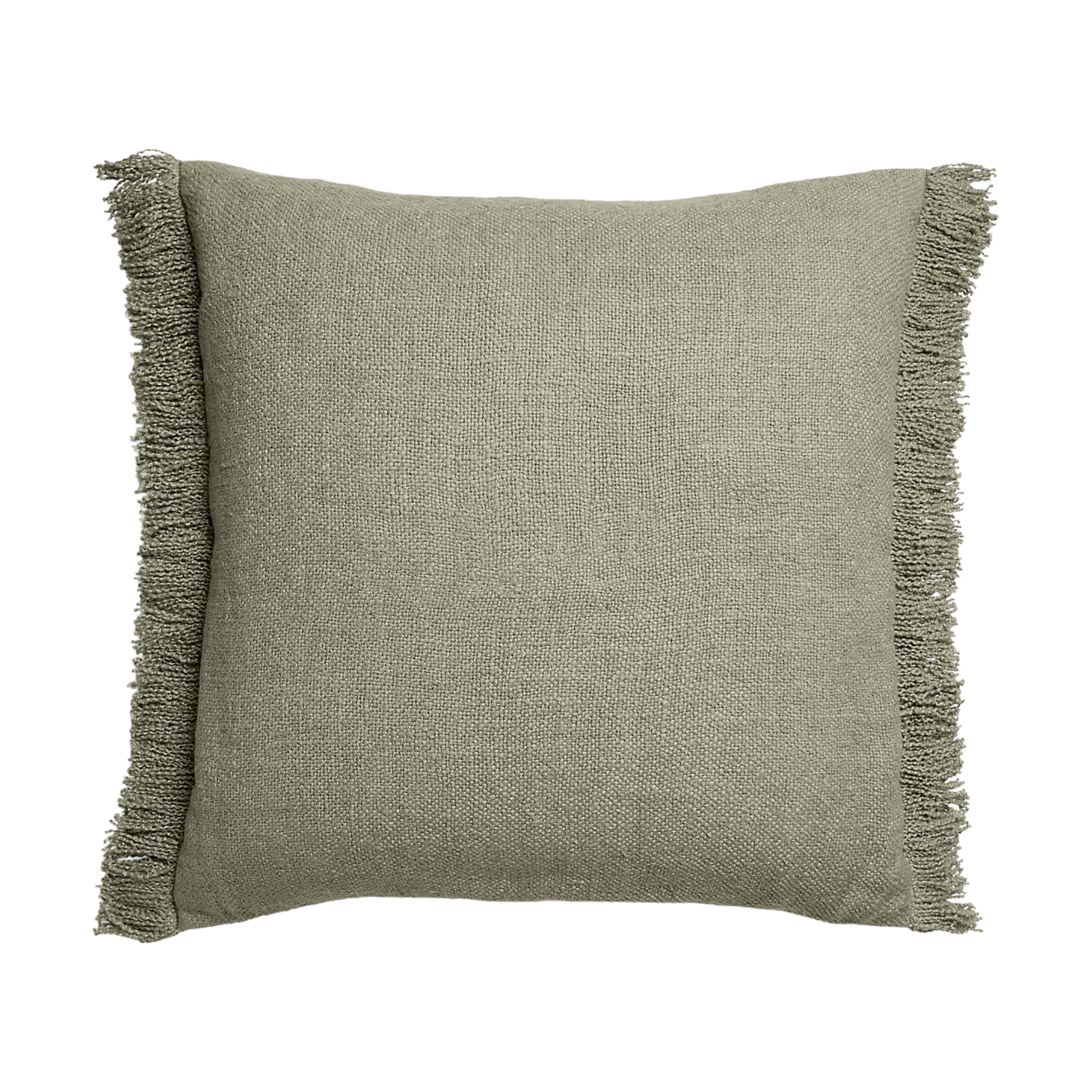
Shadow Sage Green Throw Pillow Cover
Dark sage throw pillows add a sophisticated depth to a sofa or armchair, especially when layered with cream linen or rich, earthy velvet. Place this cushion alongside some floral wallpaper for a look that's so nostalgic and surely Kate-approved.
Despite the combination of wallpaper, woodwork, and furnishings, the space doesn't feel overwhelming. The colors have enough in common to make the room feel curated rather than overly busy. It’s an ingenious approach for anyone who loves decorating with pattern: Take a softer shade from the wallpaper or fabric and carry it through the rest of the room for a sense of continuity.
There’s a reason these softer, nature-inspired shades work so well as a starting point. Catharina Björkman, a Scandi homes and interiors expert at Contura, suggests looking to the outdoors when choosing a color palette.
‘When it comes to creating the perfect color palette for your home, look to nature,’ Catharina explains. ‘In a world that continues to be filled with stresses and strains, natural colors are often linked to feelings of calm and peacefulness. The natural world offers a kaleidoscope of neutral colors which can provide a soothing foundation in any interior, think sage greens, cloudy grays, sky blues and eggshell whites. These colors work particularly well when used across large spaces such as walls, doors and ceilings.’
Design expertise in your inbox – from inspiring decorating ideas and beautiful celebrity homes to practical gardening advice and shopping round-ups.
The depth of the shade can also be tailored to the way you use a room. ‘Consider each room’s function; for example, use darker shades for spaces where you seek comfort and coziness, such as the living room, and opt for lighter tones in areas where productivity is key, such as a home office,’ she says.
Kate’s living room makes a particularly beautiful case for allowing sage to truly take center stage. Used across the wainscoting and wallpaper, it becomes the uniting factor that ties the room together.
If you’re considering a statement floral wallpaper, this is a blueprint worth following. It can make even a richly patterned scheme feel remarkably easy to live with.