It's not unusual for an interior designer to return to clients more than once, but it's far rarer to return to the same room twice – especially to redesign a kitchen into something entirely different. But it's the unique scenario the team at Amber Interiors found themselves in when they were called back to this authentic Cliff May ranch.
This wasn't the usual transformation that starts with a dated, dingy scheme, but rather a case of different styles. 'The story behind this house is kind of wild. We'd fully designed it for a client who loved color, pattern, and bold tile. Then the house changed hands, and the new owners wanted the opposite: clean, minimal, nothing . So the kitchen became an exercise in creating impact with less,' designer and founder Amber Lewis recalls.
'We let the architecture and a handful of humble, beautifully textured materials do the heavy lifting: white oak, plaster, brick, stone, and blackened metal under rustic wood beams. It's warm, it has a little old-world soul, and it's edited within an inch of its life (in the best way).' Here's how she took a bold, colorful scheme and turned it into a calm yet beautifully layered neutral kitchen.
Infuse Warmth With Natural Materials
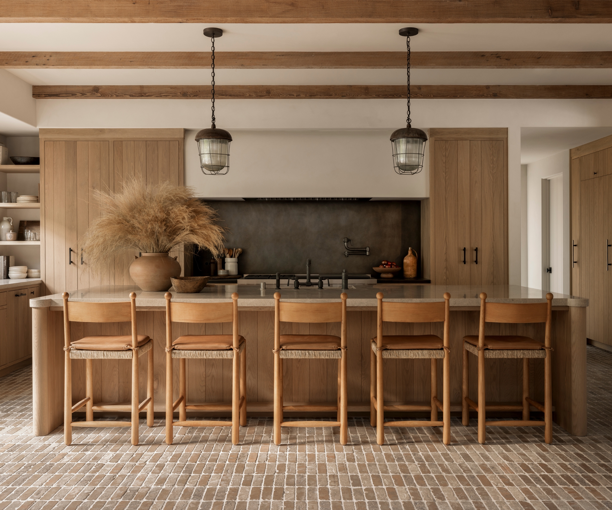
A pared-back, minimal kitchen doesn't have to be stark or boring. Tactile finishes and organic materials seamlessly replace bright colors and maximalist patterns, creating a warm, inviting kitchen that doesn't overwhelm. 'When you strip a room back to sleek cabinetry and pared-back surfaces, it can go cold and sterile fast. Natural materials are my secret weapon against that. Brick underfoot, tumbled stone, metal counters, plaster walls and white oak all bring texture and the kind of quiet variation you feel more than see,' Amber explains.
While the wood cabinetry certainly sets the tone for the space, the organic texture and tonal variations in the kitchen flooring instantly catch your eye. 'It's a small tumbled brick laid in a running bond, in this dreamy mix of blush, sand and gray. In a room this pared back, the floor is where the pattern and age get to sneak in. It gives the kitchen the feel of an old European courtyard, like an outdoor material that wandered inside. And practically? It's basically indestructible. With little kids in the house, that variation hides a lot of real life, and it only gets better with wear,' she adds.
Use Cabinetry To Add Lived-In Style
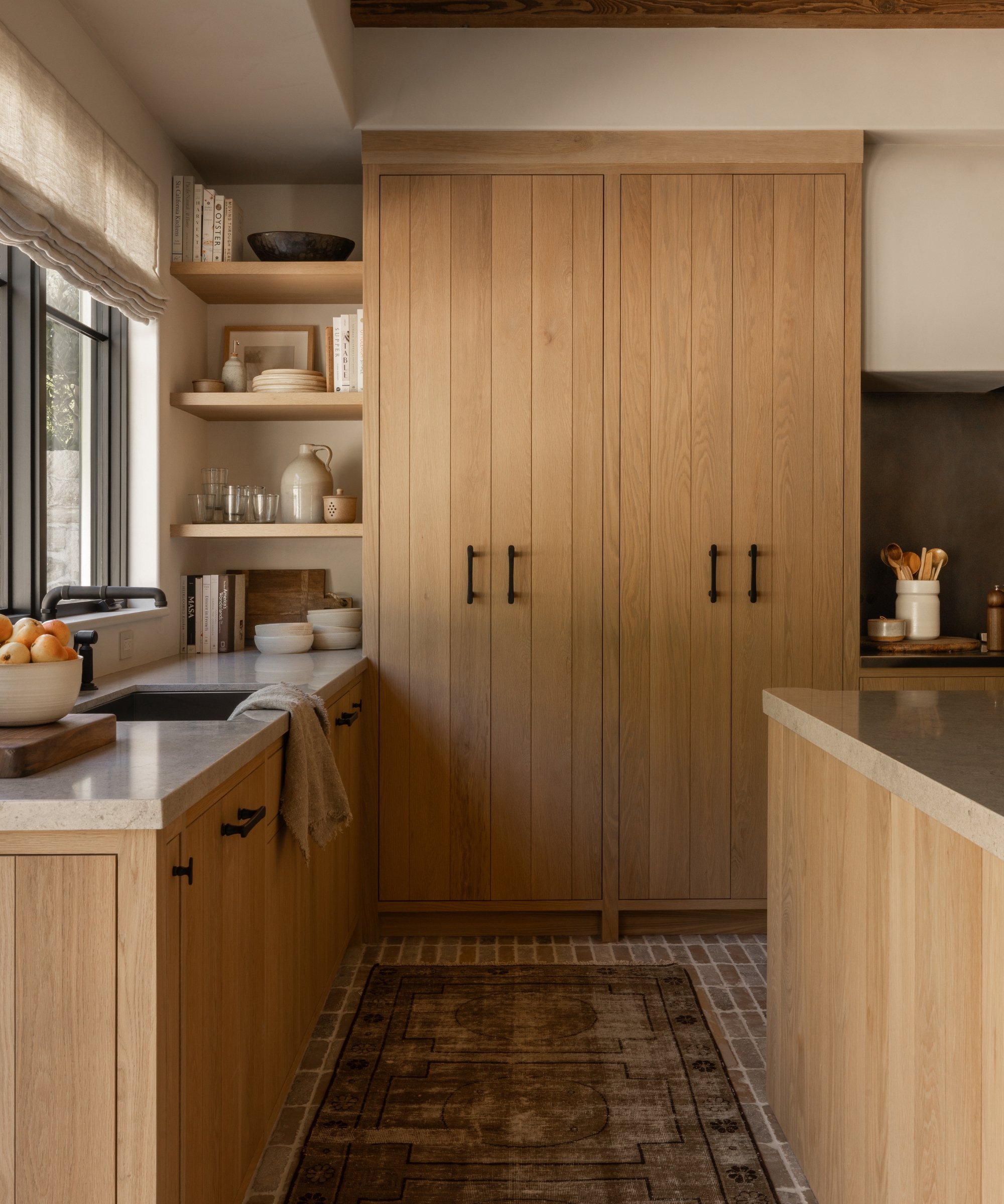
It's easy to overlook the visual impact your chosen kitchen cabinets can have on the design. It's not just about color and storage – the right style adds texture and interest, especially in a pared-back, neutral design. And in this kitchen, the cabinetry had to work harder, bringing movement, textural interest, and a less kitchen-y feel, which is where the shiplap-inspired fronts come in.
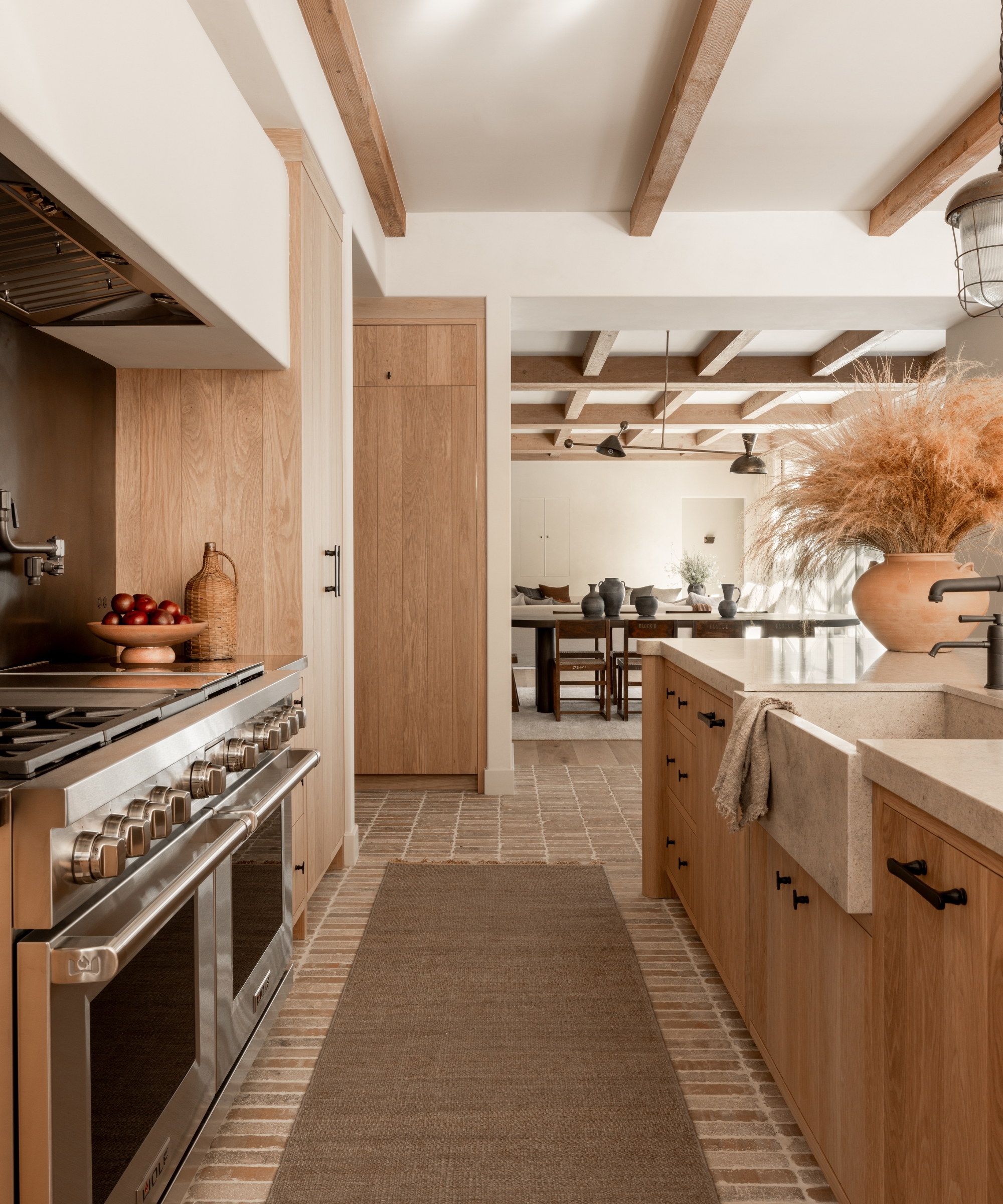
'I wanted the cabinetry to feel more like beautiful millwork than ,' Amber recalls. 'The white oak planks run floor to ceiling around the range and along the back wall, and the fridge, pantry, and storage all disappear behind them. Out of sight, out of mind, which was perfect for clients who didn't want a single thing extra. The vertical lines give the room rhythm and texture without any fuss, and they pull your eye up so the ceilings feel even taller.'
Design expertise in your inbox – from inspiring decorating ideas and beautiful celebrity homes to practical gardening advice and shopping round-ups.
Transform a Range Area Into the Heart of the Kitchen With Darker Tones
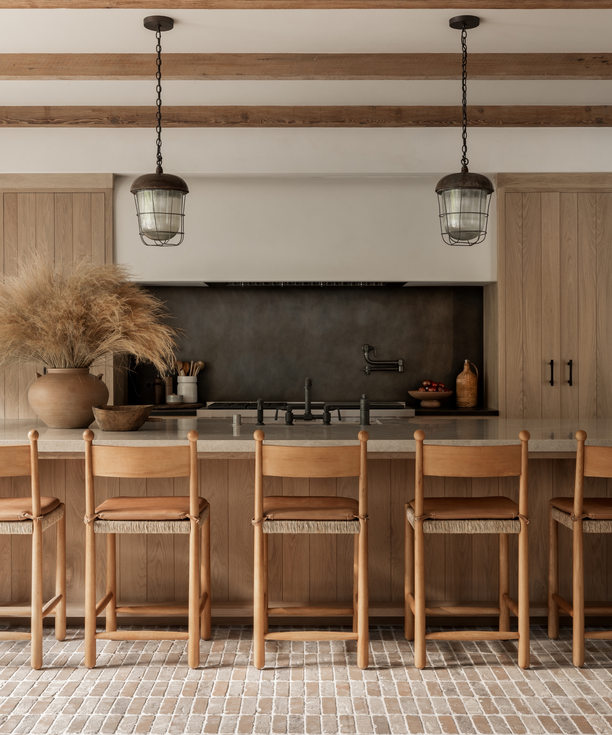
Modern spaces often overlook the range cooker area, opting to hide it rather than make it a focal point. But Amber had a different approach here, choosing to reinstate the range as the true heart of the kitchen. Centered and framed by a built-in range hood and flanked by full-length cabinetry, it's the dark backsplash that allows this nook to really stand out.
'The range wall is the heart of this kitchen. A big professional range sits under a simple plaster hood that melts right into the ceiling, with tall oak columns on either side,' she describes. 'Then we ran a dark, patinated metal backsplash all the way up to the hood, with a matching counter on each side of the range. I always say every room needs a touch of black, because it grounds everything and pulls the whole space together. Against all that pale oak and plaster, the dark metal does exactly that. Bonus: it's incredibly forgiving, which every busy kitchen needs.'
Design a Pantry That Feels Cohesive With the Main Kitchen
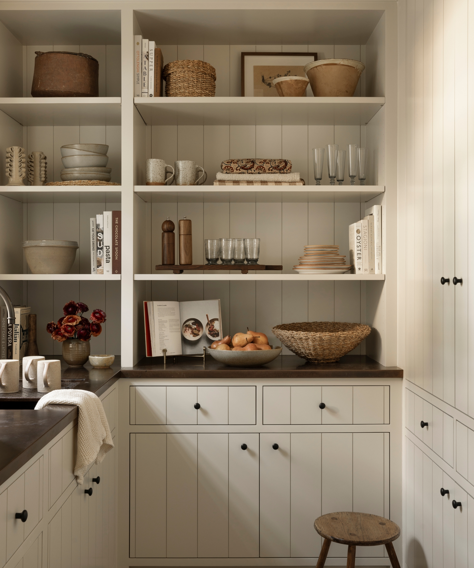
Your kitchen and pantry work in harmony, so the design should, too. It's easy to overlook these smaller storage spaces as purely functional, but they offer a charming opportunity to play with materials. In this project, Amber brought the same flooring and cabinetry style into the pantry, but used a soft neutral to create a light, inviting space, and dark countertops that tie back to the backsplash behind the range.
It's easy to see why she highlighted this space as a standout feature. 'So, it’s not technically the kitchen, but tucked just down the hall is the oh-so-cute pantry, and it’s my favorite. The built-in shiplap cabinetry adds just enough contrast through its lines and hardware while still feeling true to the clean aesthetic. Plus, my Virgo soul loves an organized space, so the mix of open display and tucked-away storage checks all my boxes!'
Add Unexpected Industrial Style With Hardware
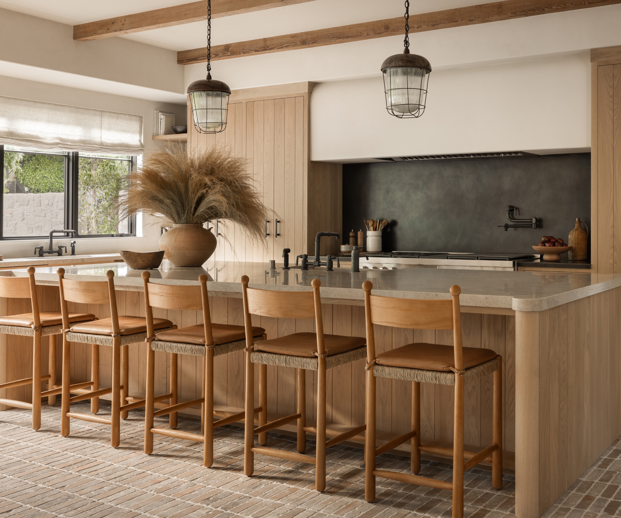
Never underestimate the power of hardware – specifically, the visual impact it has on a kitchen. While brass is favored for a classic look, a more minimal scheme requires something unexpected to bring another layer of interest. And in this kitchen, faucets and handles brought a more industrial look. 'A room this soft and neutral needs a little grit; otherwise, it can tip into too sweet,' Amber notes.
'The caged glass pendants, blackened bar pulls, and dark bridge faucets have that utilitarian edge I love. They work like punctuation marks, adding contrast and keeping the oak and plaster honest. We used naturally patinated finishes throughout the house because they bring quiet character without any upkeep. The clients wanted low-maintenance, and these finishes only look better with time.'
Create a Cozy Dining Nook
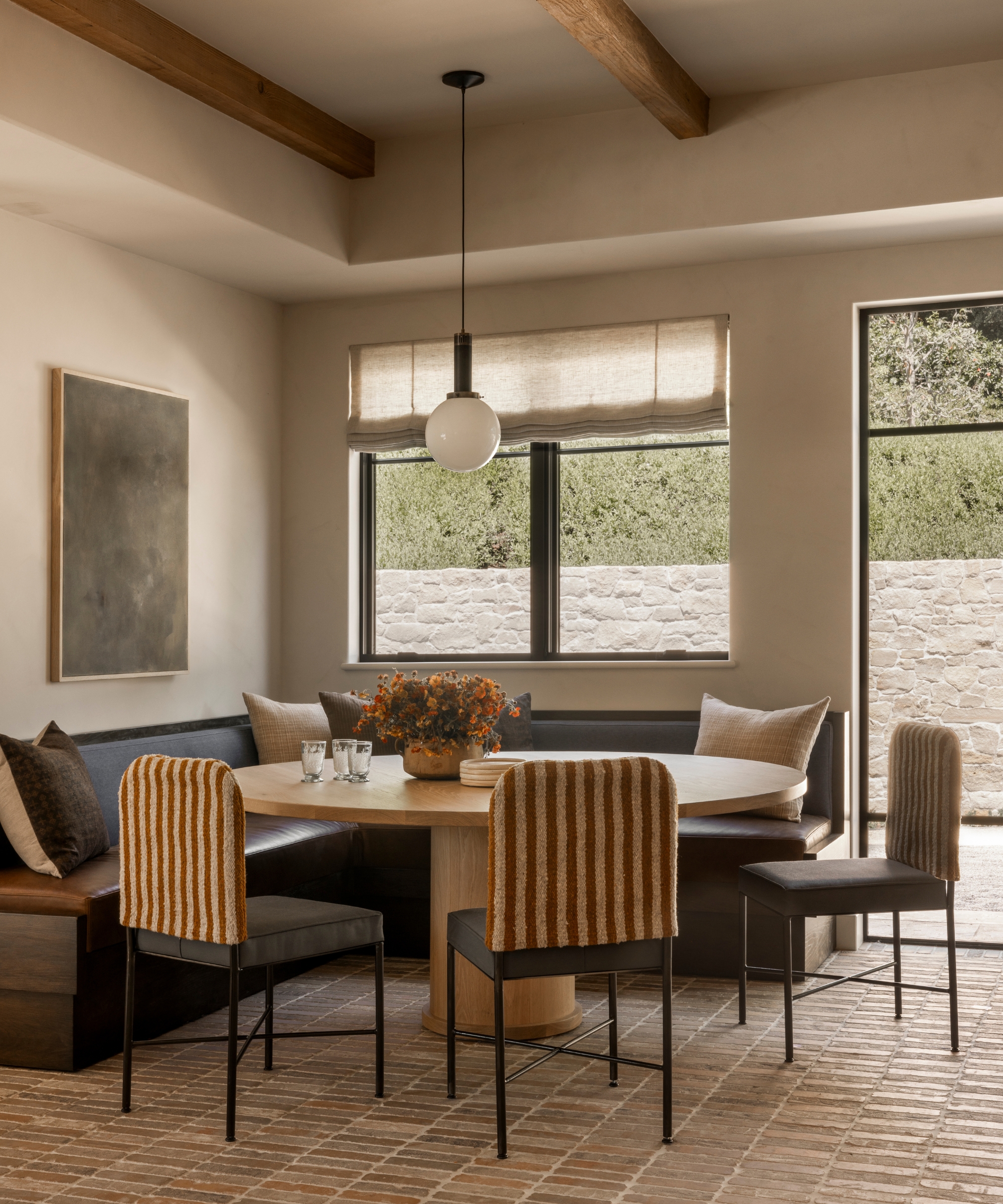
Just as the cabinet design created a more lived-in feel, the dining nook also brings a softer edge. It taps into the movement towards kitchens that do more than just function, and the upholstered banquette seating offers a cozier, more comfortable space to sit and really enjoy the kitchen. Even though there's a touch more color in this corner, it still feels perfectly at home in the minimal design.
'This nook is a built-in banquette that wraps the corner in charcoal upholstery, around a round oak pedestal table. The chairs have black frames and charcoal seats, with backs slipcovered in a caramel-and-cream stripe. That stripe is the one little hit of pattern in the kitchen, and it picks up the warm tones of the brick and oak,' Amber explains.
The smaller, decorative details were just as important in the design's success. 'A white globe pendant, linen shades, and a soft gray artwork keep everything calm. My rule is that a nook always needs a job, and this one's job is everyday family meals. A banquette fits more people than chairs alone; it's cozy for the kids, and the round table keeps everything flowing in a corner.'
- Choose natural materials to add warmth to a neutral kitchen
- Let your cabinetry be more than just storage – they're a design feature, too
- Use contrast to reinstate your range as the focal point
- Don't forget about your pantry – it deserves a beautiful design, too
- Introduce hardware that adds an unexpected feature, whether it's the style or finish
- Make your dining nook an opportunity to experiment with color and texture, but be conscious of how it marries with the rest of the room
This kitchen proves a pared-back, minimal design doesn't have to be boring, nor does it require a palette of plain white. This design feels layered, textured, and full of warmth. It's exciting and interesting without being bold or busy. 'Minimalism so often gets mistaken for emptiness, but for me it's all about refinement,' Amber adds. 'When there are only a few elements in a room, each one had better have some character. And with those stone garden walls right outside the windows, it felt only natural to bring that same earthiness inside.'
Shop the Look
At Homes & Gardens, we believe a kitchen should work as beautifully as it looks. That’s the philosophy behind , our new series exploring the world’s most inspiring cook spaces. From clever layouts to the 'it' materials of 2026, we’re uncovering the design lessons tucked inside every home. Join us for an intimate look at the spaces that define modern living – and find the blueprints for your next big project