When the Seattle-based designer Emily Ruff of Cohesively Curated was tasked with reimagining this 1926 home, the property was uninhabited, having been stripped all the way back to its studs. Her brief was to transform it into a warm, characterful sanctuary that makes hosting a dream.
To do so, Emily began by reimagining the layout to include more bedrooms, while thoughtfully designing architectural details to let the interiors once again nod to its early twentieth-century heritage.
Once the room reconfigurations had taken shape, attention turned to the decor, which was all about imparting warmth while nodding to the charming and cozy sensibilities of English decorating. Throughout, ditsy floral-patterned wallpapers, rich wood tones, warm brass, and textured stone lead the way, while there was a conscious effort to pay homage to the client's favorite color: yellow.
But, in keeping with the timeless, calming feel that runs through every room, decorating with yellow was dialed down – think creamy neutrals, pops of earthy yellow in wallpapers, and a slightly bolder, but still endlessly calming application on the bedroom walls. 'Incorporating the color throughout the home helped to make the spaces feel continuous, but each space still feels special and unique,' Emily tells me.
'Incorporating pattern and color was very important,' she adds. 'We used four different wallpapers, all with different floral block print patterns, and two that were grasscloth to add texture. Without pattern, it is really difficult to achieve the collected, warm, cozy feeling we wanted for this home.'
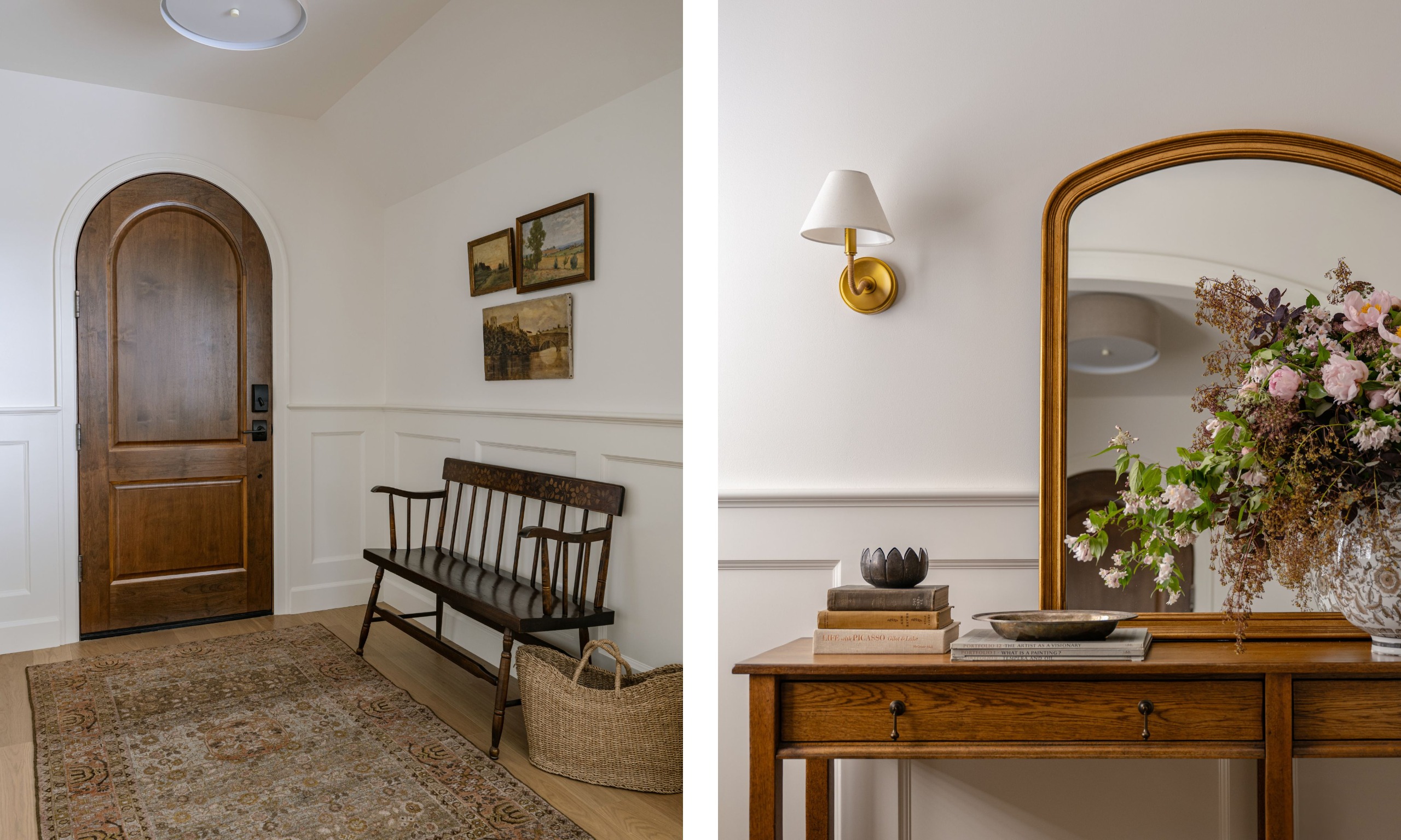
Adding architectural interest ensured the newly planned interior didn't actually feel brand new, but in keeping with the home's historic exterior style. 'One of the larger architectural ideas throughout the house was introducing curved and arched openings, and the entry sets that language up immediately,' says Emily. 'I wanted those elements to feel architectural rather than decorative, so they are paired with fairly restrained wall paneling and a soft white paint palette.'
Despite the pared-back entryway color palette, the room offers plenty of interest through its vintage decor and rich wood tones. 'The dark wood console, vintage-style rug, and collected artwork keep the entry from feeling overly formal,' she says.
Design expertise in your inbox – from inspiring decorating ideas and beautiful celebrity homes to practical gardening advice and shopping round-ups.
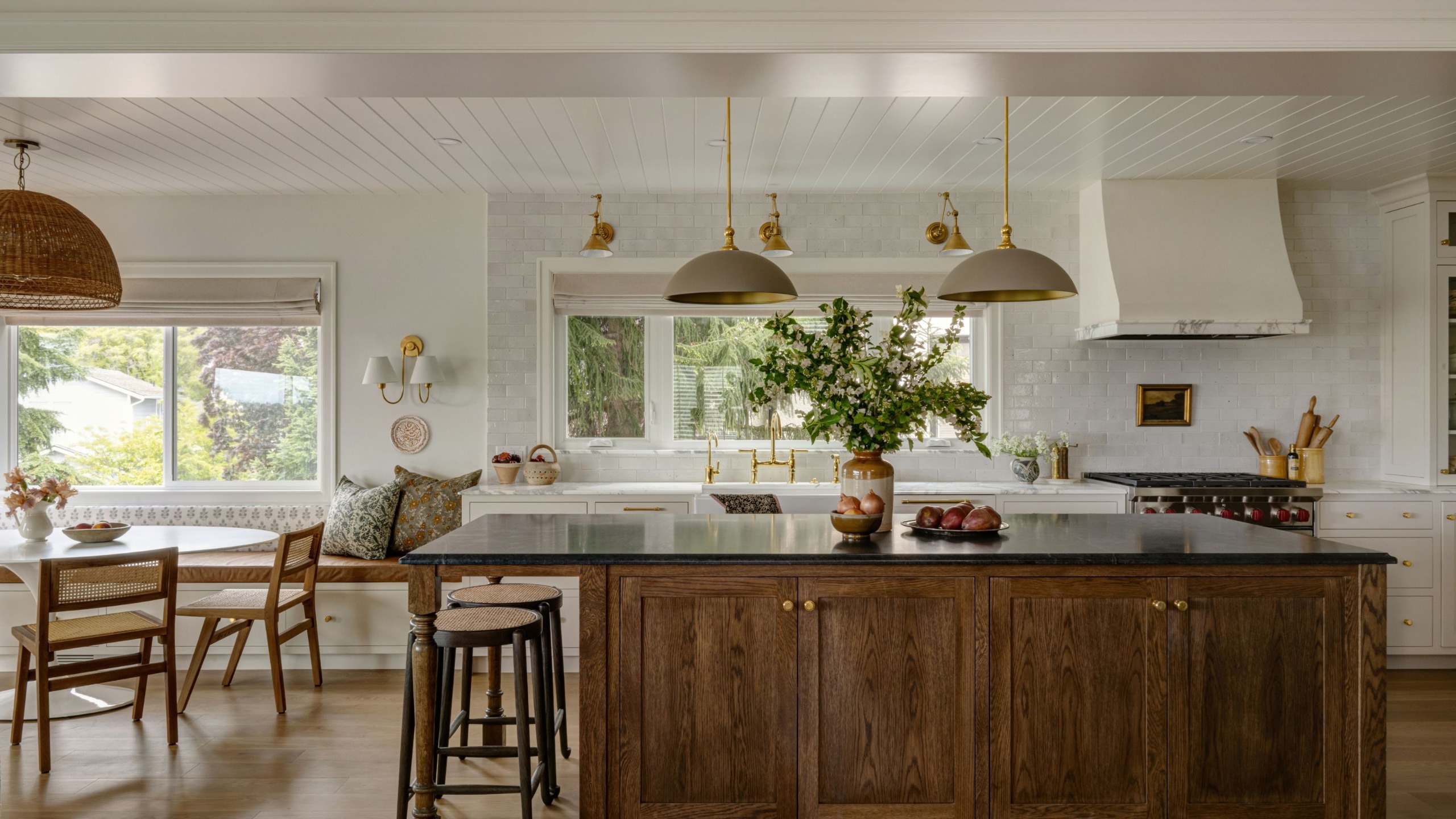
'I wanted the kitchen to feel as though it could have always belonged in the house rather than feeling like a new kitchen inserted into an older home,' Emily tells . To do so, she turned to earthy, neutral kitchen ideas, made up of dark walnut-stained wood on the kitchen island and a delicate beige paint, Sherwin-Williams' Natural Linen, on the kitchen cabinets.
'The island was intentionally designed more like an old worktable, with turned legs, an apron detail, and rounded ogee-edged soapstone,' she explains, the dark tone of which was intentionally chosen to add depth to the room's lighter tones.
And while kitchens can often risk looking a bit stark with so many hard surfaces, Emily paid close attention to the details to achieve a much more lived-in feel. 'The large window at the sink, small brass library lights, tongue-and-groove ceiling, and unlacquered brass hardware all add character without relying on anything overly decorative,' she says.
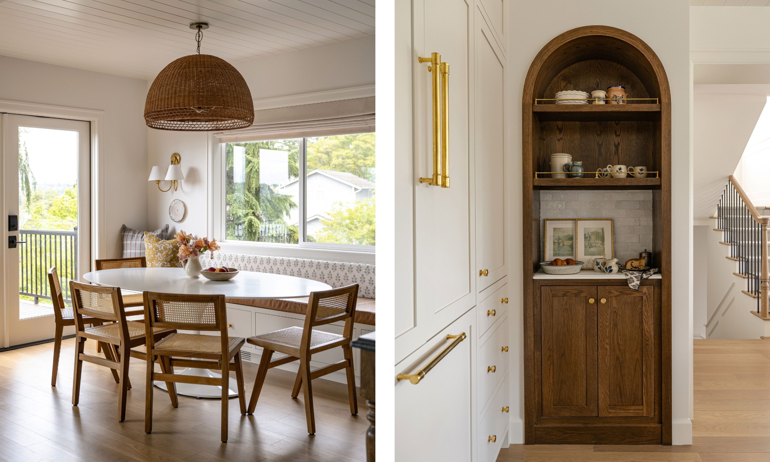
Rather than a closed-off dining space, the heart of the home is open-plan, transitioning from the hardworking kitchen to a cozy dining area and breakfast nook. 'Because the dining area is directly connected to the kitchen, I wanted it to feel related but not like an extension of the cabinetry,' Emily says. To create this cohesion, the kitchen's soft color palette is extended, while the banquette seating, complete with patterned upholstery by Kravet, adds distinction between the two areas.
Kitchen lighting ideas were another important consideration. 'The woven chandelier brings in another natural texture and helps visually define the dining area within the larger open space,' the designer adds. By the windows, Emily opted for brass sconces to 'frame the window and give the nook a more intimate layer of light in the evening'.
Elsewhere in the open-plan kitchen, the arched theme is repeated, with a built-in coffee station made from the same wood as the kitchen island.
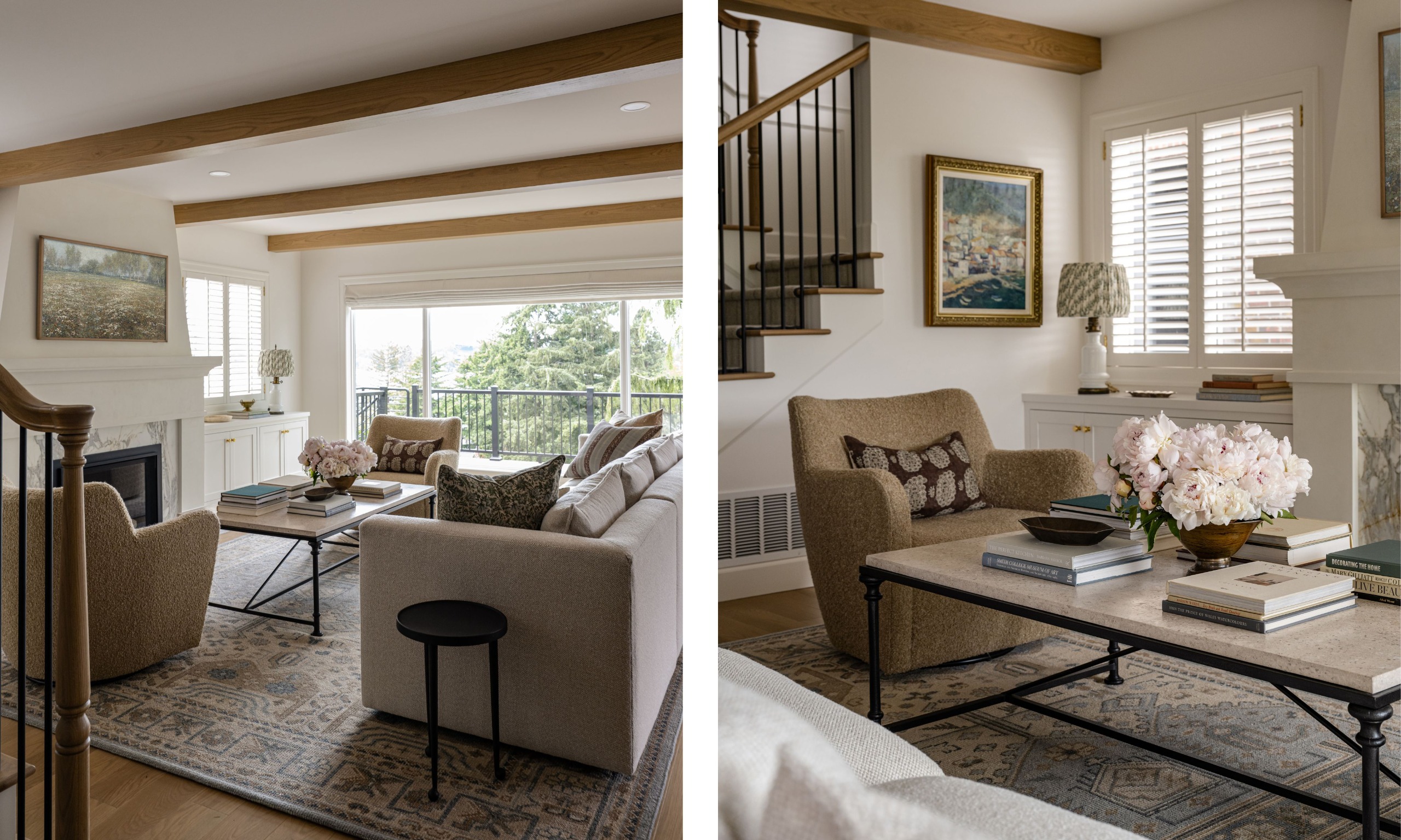
The living room is the final element of the open-plan space, but it takes on its own identity with a clever furniture layout, a cozy fireplace, and rustic wood ceiling beams. 'The stained ceiling beams were an important addition because they immediately give the room a greater sense of age and help connect it to the Tudor character of the exterior,' Emily explains.
A lesson on decorating with neutrals, the living room teams warm white walls (Benjamin Moore's White Dove) with earthy tones and the warmth of the natural wood, while texture is added through the fireplace. 'The plaster and Calacatta marble fireplace is the focal point and also ties back to the Tudor architectural style,' she adds.
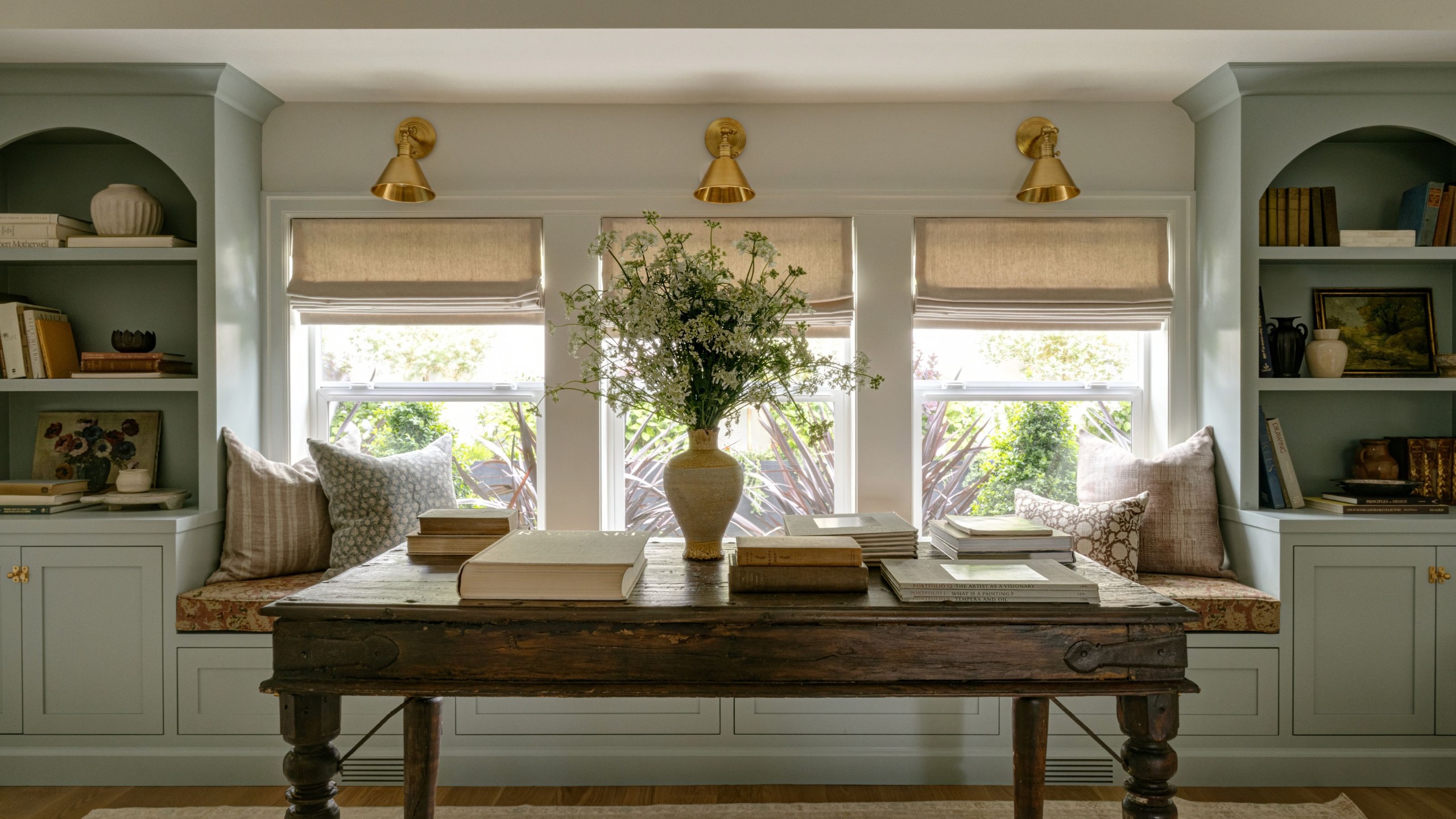
Compared to the warm whites of the kitchen and living room, the home library embraces a slightly richer shade: Benjamin Moore's Raindance, a hushed gray-green paint. 'The muted blue-green cabinetry gives the room its identity while still feeling soft enough to sit comfortably alongside the warmer tones used throughout the rest of the house,' the designer says.
The built-ins were cleverly imagined to 'take advantage of an otherwise awkward portion of the room – incorporating book storage, concealed cabinetry and a window seat,' explains Emily.
To bring the space together, Emily chose an earthy pink floral cushion for the bench, which 'adds so much personality to the space and is one of my favorite elements of the entire home.'
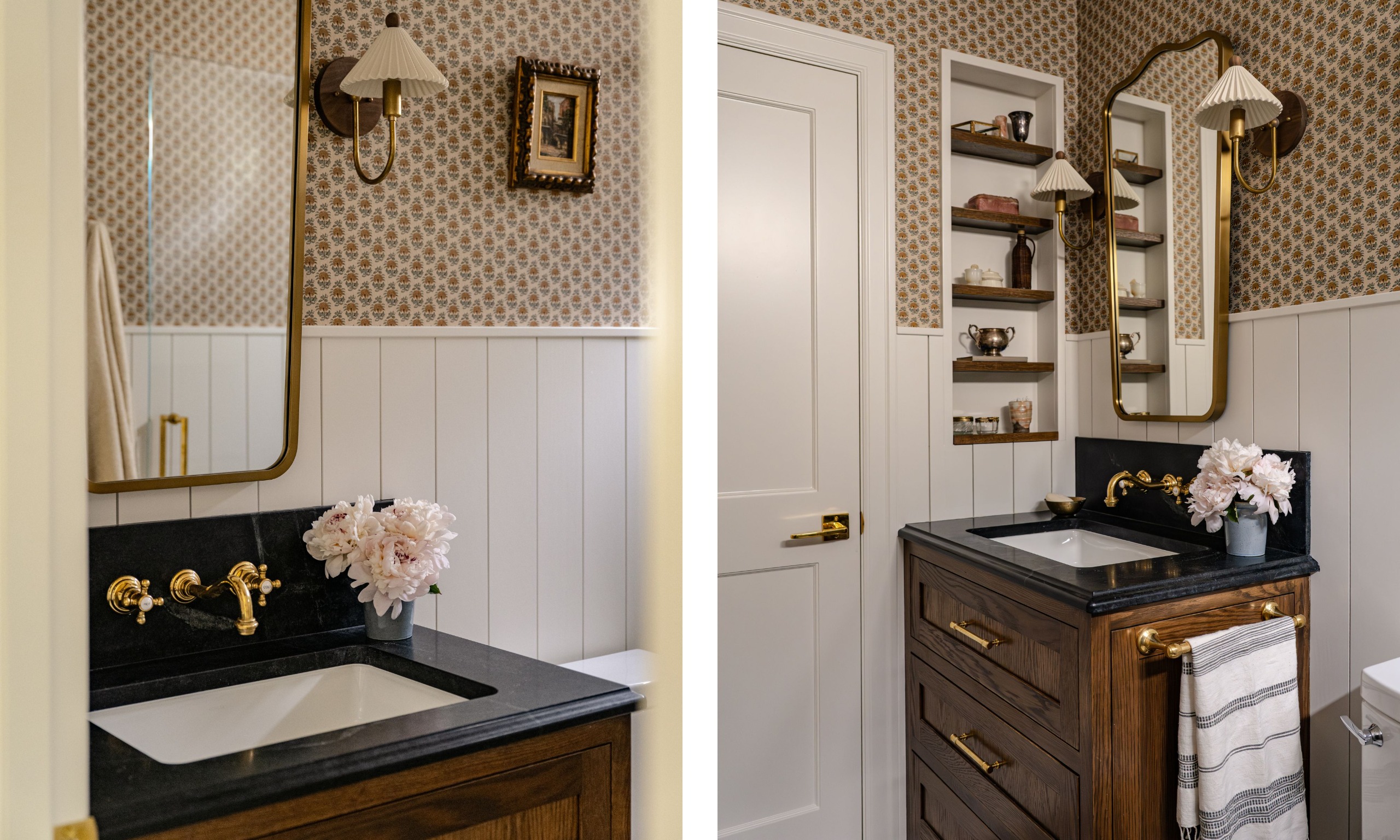
The downstairs bathroom takes advantage of its small square footage, imparting the feel of a cozy English countryside home. 'I wanted to embrace the scale and make it feel more like a jewel box rather than trying to make it visually disappear,' Emily tells me. The floral wallpaper was one of the most important features, adding an 'English sensibility', while the darker and richer wood and soapstone on the vanity ground the space.
And, as is apparent in every room of this home, it's the details that make all the difference. Here, it's the ceramic wall sconces. 'They are so fun and one of our favorite light fixture choices in the entire house.'
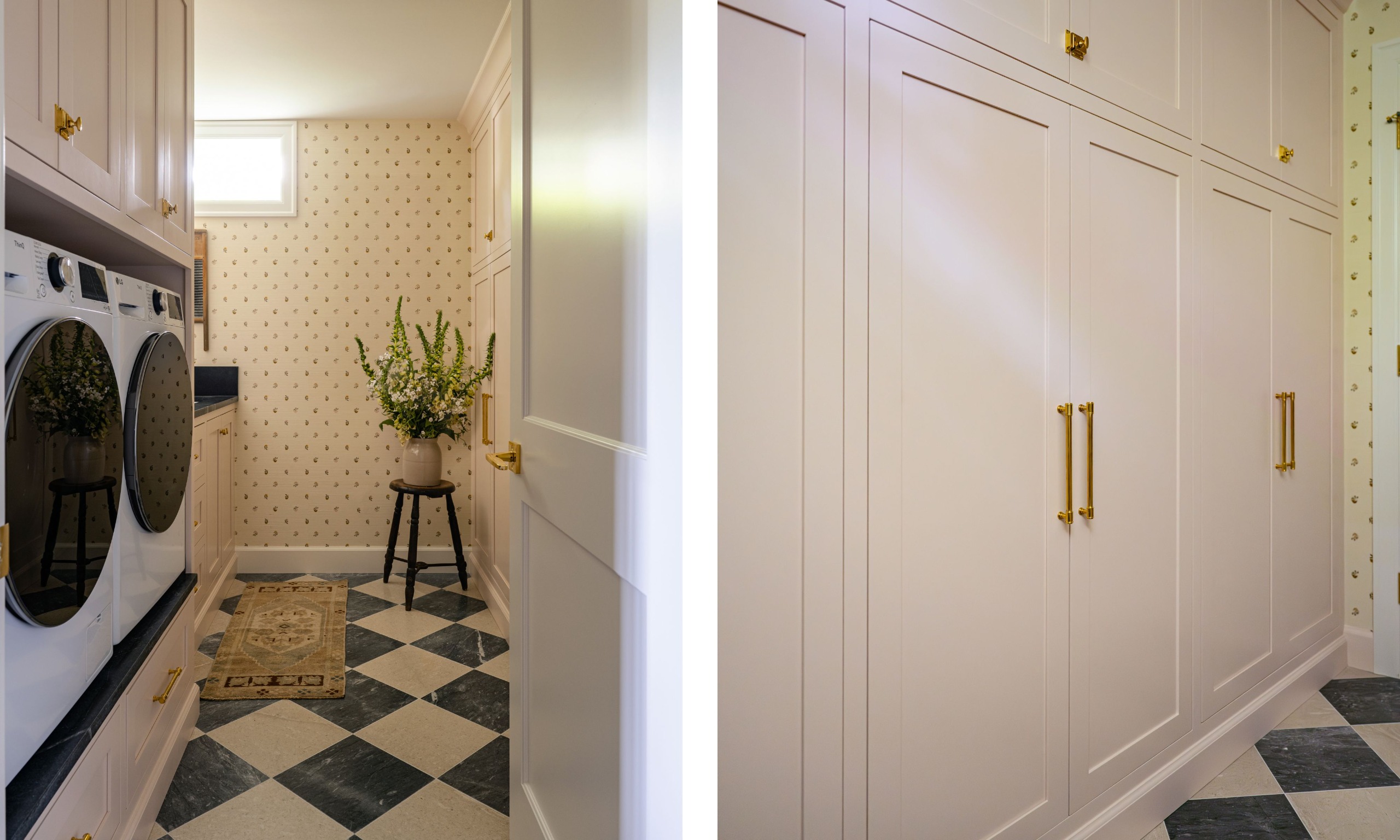
Small rooms are almost always the perfect spaces to embrace colorful palettes, and this is certainly the case in the laundry room. 'We intentionally made the laundry room feel cheerful rather than purely functional,' Emily says. With the cabinets painted Benjamin Moore's Tissue Pink and the small-scale floral wallpaper, this utilitarian room oozes charm and nods to the cottage design influences elsewhere in the home.
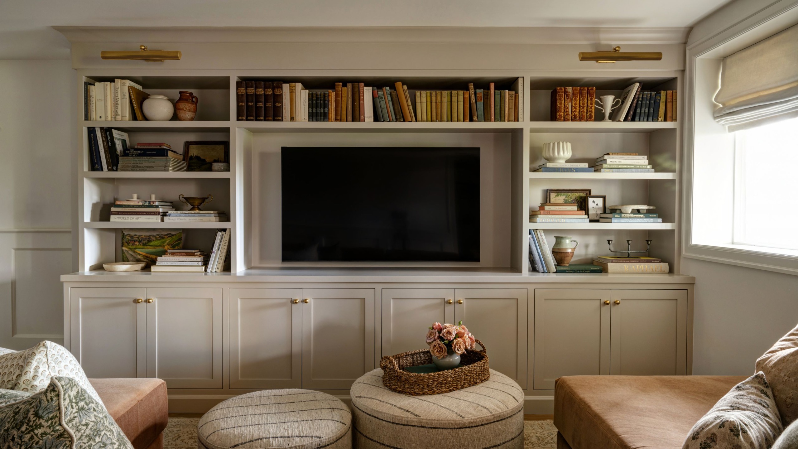
Since the homeowner often hosts friends and family, the basement was transformed into a place for them to stay, complete with a bedroom, bathroom, living area, and kitchenette. 'I didn't want the basement to feel like an entirely different house, so we carried the same vocabulary downstairs: warm neutrals, aged brass, natural stone, traditional millwork, and furniture that feels collected rather than overly coordinated,' Emily explains.
In the living space, built-ins provide a sleek backdrop while providing useful storage and a clever home for the wall-mounted television. 'The upholstery is deliberately comfortable and neutral, with the patterned pillows, rug and smaller accessories doing more of the decorative work.'
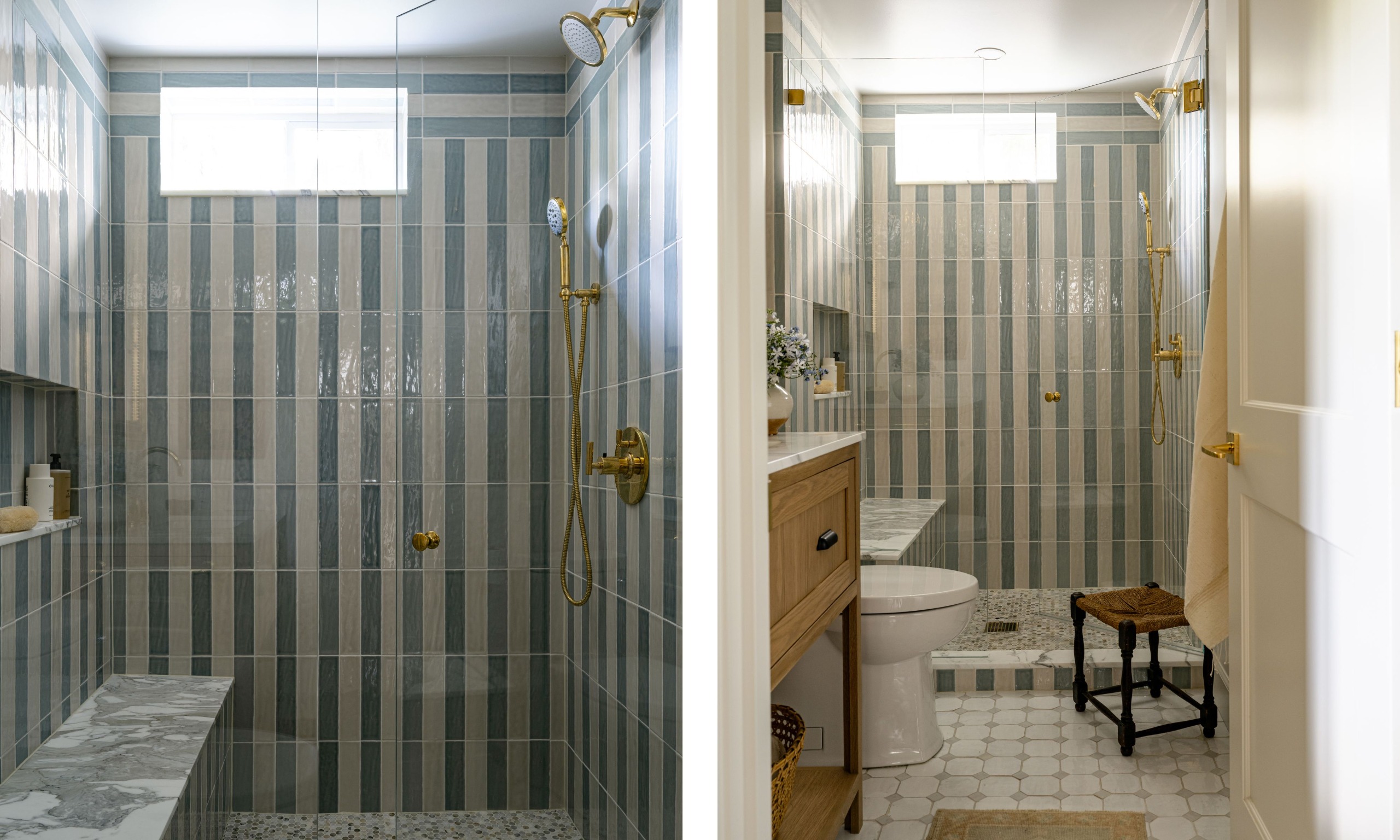
The striped shower tiles add a playful touch to this small bathroom. 'Alternating soft blue and sandy cream tile gives a very simple material a much stronger graphic quality,' Emily explains. 'The polished brass plumbing runs through the stripes almost like jewelry.'
'We balanced the stripe with quieter materials elsewhere, including a stained wood vanity, honed marble countertop and warm white walls,' the designer adds.
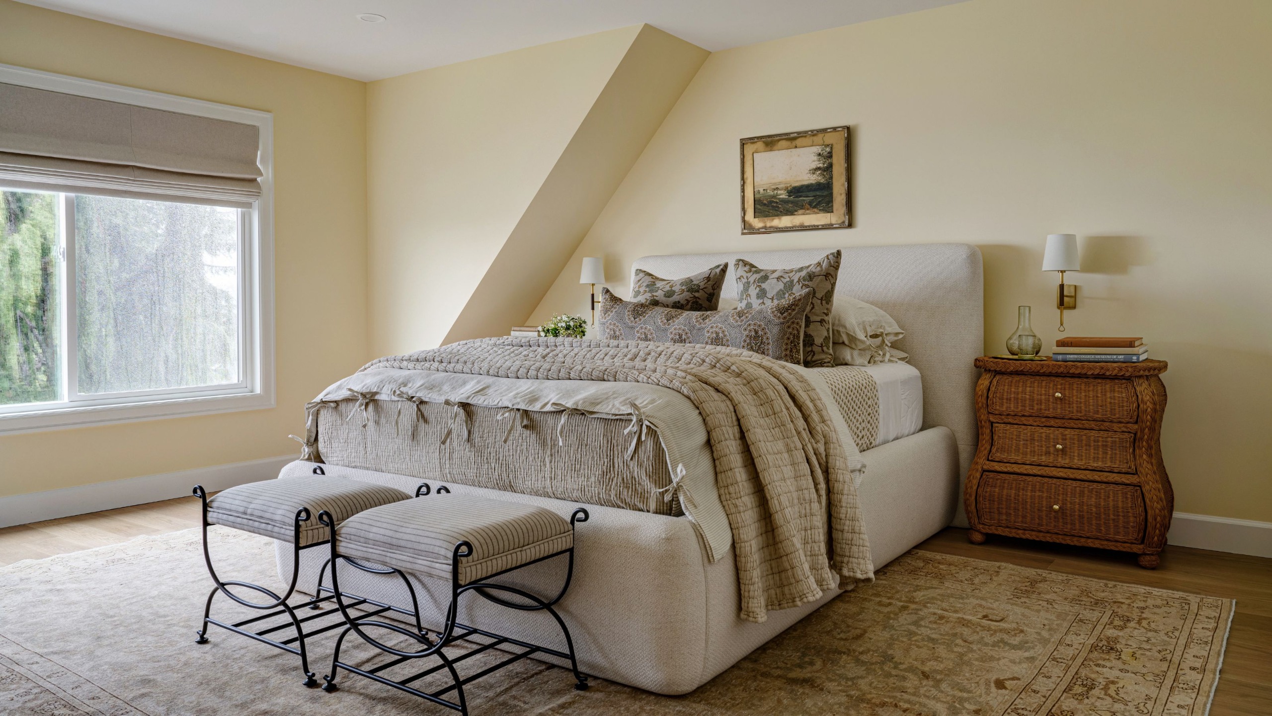
Since yellow is the client's favorite color, it was a no-brainer to include a soft, soothing variation of it in the main bedroom: Benjamin Moore's Antiquity. To tie the scheme together, Emily focused on decor that subtly echoed this soft tone. 'We incorporated a vintage rug and bedding that had similar yellow tones so everything felt cohesive,' she says. 'I love the mix of patterns in all of the bedding and how calming the space feels.'
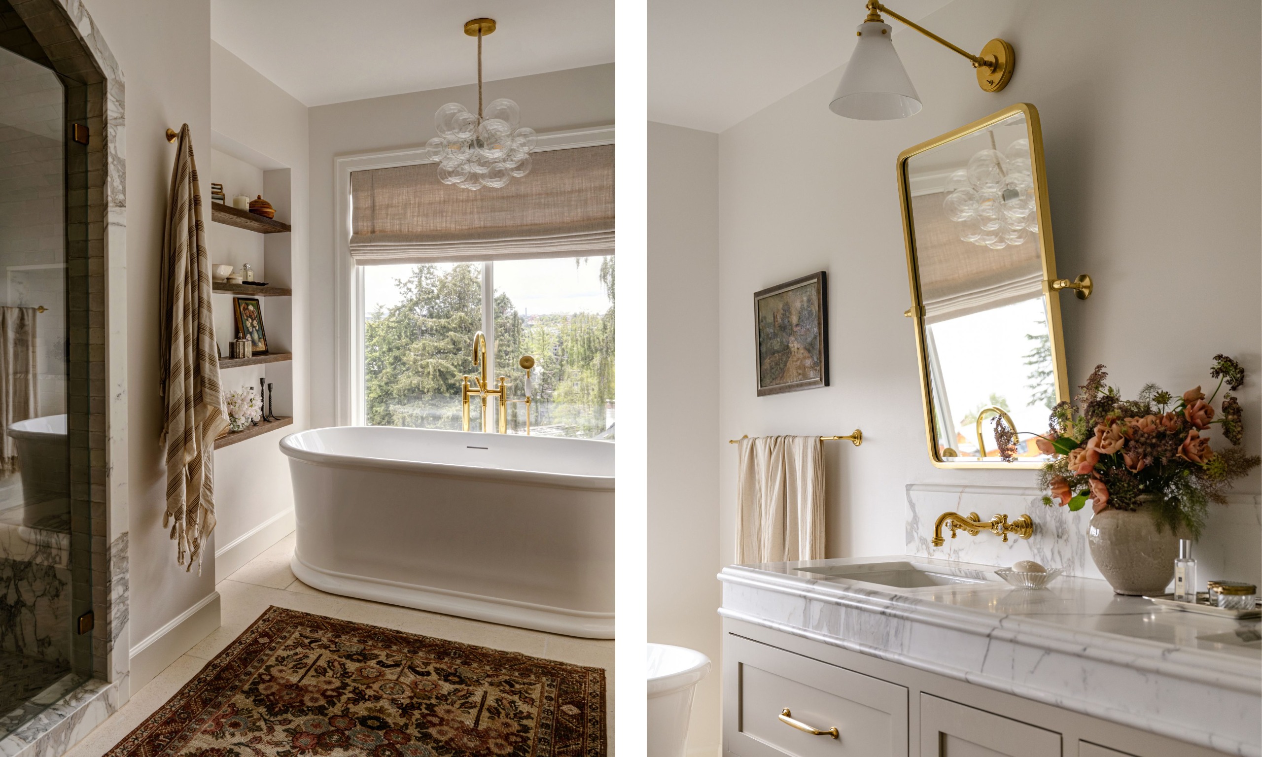
'The primary bathroom is one of the more refined spaces in the house, but I still didn't want it to feel like a conventional luxury bathroom,' Emily explains. Instead of relying on color, it's all about material choice and texture. 'The starting point was a palette of aged limestone, Calacatta marble floors, Calacatta marble slabs, and warm brass – all materials that become more interesting as they age.'
'My favorite design element is the ogee countertop edges with a double bullnose apron detail,' she adds. 'The vanity is in the center of the bathroom, so we wanted it to feel special.'
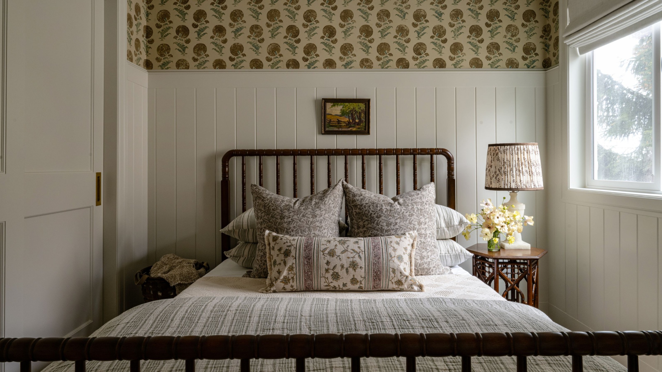
The guest bedroom is every bit cozy and inviting with its cottage-inspired design. 'The small-scale Indian Flower wallpaper was paired with tongue-and-groove wainscoting so the pattern feels enveloping without overwhelming the room,' Emily explains. 'Against that background, we used dark spindle-style wood furniture, simple linens, and a small piece of art rather than introducing another major pattern.'
'I especially like that nothing in the room feels too perfect. The antique-inspired furniture, woven textures, and small framed artwork give it the feeling of a room that has developed over time.'
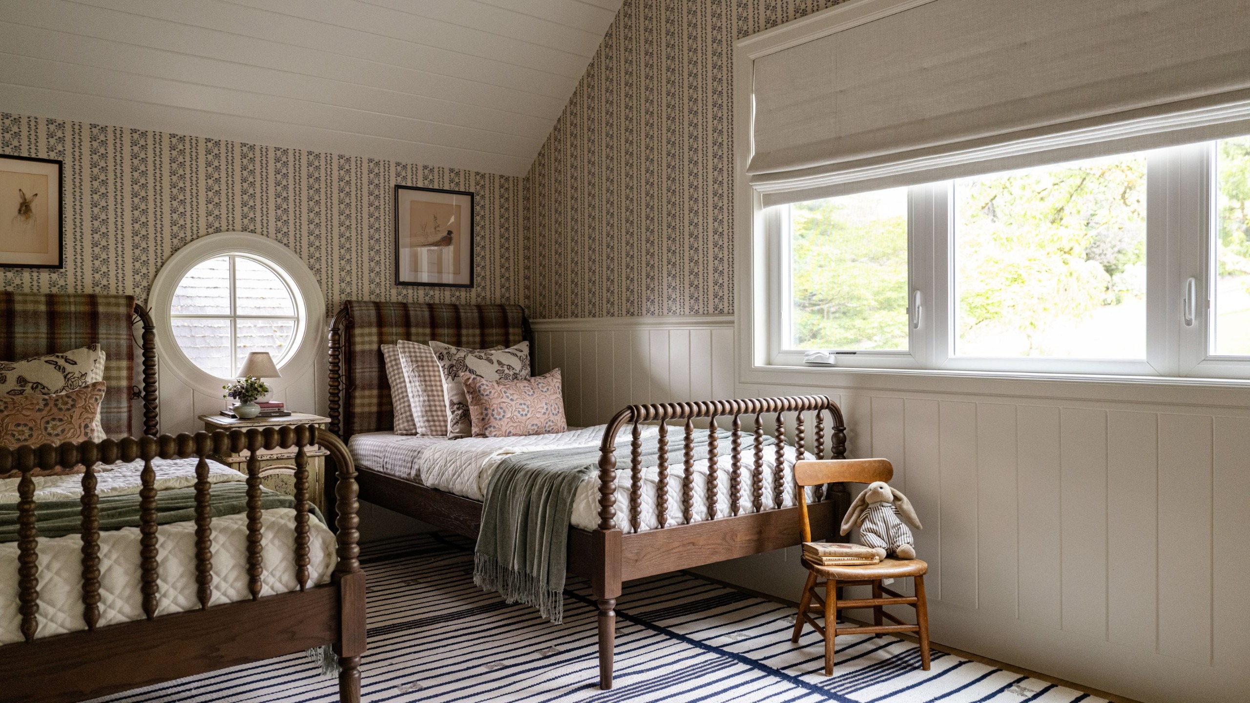
Not dissimilar to the guest room, the kids' bedroom echoes a cottage-like feel with its floral wallpaper and spindle bedframes. 'We wanted the kids' room to feel playful with a mix of patterns and muted color,' Emily says. 'Our client had the idea to add a rounded window, and we love how it sets the perfect backdrop for the twin beds. We found an inspiration image of plaid wraps on wood beds and had our upholsterer make a similar style wrap for these spindle beds. It is the perfect room for sleepovers with Nana.'
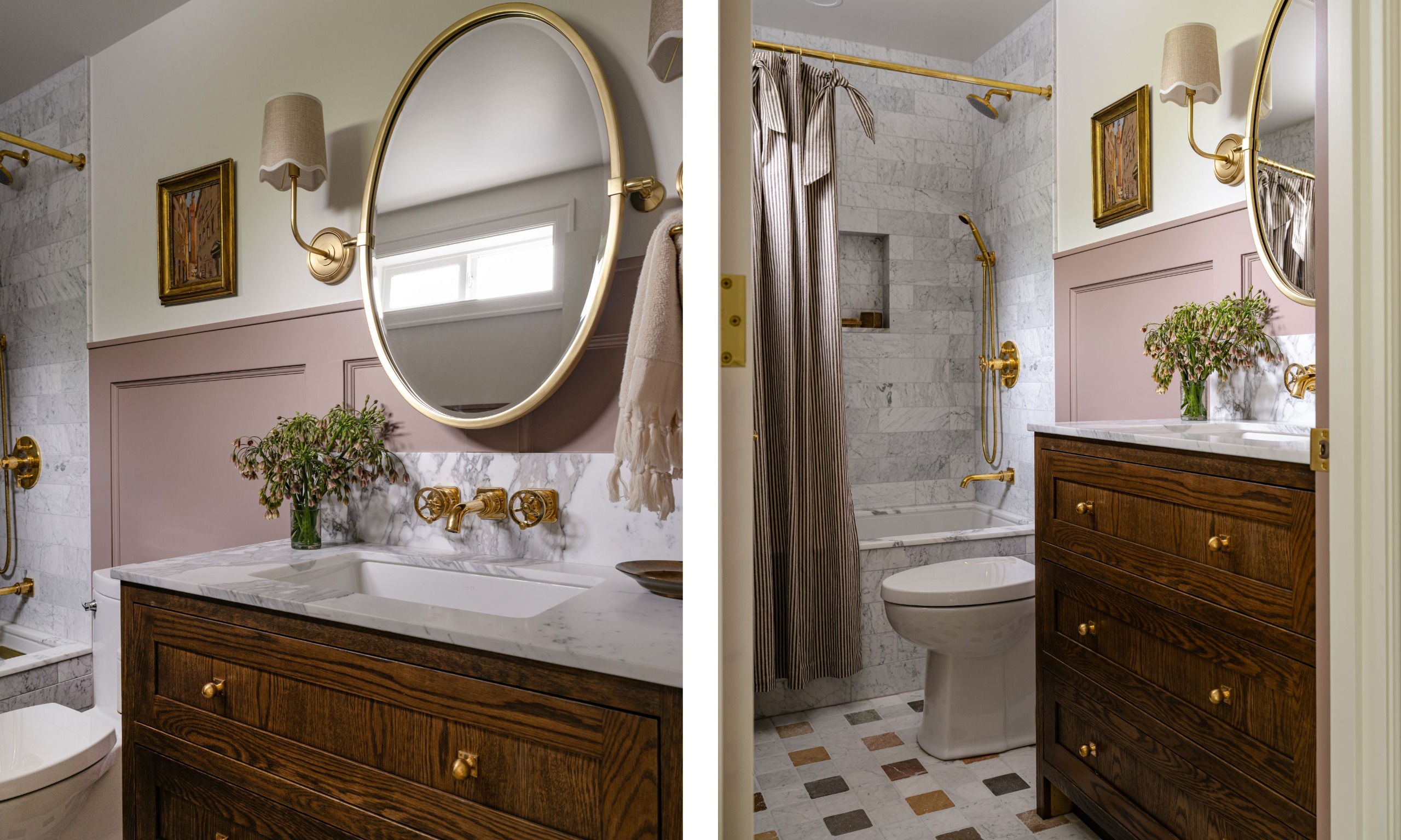
Repeating the theme of subdued pink tones, the kids' bathroom is both fun and timeless. The wainscoting was painted with Farrow & Ball's Sulking Room Pink, while subtle color was also added through the floor tiles. 'Rather than introducing a colorful ceramic tile, we designed a custom stone floor using Carrara marble as the field and inset individual pieces of green, coral, gold, blue, and caramel-toned natural stones throughout it,' Emily explains. 'From a distance, it reads as a classic marble floor; up close, the colored pieces become a playful surprise.'
Even though Emily took on this project when it was stripped completely back to its studs, the architectural language throughout nods to that of the exterior, resulting in an interior that feels as though it has always been there. And, perhaps even more importantly, this is a home that is full of warmth; one that makes hosting friends and family a joy. 'It is full of so much character and charm, which was always the primary goal,' Emily remarks.
Love beautiful design ideas, expert advice, and inspiring decor trends? Sign up for our newsletter and get the latest features delivered straight to your inbox.